


Fournisseur officiel
Comme nous somme les distributeurs officiels et autorisés, nous vous fournissons des licences légitimes directement à partir de 200+ éditeurs de logiciels.
Voyez toutes nos marques.
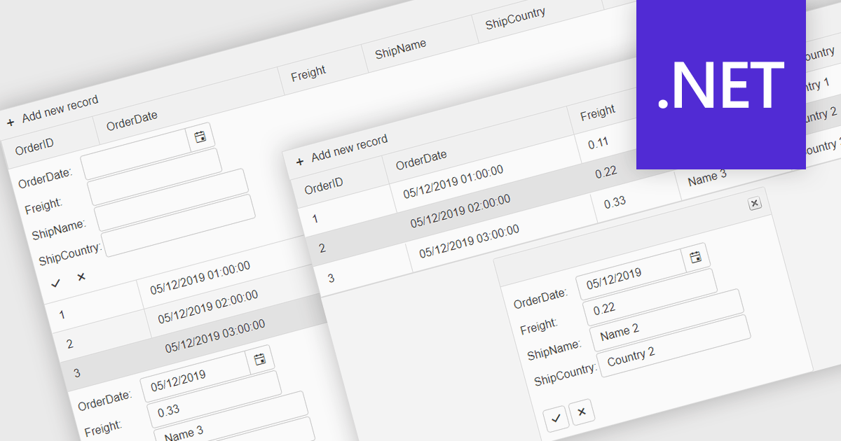
Forms in grids combine tabular data display with built-in form editing, allowing users to view and update records directly within the grid instead of switching to separate edit screens. This approach improves efficiency by keeping users in context, reducing navigation, and providing immediate validation and feedback. Forms in grids are commonly used in administrative dashboards, configuration screens, and data-heavy business applications where users need to edit multiple records quickly while maintaining visibility of related data.
Several .NET grid components enable form-based editing within grids, including:
For an in-depth analysis of features and price, visit our .NET grid controls comparison.
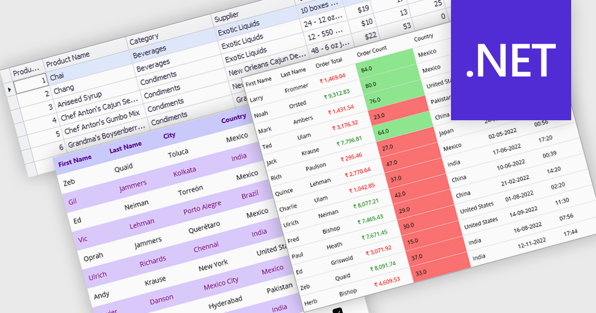
Data grids with column spanning functionality can be configured so the columns collectively extend to fill the entire width of the container, eliminating unused or empty space at the grid's edges. This behavior ensures that available horizontal space is distributed across columns rather than leaving fixed-width gaps, resulting in a more balanced and visually consistent layout. The primary benefits are improved readability, more efficient use of screen space, and a layout that adapts smoothly to resizing and different display sizes without requiring manual adjustment of individual column widths.
Several .NET grid components allow column spanning, including:
For an in-depth analysis of features and price, visit our comparison of .NET grid components.
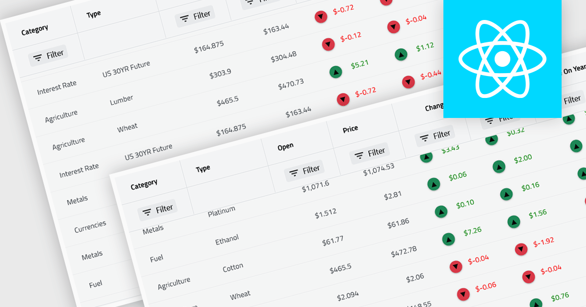
Virtual scroll support in a grid component is a rendering strategy that displays only the rows and columns currently visible in the viewport while dynamically loading and unloading data as the user scrolls. It minimizes DOM size and memory usage by avoiding the creation of off-screen elements, which improves rendering speed, reduces layout thrashing, and maintains smooth interaction even with very large datasets. This approach enables grids to handle millions of records efficiently without requiring pagination, lowers CPU and GPU load, and delivers consistent performance across a wide range of devices.
Several React grid controls offer virtual scroll capability including:
For an in-depth analysis of features and price, visit our React grid controls comparison.
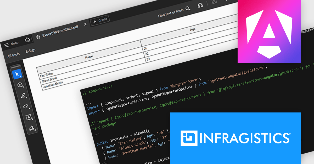
Infragistics Ignite UI for Angular is a comprehensive suite of Angular components and UI controls designed to accelerate development of high-performance, enterprise-grade web applications. It offers a rich collection of data grids, charts, and other UI elements, along with advanced features like pivoting, docking, and hierarchical data management. Built on Angular, the toolkit integrates into existing projects and provides a foundation for building modern, responsive, and interactive user interfaces.
The Ignite UI for Angular 21 release introduces the Grid PDF Exporter, a new service that allows developers to export data directly into PDF format from both raw arrays and advanced Angular grid components like IgxGrid, IgxTreeGrid, IgxHierarchicalGrid, and IgxPivotGrid. It offers a rich set of export capabilities including support for multi-page documents, automatic handling of page breaks, and customization of PDF formatting. Whether you're working with hierarchical data or flat tables, the service provides a structured and flexible solution for generating professional PDF files.
To see a full list of what's new in version 21, see our release notes.
Infragistics Ignite UI for Angular is part of Infragistics Ignite UI which is licensed per developer and is available as a Perpetual License with a 1, 2 or 3 year support and maintenance subscription. See our Infragistics Ignite UI licensing page for full details.
Infragistics Ignite UI for Angular is available in the following products:
Row and column features form the core of modern grid components, enabling users to view, navigate, and manipulate tabular data efficiently. These capabilities improve usability and help developers present information in a structured, interactive format suited to many types of applications. By offering clear ways to organise, edit, and inspect information, row and column features allow users to work more effectively while maintaining control over how content is displayed.
Common features include:
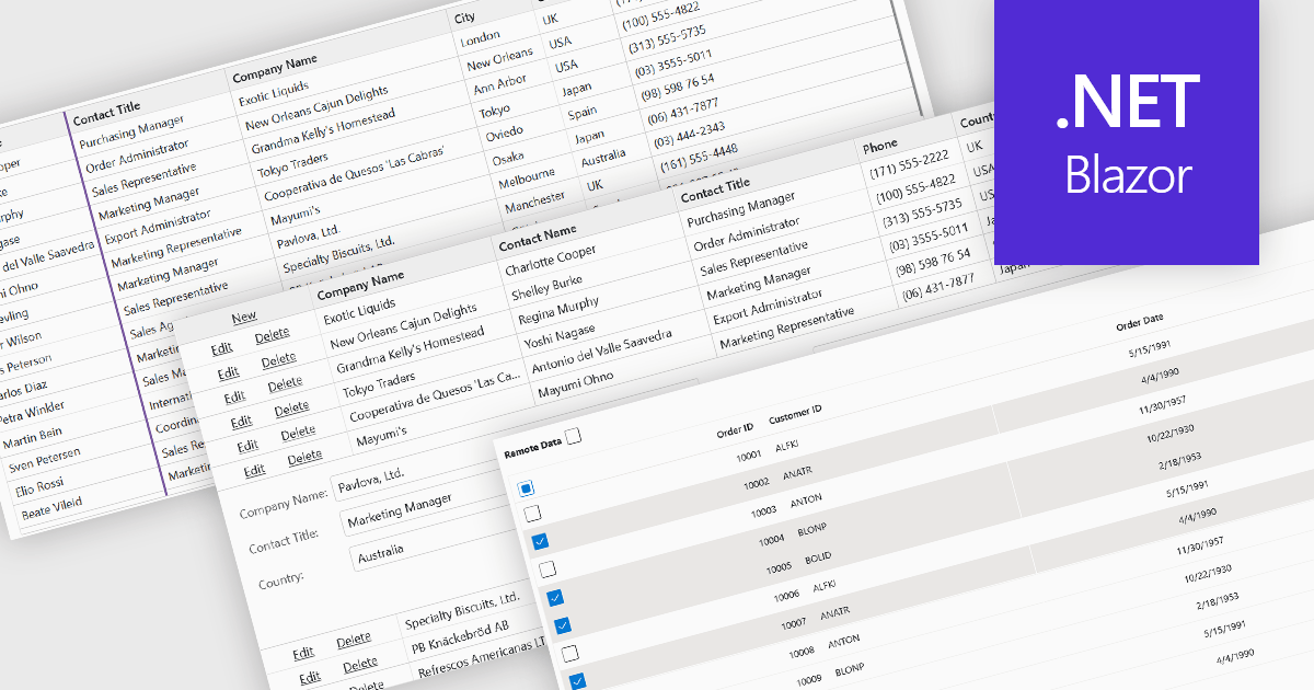
For an in-depth analysis of features and price, visit our Blazor grid components comparison.


Tél : (888) 850 9911
Fax : +1 770 250 6199


