PDF Xpress .NET
리얼 PDF 렌더링 솔루션으로 신속하고 쉽게 애플리케이션을 만듭니다.
PDF와 PDF/A 만들기 및 편집 - 텍스트와 이미지에서 PDF 파일을 생성하고, 기존 PDF 파일을 편집합니다. 또한 PDF/A-1b 아카이브 파일을 만들 수 있으며, TIFF, JBIG2, PNG, GIF, JPEG, JPEG 2000, BMP & RAW를 포함하는 여러 이미지 형식에서 이미지를 추가 할 수 있습니다.

스크린샷: Why use a column chart when a funnel chart is what you need? Incorrect chart types lead to incorrect analysis, which in turn lead to incorrect business decisions. Your users deserve better. FusionCharts Suite XT brings you 90 chart types right from the ... 더 읽기 본 제품에 관한 더 많은 결과 보기
스크린샷: Why use a column chart when a funnel chart is what you need? Incorrect chart types lead to incorrect analysis, which in turn lead to incorrect business decisions. Your users deserve better. FusionCharts Suite XT brings you 90 chart types right from the ... 더 읽기
스크린샷: The Charts don't just look good; they feel good too! Fusioncharts are highly interactive with drill-down, tooltips, zooming, panning, chart export and visual editing. Makes for an enjoyable reporting experience. ... 더 읽기

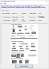
스크린샷: Barcode Xpress reads most commonly used 1D barcodes, detecting them anywhere on the page, in any orientation. 0 ... 더 읽기 본 제품에 관한 더 많은 결과 보기
스크린샷: Barcode Xpress accurately reads common industry 1D and 2D barcodes and also writes most 1D barcodes and many 2D barcodes. 0 ... 더 읽기
스크린샷: Report confidence values for detected barcodes. 0 ... 더 읽기

스크린샷: Multiple Chart Types 더 읽기 본 제품에 관한 더 많은 결과 보기
스크린샷: Data Filtering 더 읽기
스크린샷: Data Grouping 더 읽기

스크린샷: PDF Xpress supports extracting text content from PDF pages and reporting contextual information for specific words. Use PDF Xpress to report the counding quadrilaterals and surrounding words for any whole or partial word extracted from the pages of a PDF ... 더 읽기 본 제품에 관한 더 많은 결과 보기
스크린샷: PDF Xpress supports extracting text content from PDF pages and reporting contextual information for specific words. Use PDF Xpress to report the counding quadrilaterals and surrounding words for any whole or partial word extracted from the pages of a PDF ... 더 읽기
스크린샷: PDF Xpress allows you to add an image to a specific page in a PDF document. 0 ... 더 읽기

스크린샷: 0 ... 더 읽기 본 제품에 관한 더 많은 결과 보기
스크린샷: 0 ... 더 읽기
스크린샷: 0 ... 더 읽기

스크린샷: Understanding PrizmDoc 더 읽기 본 제품에 관한 더 많은 결과 보기
스크린샷: Document Viewing- PPTX 더 읽기
스크린샷: Document Viewing- DOC 더 읽기

스크린샷: Why use a column chart when a funnel chart is what you need? Incorrect chart types lead to incorrect analysis, which in turn lead to incorrect business decisions. Your users deserve better. FusionCharts Suite XT brings you 90 chart types (total number for ... 더 읽기 본 제품에 관한 더 많은 결과 보기
스크린샷: Why use a column chart when a funnel chart is what you need? Incorrect chart types lead to incorrect analysis, which in turn lead to incorrect business decisions. Your users deserve better. FusionCharts Suite XT brings you 90 chart types (total number for ... 더 읽기
스크린샷: FusionCharts XT supports both JSON and XML data formats. So when you are integrating the charts with other JavaScript frameworks, JSON is an ideal choice. And when you are working with server-side business applications, XML becomes more convenient with ... 더 읽기

스크린샷: Display customer satisfaction index across multiple regions. ... 더 읽기 본 제품에 관한 더 많은 결과 보기
스크린샷: World Map showing office locations with markers. ... 더 읽기
스크린샷: World Map showing hits by country. ... 더 읽기

스크린샷: Real-time charts (also called data streaming charts) automatically update themselves every 'n' seconds by getting new data from the server. You can use them to display up-to-second data in stock monitors, network monitoring applications and ... 더 읽기 본 제품에 관한 더 많은 결과 보기
스크린샷: Angular Gauges are essentially like the speedometer or fuel gauge of your car. They use a radial scale to display your data range and a dial is used to indicate the data value. ... 더 읽기
스크린샷: The cylinder gauge is represented by a vertical cylinder, whose fill level indicates the data that you wish to depict. It is used to report inventory levels, power plant reports, fuel levels etc. ... 더 읽기

스크린샷: The Heat Map charts represents data in a tabular format with user-defined color ranges like low, average and high. It is used to plot complex data like performance comparison of different companies, periodic table, employee attendance, stock market ... 더 읽기 본 제품에 관한 더 많은 결과 보기
스크린샷: The Radar chart is a very effective tool for comparing multiple entities based on different characteristics. For instance, they can be used for comparing various cars based on their fuel efficiency, maneuverability, pick-up and engine power. ... 더 읽기
스크린샷: The candlestick chart offers you a powerful and interactive interface to plot your stock data. It offers the following features: Integrated price and volume plot. Volume plot can be turned on or off. Multiple options for price plotting- Candlestick / bar ... 더 읽기