


Proveedor oficial
Como distribuidores oficiales y autorizados, le suministramos licencias legítimas directamente de más de 200 editores de software.
Ver todas nuestras marcas.
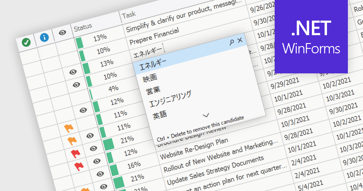
An Input Method Editor (IME) facilitates the entry of complex characters and scripts not directly supported by standard keyboards, which is especially vital for languages with extensive character sets like Chinese, Japanese, and Korean. When integrated into a grid component, an IME enables users to input text directly into data cells using phonetic or syllabic methods that are converted into the desired characters. This integration streamlines the data entry process in applications requiring multi-language support, significantly enhancing usability and efficiency. It simplifies the development of applications targeting global markets by providing native language input support, thereby improving the user experience and reducing the need for external language input tools.
Several WinForms grid components offer Input Method Editor (IME) support, including:
For an in-depth analysis of features and price, visit our comparison of WinForms grid components.
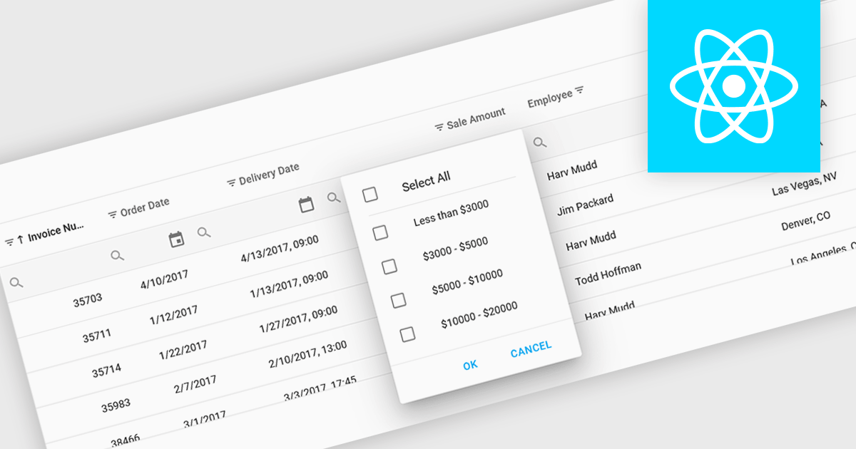
Using a grid control with support for filters enables users to dynamically narrow the displayed data based on specific criteria. This functionality helps users focus on relevant subsets of information by filtering individual columns using operators, keywords, or pre-defined options. Filtering improves data exploration efficiency and reduces cognitive load by presenting only the data that aligns with the user's current analysis.
Several React grid controls offer filtering functionality including:
For an in-depth analysis of features and price, visit our React Grid controls comparison.
Blazorise is a versatile component library that empowers developers to build modern and feature-rich web applications using Blazor, a client-side web development framework from Microsoft. It offers a comprehensive collection of user interface components, including buttons, forms, tables, charts, and navigation elements, all built with accessibility and responsiveness in mind.
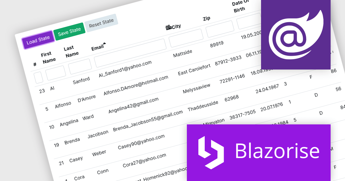
The Blazorise v1.5 update introduces DataGrid State Management. New LoadState and GetState methods enable you to load and save the state of the datagrid from/to LocalStorage. On the first render, the web page checks LocalStorage for saved states and loads them if they are available. This feature enables seamless preservation and restoration of user actions, such as sorting, filtering, and row selections, even when navigating away from or refreshing the page.
To see a full list of what’s new in version 1.5, see our release notes.
Blazorise is licensed per developer and is Runtime Royalty Free. Available in a variety of editions, Professional, Enterprise and Enterprise Plus, each providing different levels of support and services. See our Blazorise licensing page for full details.
For more information, visit our Blazorise product page.

Infragistics Ignite UI for Blazor is a comprehensive UI component library designed specifically for .NET developers building modern web applications with Blazor. It offers a rich set of over 60 components, including performant data grids, interactive charts, and essential UI elements. This allows developers to craft visually appealing, feature-packed Blazor applications with a focus on data visualization, user interaction, and a variety of design themes.
Version 23.2.189 introduces the new hierarchical data grid. This intuitive component empowers you to present multi-level information in a clear, structured format. Bind your data with minimal coding, and leverage fine-grained control through various events. The grid boasts a rich feature set, including selection tools, advanced filtering and sorting options, all designed to enhance user experience by providing a more organized and interactive way to explore information.
To see a full list of what's new in version 23.2.189, see our release notes.
Infragistics Ignite UI for Blazor is part of Infragistics Ignite UI which is licensed per developer and is available as a Perpetual License with a 1, 2 or 3 year support and maintenance subscription. See our Infragistics Ignite UI licensing page for full details.
Infragistics Ignite UI for Blazor is available in the following products:

Syncfusion Essential Studio Blazor (available as part of Syncfusion Essential Studio Enterprise) is a comprehensive UI component library designed to accelerate the development of high-performance, modern web applications using the Blazor framework. It boasts over 85+ responsive, lightweight, and modular components spanning various categories like data visualization, data editing, document processing, and interactive UI elements. This rich repertoire empowers developers to rapidly build user-friendly, feature-rich web interfaces, all with the advantage of seamless integration with both server-side and client-side Blazor applications.
The Syncfusion Essential Studio Blazor 2024 Volume 1 (25.1.35) release introduces a new operator for its search and filter functionality. This addition empowers users with the ability to conduct more precise and targeted searches on their data. This enhanced functionality expands filtering capabilities to include options like "Does Not Contain," "Is Null," and "Does Not Start With," granting users greater flexibility and control over how they search and filter data within the DataGrid.
To see a full list of what's new in version 2024 Volume 1 (25.1.35), see our release notes.
Syncfusion Essential Studio Blazor is available as part of Syncfusion Essential Studio Enterprise which is licensed per developer starting with a Team License of up to five developers. It is available as a 12 Month Timed Subscription License which includes support and maintenance. See our Syncfusion Essential Studio Enterprise licensing page for full details.
For more information, visit our Syncfusion Essential Studio Blazor product page.
Tel: (888) 850 9911
Fax: +1 770 250 6199


