


Proveedor oficial
Como distribuidores oficiales y autorizados, le suministramos licencias legítimas directamente de más de 200 editores de software.
Ver todas nuestras marcas.
It's a great time to update your MESCIUS software subscriptions. Now through October 4th 2024, we are offering expired MESCIUS customers the ability to re-start their expired subscriptions at the discounted renewal rate* instead of paying for an upgrade or late renewal. This offer is valid for the following MESCIUS subscriptions:
Don't miss out on the opportunity to get back on an active subscription for your product and enjoy all of the benefits of an updated toolkit, including:
Click the link above for your product to view the special pricing or contact us for a quote.
* This offer requires verification of upgrade eligibility. Some restrictions apply.
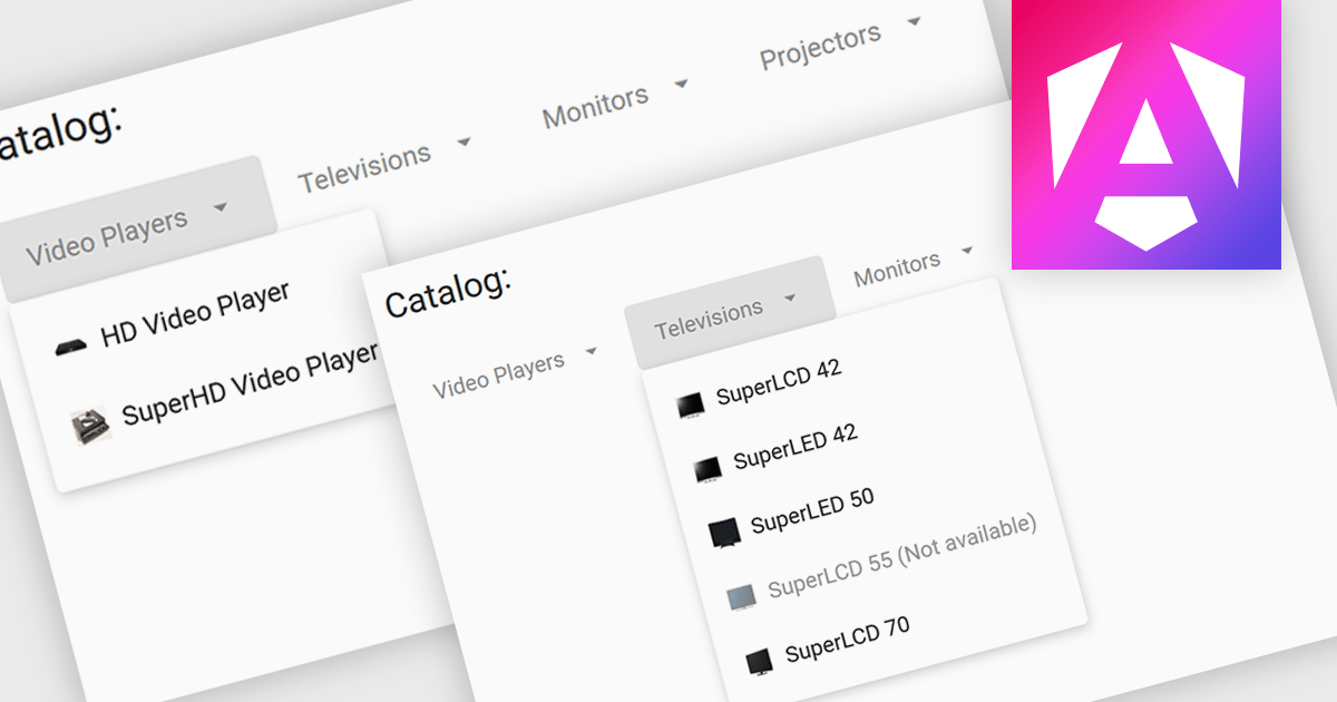
Menu controls are interactive elements within a user interface that allow users to access additional options or functions. These controls typically appear as buttons, drop-down lists, or context menus. They are widely used to organize and present complex functionalities in a structured and efficient manner, improving user experience and navigation.
Several Angular UI suites offer menu controls including:
For an in-depth analysis of features and price, visit our Angular UI suites comparison.
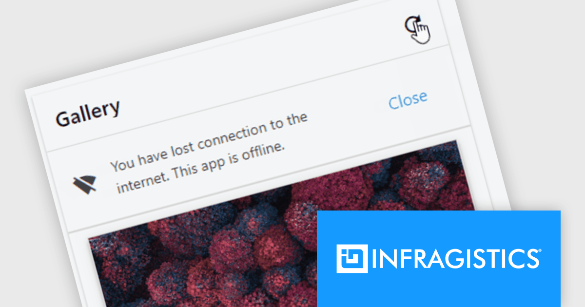
Infragistics Ignite UI for Web Components is a comprehensive library of pre-built, reusable UI components designed for constructing modern web applications using the Web Components standard. It offers a diverse collection of data grids, charts, and interactive elements, enabling developers to rapidly create high-performance, cross-platform applications without dependency complexities.
The Ignite UI for Web Components 24.1 update now includes a Banner component, offering developers a versatile tool for displaying prominent, persistent messages within applications. Positioned between the transient Snackbar and the modal Dialog, the Banner provides a non-intrusive way to convey crucial information to users. Its customizable features, including support for custom action buttons and icons, allow for tailored messaging and user interaction, enhancing application usability and user experience.
To see a full list of what's new in version 24.1 (4.10.0), see our release notes.
Infragistics Ignite UI for Web Componentsis part of Infragistics Ignite UI which is licensed per developer and is available as a Perpetual License with a 1, 2 or 3 year support and maintenance subscription. See our Infragistics Ignite UI licensing page for full details.
Ignite UI for Web Components is available to buy in the following products:
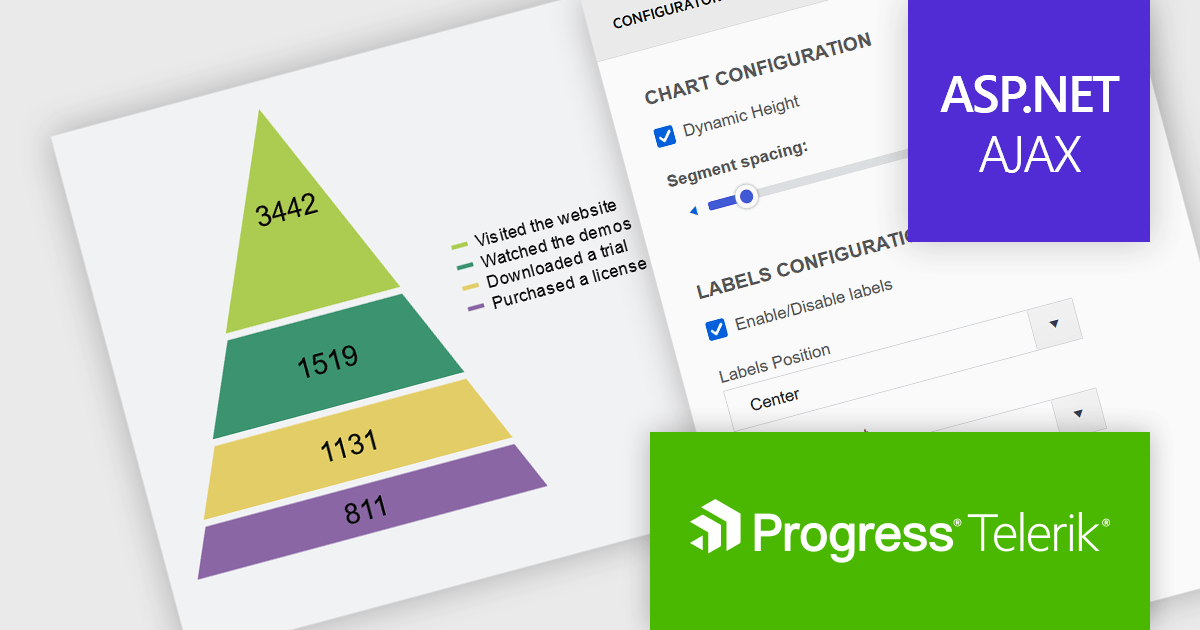
Telerik UI for ASP.NET AJAX is a library of over 120 user interface components designed for developers building Web Forms applications on the ASP.NET AJAX framework. It provides a variety of pre-built and high-performant controls which are fully customizable, ranging from data management to layout, navigation and data visualization. This feature-rich suite allows for the creation of responsive and visually appealing web applications, whilst enabling developers to enhance the user experience and expedite the development process.
The Telerik UI for ASP.NET AJAX 2024 Q3 update (2024.3.805) introduces a new data visualization component that enables developers to employ the pyramid chart type. Specifically designed for visualizing hierarchical data structures, this chart type displays a single series of data in progressively increasing proportions, organized into segments, where the size of each segment is determined by the value of the corresponding series item. With built-in properties for effortless customization, it equips developers with a versatile tool for illustrating data distribution more effectively using a pyramidal structure in their web applications.
To see a full list of what's new in 2024 Q3 (2024.3.805), see our release notes.
Telerik UI for ASP.NET AJAX is licensed per developer and is available as a perpetual license with a one year support subscription, which is available in three tiers: Lite, Priority or Ultimate. See our Telerik UI for ASP.NET AJAX licensing page for full details.
Telerik UI for ASP.NET AJAX is available to buy in the following products:
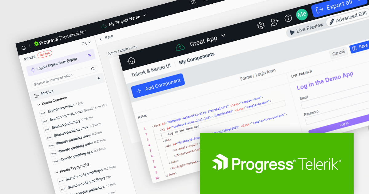
Progress ThemeBuilder by Telerik is a comprehensive visual design tool that accelerates user interface customization for Telerik and Kendo UI web components. ThemeBuilder enables you to style virtually every appearance-related property of the UI components, from top-level elements to the smallest of details, without requiring direct CSS manipulation. It integrates seamlessly with existing development workflows and allows developers to create, modify, and maintain consistent and visually appealing themes across applications. This tool significantly reduces the time and effort required for UI customization and makes it easy to align them with branding and design specifications.
The Progress ThemeBuilder 2024 Q3 update adds custom component support, extending the tool's theming capabilities beyond the default set of Telerik and Kendo UI components. By being able to style any custom HTML, it helps you achieve a consistent style across both Telerik/Kendo UI components and your own internal ones. This enhancement allows for the seamless integration of custom-built UI components into the ThemeBuilder environment, providing a unified styling experience and ensuring consistent visual design throughout your projects, whilst streamlining the UI development process.
To see a full list of what's new in 2024 Q3, see our release notes.
Progress ThemeBuilder is licensed per user and is available as an annual license with a one year support subscription, which is available in three tiers: Lite, Priority or Ultimate. See our Progress ThemeBuilder licensing page for full details.
For more information, see our Progress ThemeBuilder product page.
Tel: (888) 850 9911
Fax: +1 770 250 6199


