


Fournisseur officiel
Comme nous somme les distributeurs officiels et autorisés, nous vous fournissons des licences légitimes directement à partir de 200+ éditeurs de logiciels.
Voyez toutes nos marques.
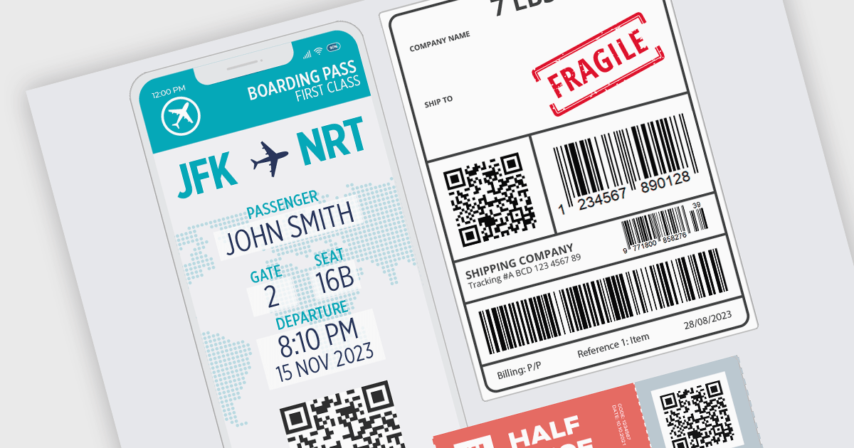
Barcode functionality in Vue.js UI suites offers software developers an easy way to integrate barcode generation and scanning capabilities into their Vue.js applications. By leveraging barcode components, developers can quickly implement features like product lookups, inventory management, and asset tracking, without needing to delve into the complexities of low-level barcode processing. This ensures consistent data accuracy and integrity, as barcodes minimize human errors common in manual data entry. It also simplifies data management and boosts operational efficiency by facilitating rapid data processing and access.
Several Vue.js UI suites offer barcode functionality, including:
For an in-depth analysis of features and price, visit our comparison of Vue.js UI suites.
ONLYOFFICE Docs Enterprise Edition with WordPress Connector combines an online document editor with a seamless integration for WordPress, which is a content management system for creating and managing websites. This allows teams to create, view, edit, and collaborate on spreadsheets, presentations, and text files online, directly within WordPress, boosting efficiency and eliminating the need for file switching.
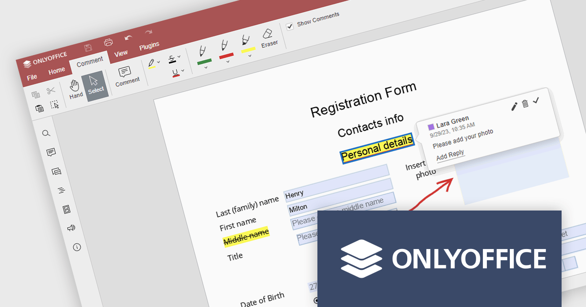
The ONLYOFFICE WordPress Connector 2.0.0 release (available as part of ONLYOFFICE Docs Enterprise Edition with WordPress Connector v8.0.1) brings the ability to open PDF files uploaded to your WordPress site directly within the admin dashboard for form filling and annotating using ONLYOFFICE Docs. You can fill out interactive fields, highlight, underline and strikethrough text, leave comments, and draw different objects and lines with the built-in drawing tools. By enabling seamless interactions with PDF documents directly within the platform and reducing the steps needed to edit or comment on PDF files, this capability streamlines document management workflows, optimizes productivity and eliminates the need for external software solutions.
To see a full list of what's new in ONLYOFFICE Docs Enterprise Edition v8.0.1 with WordPress Connector 2.0.0, see our release notes.
ONLYOFFICE Docs Enterprise Edition with WordPress Connector is licensed per server and is available as an annual license with 1 year of support and updates, or as a perpetual license with 3 years of support and updates. See our ONLYOFFICE WordPress connector licensing page for full details.
For more information, see our ONLYOFFICE WordPress connector product page.

Charting support within a reporting component refers to the functionality that enables data visualization through charts and graphs. This integration offers several advantages for developers. By leveraging built-in charting capabilities, developers can streamline the reporting process, reducing the need for manual chart creation and improving report clarity and interactivity for end users. This not only saves development time but also fosters a more intuitive user experience for data exploration and analysis.
Several Vue.js reporting components support charts including:
For an in-depth analysis of features and price, visit our Vue.js Reporting Components comparison.
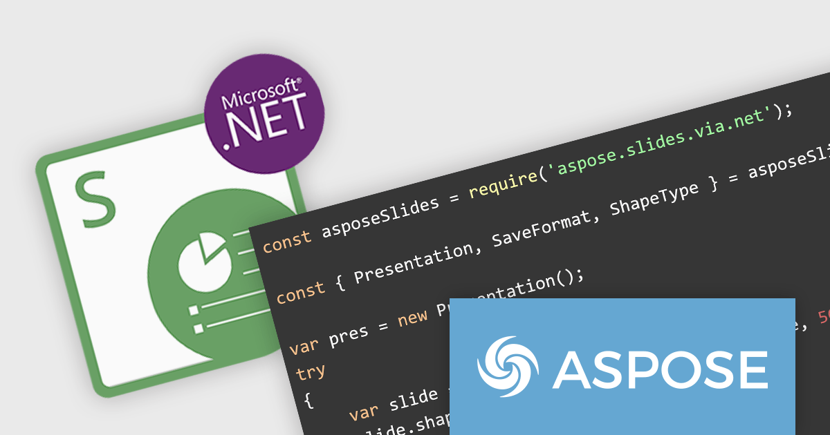
Aspose.Slides for Node.js via .NET empowers Node.js developers to work with presentations directly within their applications. This server-side JavaScript API eliminates the dependency on Microsoft PowerPoint or additional software. Developers can leverage Aspose.Slides for Node.js via .NET to create new presentations from scratch, modify existing ones, and convert them between various formats.
With Aspose.Slides for Node.js via .NET, your Node.js applications can generate presentations dynamically based on data, automate report creation with rich formatting, and integrate seamlessly with document management systems. This makes it a valuable tool for applications that require a robust and versatile solution for presentation manipulation.
Aspose.Slides for Node.js via .NET is offered as Developer Small Business, Developer OEM, Site Small Business, and Site OEM licenses catering to a range of business needs. Licenses are perpetual, and include 1 year of support and maintenance. Subscription renewals are also available. See our Aspose.Slides for Node.js via .NET licensing page for full details.
Aspose.Slides for Node.js via .NET is available in the following products:
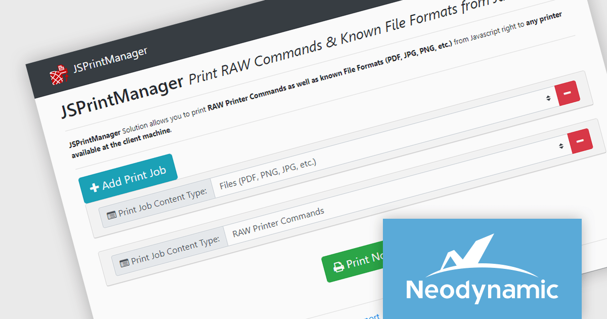
Neodynamic offers two JSPrintManager solutions for client-side printing and scanning in web applications. JSPrintManager for Any Web Platform allows you to integrate printing functionality into any website built with technologies like ASP.NET, PHP, or Blazor using pure JavaScript. Neodynamic also offers JSPrintManager for Blazor which enables you to seamlessly add printing capabilities to your Blazor server or WebAssembly projects with C# code. Both solutions empower you to print various data formats directly from the browser without requiring user interaction with print dialogs.
The Neodynamic JSPrintManager 7.0 releases add a new JS printerDeleteAllJobs function to delete all print jobs in a given printer queue. This enhances control over print queues directly from web applications, allowing developers to manage print jobs efficiently, particularly for scenarios where users might accidentally send multiple files or need to clear the queue before a critical print.
To see a full list of what's new in 7.0, see our release notes for JSPrintManager for Any Web Platform and JSPrintManager for Blazor.
Neodynamic JSPrintManager is licensed per Web App and Web server and is available as a Perpetual license which includes 1 year of free updates and priority support. See our Neodynamic JSPrintManager for Any Web Platform licensing page and Neodynamic JSPrintManager for Blazor licensing page for full details.
Learn more on our Neodynamic JSPrintManager for Any Web Platform and Neodynamic JSPrintManager for Blazor product pages.


Tél : (888) 850 9911
Fax : +1 770 250 6199


