


Fournisseur officiel
Comme nous somme les distributeurs officiels et autorisés, nous vous fournissons des licences légitimes directement à partir de 200+ éditeurs de logiciels.
Voyez toutes nos marques.
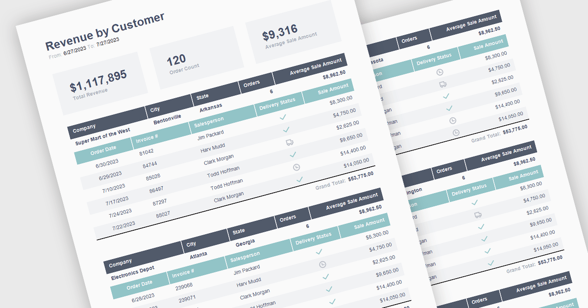
The ability to summarize and aggregate information in a report provides a means of condensing extensive data sets to form part of a concise and meaningful overview of the report's contents. This feature highlights key insights, eliminating the need for readers to sift through raw data. Aggregation processes the data mathematically through calculations such as totals, averages, percentages, means, or medians to identify patterns and trends. By highlighting and summarizing the report's findings in this way, this feature consolidates complex information in a way that aides the reader in identifying patterns and interpreting the data.
The following React reporting components support summaries and aggregates:
For an in-depth analysis of features and price, visit our comparison of React reporting components.
Highcharts is a JavaScript charting framework that allows web developers and data analysts to generate dynamic, visually appealing charts and graphs for websites and web applications. It can display a variety of chart types, including line, spline, area, column, bar, pie, scatter, and many more. Highcharts is well-known for its ease of use, rich documentation, and ability to handle huge datasets efficiently. Features include responsive design, accessibility support, and cross-browser compatibility. Its customization capabilities allow users to create bespoke data visualizations that increase engagement and provide insightful data presentations.
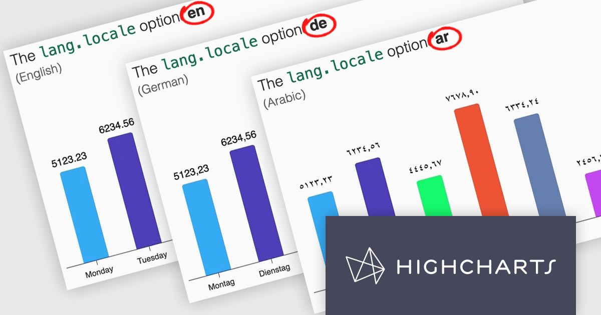
Highcharts v12 introduces the lang.locale option, enabling locale-aware formatting for dates and numbers in charts. This option allows you to define the locale for all charts on a page or set it individually per chart. If no locale is specified, the chart automatically defaults to the page’s or browser’s language settings. Utilizing the browser’s Intl object, lang.locale ensures that dates and numbers are formatted correctly, not only replacing elements like month and weekday names but also structuring entire date expressions according to the selected locale. For instance, American English (en-US) formats a date as January 1, 2025, while British English (en-GB) displays it as 1 January 2025.
To see a full list of what's new in v12, see our release notes.
Highcharts Core is licensed on an annual or perpetual basis, OEM licenses, and Advantage Renewals. It is licensed per Developer and has several license options including Internal, SaaS, SaaS+, and Self Hosted. See our Highcharts Core licensing page for full details.
Learn more on our Highcharts Core product page.

Scheduling controls enable users to efficiently manage tasks, appointments, and resource allocation through an intuitive and interactive interface. It provides essential features like real-time updates, automated scheduling, and conflict detection, ensuring seamless coordination across teams and workflows. Personalized scheduling options allow users to tailor views, set preferences, and automate recurring events, enhancing both productivity and user experience. By integrating with backend systems and APIs, scheduling tools support dynamic data handling, making them ideal for applications such as workforce management, appointment booking and project planning, in industries like healthcare, finance, and customer service.
Several React User Interface suites offer scheduling controls including:
For an in-depth analysis of features and price, visit our React UI suites comparison.
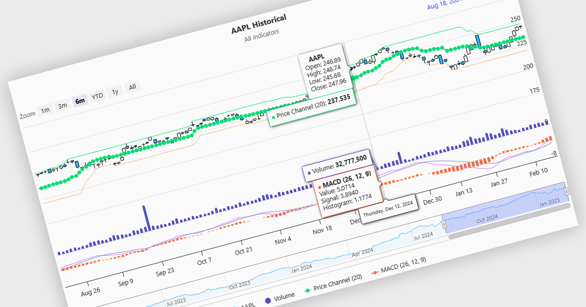
Indicators in a financial chart are mathematical formulas applied to market data, such as price and volume, to generate insights into trends, momentum, volatility, and trade opportunities. Indicators are visualized as lines, histograms, or overlays on the chart, providing dynamic analysis rather than static points. Moving averages track price trends with smooth lines, while oscillators like RSI appear as separate graphs to measure momentum. These tools help traders analyze patterns, confirm price movements, and support decision-making. For software developers, integrating indicators enhances data visualization, enables algorithmic trading strategies, and improves user experience by delivering clear, actionable insights.
Several Angular charting components provide support for indicators within financial charts, including:
For an in-depth analysis of features and price, visit our Angular chart components comparison.

Cell types in Grid components are specialized configurations that define how data is displayed, edited, and interacted with within a grid or table structure. They allow developers to tailor the presentation and functionality of each cell to better match the type of data it contains. By specifying cell types such as text, numeric, date/time, and more, Grid components can provide intuitive controls and formatting automatically, streamlining data entry and reducing errors.
Common features include:
For an in-depth analysis of features and price, visit our jQuery grid components comparison.


Tél : (888) 850 9911
Fax : +1 770 250 6199


