


Fournisseur officiel
Comme nous somme les distributeurs officiels et autorisés, nous vous fournissons des licences légitimes directement à partir de 200+ éditeurs de logiciels.
Voyez toutes nos marques.
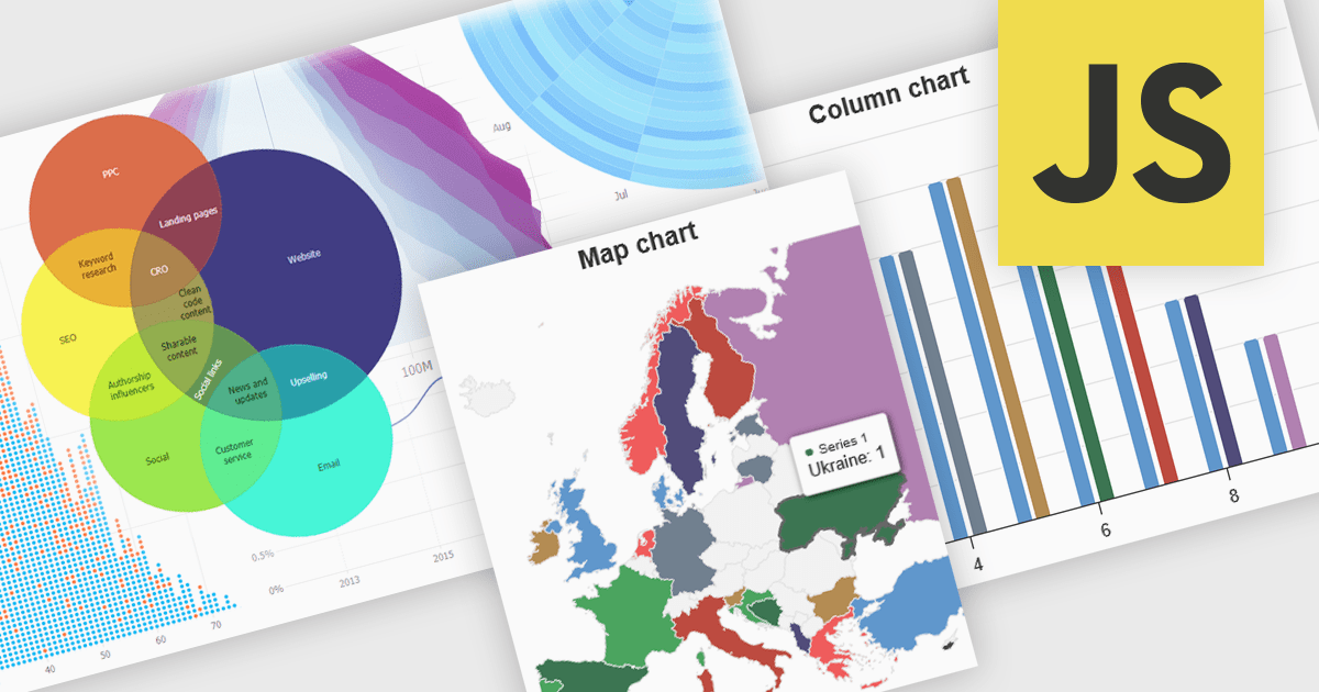
High contrast charts use distinct and contrasting color palettes within data visualizations to improve clarity, particularly for individuals with visual impairments. This involves choosing colors with noticeably different hues and brightness for elements such as lines, bars, labels, and backgrounds, so that differences in data are easy to spot. These charts improve data understanding, make information accessible to more people, reduce eye strain for some users, and support accessibility standards. They are useful in many areas, such as financial reports, scientific papers and public health dashboards that must be clear and designed for a everyone regardless of visual ability.
Several JavaScript charting components provide accessible high contrast features, including:
For an in-depth analysis of features and price, visit our JavaScript chart components comparison.
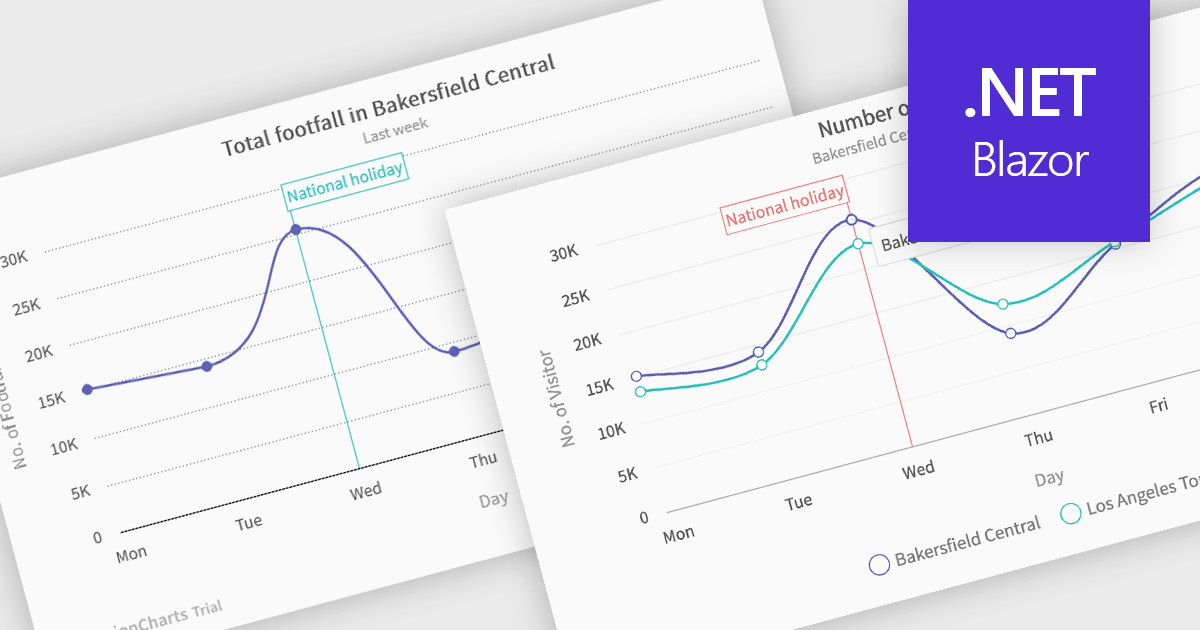
Spline charts are a type of line graph that displays continuous data points connected by smooth, curved lines, offering a visually fluid representation of trends and changes over time. This smoothing effect helps to highlight the overall trajectory of the data and can provide estimations of values between plotted points. Multi-Series Spline Charts extend this functionality by plotting multiple related datasets on the same graph, enabling direct visual comparison of their trends and the identification of correlations or divergences.
Several .NET Blazor chart controls offer spline charts including:
For an in-depth analysis of features and price, visit our .NET Blazor chart controls comparison.

ComponentSource's expertise and global reach have significantly expanded the worldwide accessibility of FusionCharts' data visualization solutions. By leveraging ComponentSource's established distribution network and multilingual support, FusionCharts has connected with a broader international audience of developers and organizations across diverse industries and geographical locations, enabling them to enhance their applications with compelling data insights.
This 5 year partnership between ComponentSource and FusionCharts reflects a shared dedication to empowering developers with best-in-class tools, acknowledging the role of effective data visualization in modern applications. Through this partnership, ComponentSource has played a key role in making FusionCharts flagship product FusionCharts Suite XT more accessible to a global audience.
Now marking 5 years of working together, ComponentSource and FusionCharts are continuing to build on their collaboration. As demand grows for tools that help developers deliver more data-driven and visually rich applications, the partnership remains focused on improving access and simplifying procurement for teams everywhere.
As we celebrate this milestone, we look forward to strengthening our partnership and continuing to provide developers with the tools they need to succeed.
For more information, visit our FusionCharts brand page.
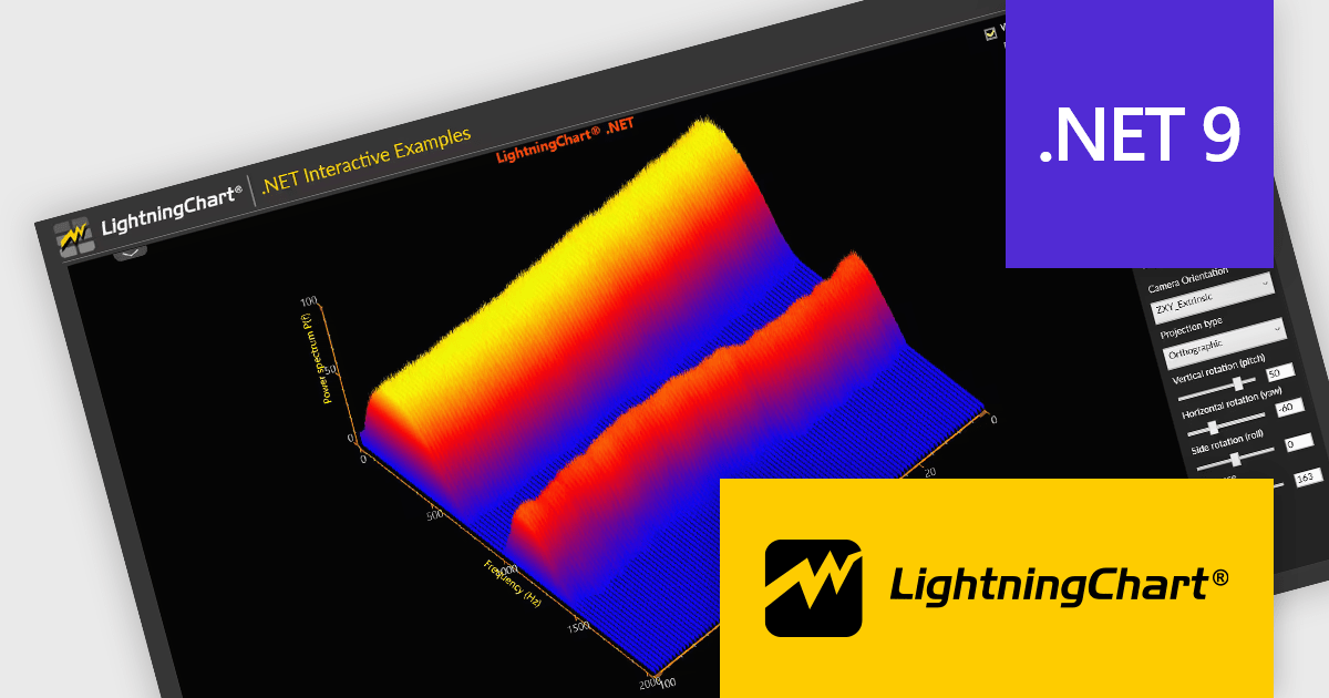
LightningChart .NET is a high-performance data visualization library designed for .NET developers working with WPF, WinForms, and UWP applications. It offers GPU-accelerated rendering for smooth real-time visualization of massive datasets, exceeding billions of data points. This library supports a wide variety of chart types, including 2D, 3D, polar, and geographic maps, along with extensive customization options for each. LightningChart .NET is a powerful tool for developers creating demanding data visualization applications requiring exceptional performance.
The LightningChart .NET v12.2.1 update adds support for .NET 9. This brings a significant performance and compatibility boost to developers building high-performance data visualization applications. By aligning with the latest version of the .NET platform, LightningChart ensures developers can take advantage of modern language features, improved memory management, and enhanced runtime performance. This results in faster chart rendering, lower latency in data updates, and better responsiveness in UI-heavy applications.
To see a full list of what's new in v12.2.1, see our release notes.
LightningChart .NET is available per developer in packages for either WPF, WinForms, UWP or all 3. Each package comes as a subscription license (with 1 or 2 years of limited support), or a perpetual license (with 1 or 2 years of Standard or Premium support). Floating licenses and site licenses are available upon request. See our LightningChart .NET licensing page for full details.
Learn more on our LightningChart .NET product page.
amCharts: Charts is a versatile and user-friendly JavaScript library designed for seamless data visualization across a wide range of applications. This ready-made solution helps users to integrate interactive charts without the need to learn complex new technologies. Featuring built-in support for TypeScript and ES6 modules, amCharts: Charts offers full compatibility with popular front-end frameworks such as Angular, React, and Vue.js. Its flexibility and ease of use make it an ideal choice for developers seeking a powerful yet simple drop-in solution to create engaging and informative data visualizations for dashboards and data analytics.
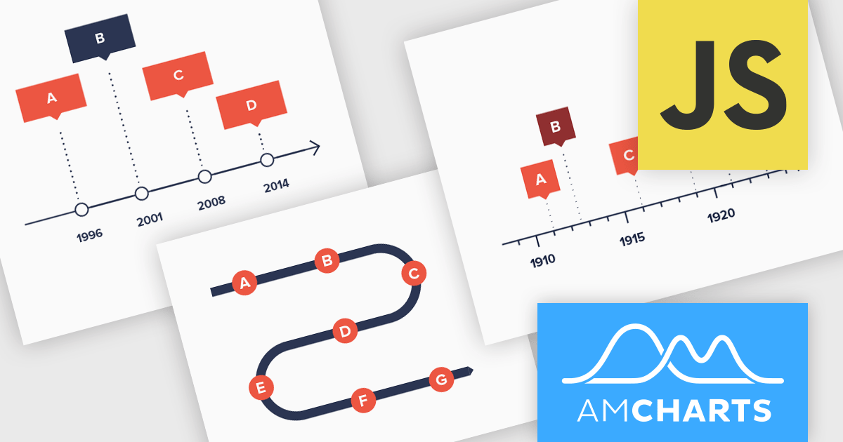
The amCharts 5.12.0 update introduces a new Timeline chart type, providing developers with a specialized component for visualizing linear datasets in a space-efficient manner. This chart facilitates the creation of two-dimensional plots that can be rendered along serpentine, spiral, or fully customized paths. By deviating from traditional linear axes, the Timeline chart offers a unique approach to presenting chronological or sequential data, potentially enhancing user engagement and providing alternative perspectives on data distribution without requiring complex configurations beyond standard XY chart principles. This new chart type inherits core functionalities from existing XY charts, ensuring a familiar development experience while offering a distinct visual representation option.
To see a full list of what's new in amCharts 5: Charts (version 5.12.0), see our release notes.
amCharts is licensed per developer on an annual or perpetual basis, with options for websites, SaaS and OEM distribution. See our amCharts 5: Charts licensing page for full details.
For more information, visit our amCharts 5: Charts product page.


Tél : (888) 850 9911
Fax : +1 770 250 6199


