


Fournisseur officiel
Comme nous somme les distributeurs officiels et autorisés, nous vous fournissons des licences légitimes directement à partir de 200+ éditeurs de logiciels.
Voyez toutes nos marques.
Syncfusion Essential Studio ASP.NET MVC (available as part of Syncfusion Essential Studio Enterprise) is a comprehensive suite of web UI controls that empowers developers to craft rich, interactive ASP.NET MVC applications. Backed by the lightweight and modular Essential JS 2 library, it offers over 80 components ranging from data grids and charts to schedulers and pivot grids, while ensuring a seamless integration with the MVC framework for an efficient development experience.
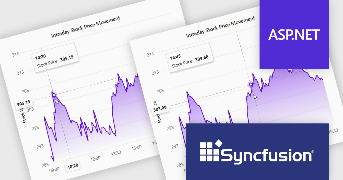
The Syncfusion Essential Studio ASP.NET MVC 2024 Volume 4 (28.1.33) update introduces the Crosshair Snap feature to its charting tools, delivering enhanced precision and usability for developers. This feature ensures the crosshair automatically snaps to the nearest data point, eliminating the need for users to align the cursor with exact positions manually. By streamlining interaction with charts, the Crosshair Snap simplifies the analysis of complex datasets and improves the clarity of data visualization. This addition not only optimizes the end-user experience but also provides developers with a powerful tool to create more intuitive and efficient applications.
To see a full list of what's new in 2024 Volume 4, see our release notes.
Syncfusion Essential Studio ASP.NET MVC is available as part of Syncfusion Essential Studio Enterprise which is licensed per developer starting with a Team License of up to five developers. It is available as a 12 Month Timed Subscription License which includes support and maintenance. See our Syncfusion Essential Studio Enterprise licensing page for full details.
Learn more on our Syncfusion Essential Studio ASP.NET MVC product page.
Syncfusion Essential Studio Flutter (available as part of Syncfusion Essential Studio Enterprise) is a powerful UI toolkit that enables you to build beautiful and performant mobile apps for Android and iOS using Flutter. It provides a rich suite of pre-built widgets for common design elements like charts, data grids, calendars, and PDF viewers. These widgets are highly customizable and allow you to quickly implement stunning visuals and advanced functionalities without spending time on repetitive coding.
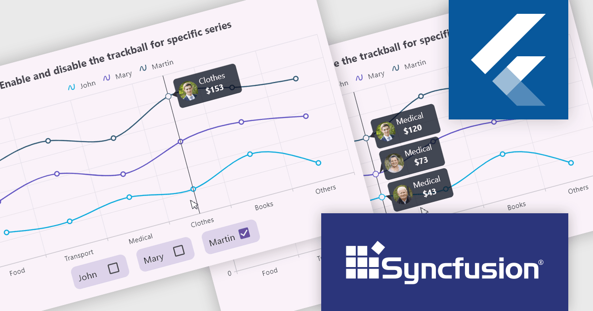
The Syncfusion Essential Studio Flutter 2024 Volume 4 update introduces the ability to activate or deactivate the trackball for individual chart series, offering developers enhanced control over data visualization. This feature allows for precise data tracking by focusing the trackball on specific series, improving the clarity and relevance of user interactions within complex datasets. By enabling developers to customize the trackball behavior, this update supports a more tailored and efficient user experience, making it easier to highlight critical data points while minimizing visual clutter in multi-series charts.
To see a full list of what's new in 2024 Volume 4, see our release notes.
Syncfusion Essential Studio Flutter is available as part of Syncfusion Essential Studio Enterprise which is licensed per developer starting with a Team License of up to five developers. It is available as a 12 Month Timed Subscription License which includes support and maintenance. See our Syncfusion Essential Studio Enterprise licensing page for full details.
Learn more on our Syncfusion Essential Studio Flutter product page.
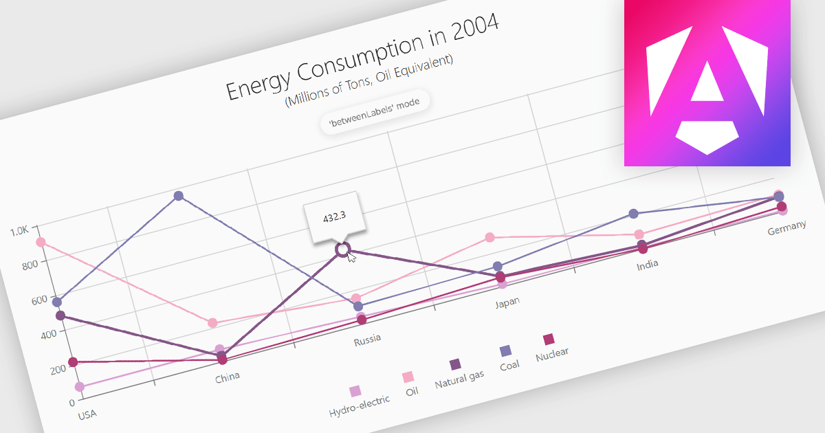
Line charts are a fundamental data visualization tool used to represent quantitative values over a continuous interval, such as time, by connecting data points with straight lines. They are particularly effective for analyzing trends, comparing multiple data sets, and identifying relationships or patterns within large or complex datasets. For software developers, line charts provide a clear and efficient way to present dynamic data, support interactive features for deeper analysis, and enhance decision-making by making critical insights easily accessible through a customizable and intuitive format.
Several Angular chart controls offer line charts including:
For an in-depth analysis of features and price, visit our comparison of Angular Charts.

Effective January 6, 2025, Highcharts has streamlined its licensing model to enhance clarity, simplify compliance, and improve the overall user experience. The updates include unified definitions, revised license grants, and an upgraded ADV+ support offering.
Streamlined Definitions
The terms “SaaS application” and “web application” have been replaced with a unified term: "External Application". This new terminology clarifies the distinction between applications covered under the Internal License and those requiring additional licensing.
Updated License Grants
Public websites, previously covered under the Internal License grant, are now under the SaaS License grant. This ensures consistency across applications for public access.
Video Call Support for ADV+ Subscribers
Users subscribed to the Highcharts Advantage Plus (ADV+) tier now benefit from video call support, providing more robust communication options for troubleshooting and guidance.
For existing customers using the Internal License to deploy on public websites, these updates reclassify such use under the SaaS License grant. The updated Highsoft license terms mean that customers currently using an Internal License for an external Public Web site or for an “External Application” will need to upgrade to a SaaS License to ensure compliance. For more information see our updated Highcharts Core licensing page.
If you have questions about Highcharts licensing, our experts are here to assist. Whether you need guidance on selecting the right license, moving to a new agreement, or ensuring compliance, we’re ready to help via toll-free phone, live chat or email.
ComponentOne WinUI and MAUI Edition is a comprehensive suite of UI components designed for cross-platform .NET development, supporting WinUI, MAUI, UWP, and Xamarin with a single license. It empowers developers to create modern and high-performance applications for business and enterprise use. With versatile controls and seamless integration, the suite simplifies the development process, enhances productivity, and ensures compatibility with the latest .NET platforms, making it an essential tool for delivering exceptional user experiences.
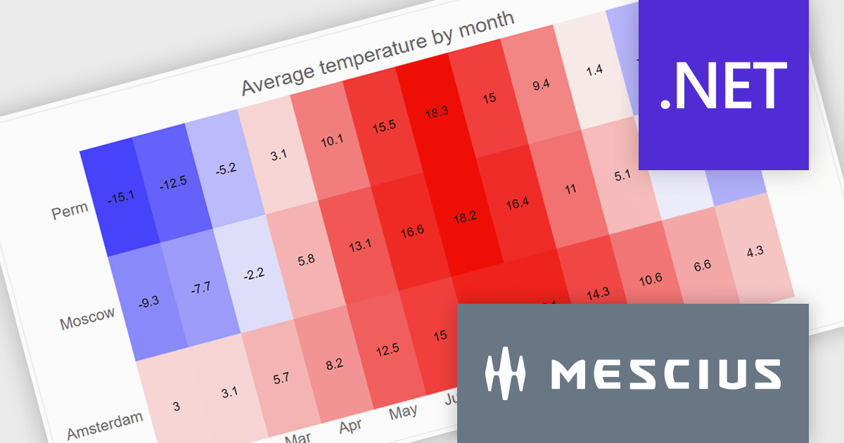
The ComponentOne Studio WinUI & MAUI Edition 2024 v2 update introduces new heatmap charts, providing developers with a robust tool for visualizing dense datasets in a clear and structured manner. With support for both discrete and gradient color options, along with the ability to display data labels, these charts enhance the readability of complex information. This feature is ideal for scenarios requiring quick data analysis, offering developers a versatile and efficient way to present large volumes of data in visually impactful 2D layouts.
To see a full list of what's new in 2024 v2, see our release notes.
ComponentOne Studio WinUI and MAUI is licensed per developer on a perpetual basis and includes a 12 month subscription. See our ComponentOne Studio WinUI and MAUI licensing page for full details.
Learn more on our ComponentOne Studio WinUI and MAUI product page.


Tél : (888) 850 9911
Fax : +1 770 250 6199


