


Fournisseur officiel
Comme nous somme les distributeurs officiels et autorisés, nous vous fournissons des licences légitimes directement à partir de 200+ éditeurs de logiciels.
Voyez toutes nos marques.
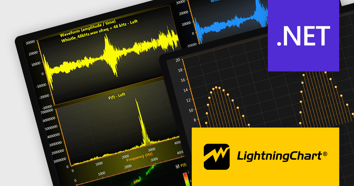
LightningChart .NET is a 2D and 3D data visualization SDK empowering developers with high-performance and flexibility. Boasting over 100 chart types, advanced technical indicators, and real-time rendering capabilities, it handles demanding scientific, financial, and engineering challenges, while its rich API and comprehensive support equip developers to craft informative and interactive dashboards.
The LightningChart .NET v11.0.1.1 release enhances text rendering fidelity in WinForms applications, ensuring exceptional clarity and readability across diverse screen resolutions and DPI configurations. This update guarantees a visually consistent and crisp user experience, independent of the user's device display characteristics. Additionally, it optimizes per-monitor DPI awareness for text rendering in both WinForms and WPF applications, particularly within the .NET 6 build environment. This refinement assures well-rendered and accurately scaled text across multiple monitors with varying DPI settings.
To see a full list of what's new in v11.0.1.1, see our release notes.
LightningChart .NET is available per developer in packages for either WPF, WinForms, UWP or all 3. Each package comes as a subscription license (with 1 or 2 years of limited support), or a perpetual license (with 1 or 2 years of Standard or Premium support). Floating licenses and site licenses are available upon request. See our LightningChart .NET licensing page for full details.
For more information, see our LightningChart .NET product page.

LightningChart JS is a high-performance JavaScript charting library that utilizes WebGL rendering and GPU acceleration to deliver exceptional performance for a wide range of data visualization needs. It is designed to handle large datasets and complex visualizations with ease, enabling developers to create interactive and visually appealing charts for various applications.
The LightningChart JS v5.1.0 release lets you unleash the power of complex visualizations with the new Mesh Model 3D chart type. Render intricate geometries and models with dynamic coloring pulled from a separate data set in real-time. The PaletteFill feature imbues 3D Mesh Models with vibrant colors based on vertex values, transforming your charts into captivating representations of even the most detailed 3D shapes.
To see a full list of what's new in v5.1.0, see our release notes.
LightningChart JS is licensed based on method of deployment with options including SaaS Developer Licenses, Application Developer Licenses, and Publisher Developer Licenses. Each license is perpetual and includes 1 year subscription for technical support and software updates. See our LightningChart JS licensing page for full details.
Learn more on our LightningChart JS product page.

Data aggregation functionality in charts refers to the process of combining and summarizing raw data to provide a more concise and understandable representation. This technique involves collecting and grouping data points based on specific criteria, such as time intervals, categories, or geographic regions, and then calculating summary statistics, such as averages, totals, or percentages. The aggregated data is then used to create charts and graphs that offer a comprehensive overview of trends, patterns, or comparisons within the dataset. This approach helps in simplifying complex datasets and makes them more accessible for analysis, allowing decision-makers to derive meaningful insights and draw informed conclusions from the visual representation of aggregated information.
Several React chart controls support data aggregation including:
For an in-depth analysis of features and price, visit our React Chart Controls comparison.
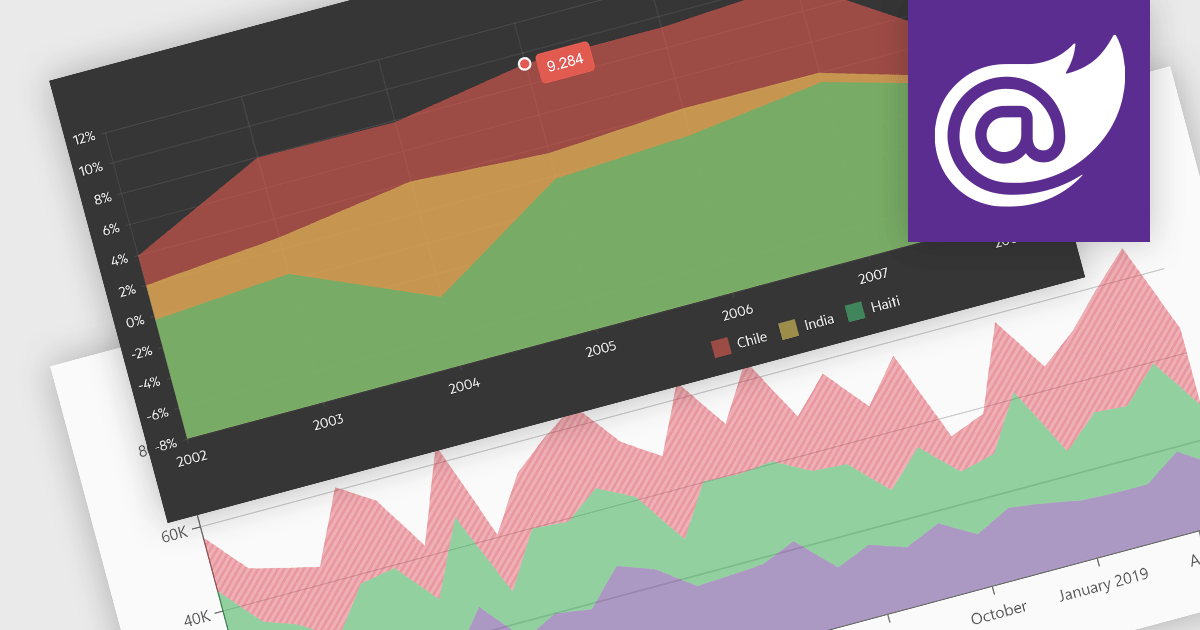
Area charts combine the strengths of line and bar charts, typically depicting how quantitative data changes over time. The area beneath the lines is shaded, emphasizing trends, comparisons between multiple data series, and the magnitude of change within each series. Ideal for showcasing cumulative totals and proportions, area charts excel in revealing trends and relationships within your data.
Several Blazor chart controls offer area charts including:
For an in-depth analysis of features and price, visit our Blazor chart controls comparison.
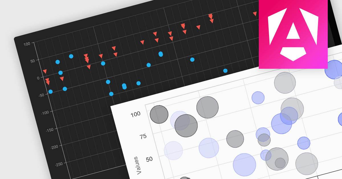
Scatter and bubble charts are used to display data points on a two-dimensional graph. While scatter charts use dots to represent data points, bubble charts add an additional dimension by varying the dot size, often representing volume or intensity. These charts are useful for showing relationships between variables and for identifying patterns or trends in data.
Several Angular chart controls offer scatter and bubble charts including:
For an in-depth analysis of features and price, visit our Angular chart controls comparison.


Tél : (888) 850 9911
Fax : +1 770 250 6199


