


Fournisseur officiel
Comme nous somme les distributeurs officiels et autorisés, nous vous fournissons des licences légitimes directement à partir de 200+ éditeurs de logiciels.
Voyez toutes nos marques.
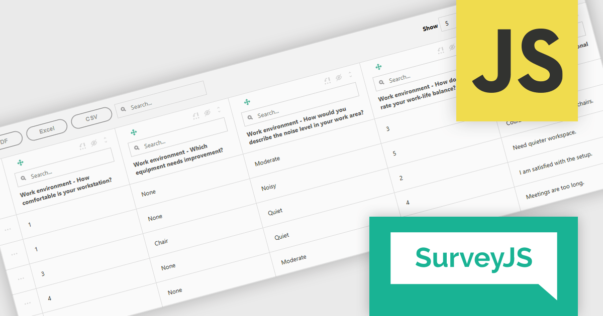
SurveyJS Survey Creator is a JavaScript library that enables developers to embed a drag-and-drop survey and form builder directly within their web applications. It provides a comprehensive UI for designing surveys with various question types, logic branching, and layout customization, generating JSON schemas that can be used by the SurveyJS Survey Library to render and process the surveys. This allows for the creation of dynamic and user-configurable data collection tools without requiring extensive custom development, streamlining the process of integrating survey functionality into applications.
The SurveyJS Survey Creator 2.3.9 update introduces support for specialized and composite question types within the Table View, enabling developers to efficiently display and analyze complex survey structures in a unified interface. This enhancement allows multiple question types such as numeric ratings, text responses, and categorical selections to be reviewed side by side, improving clarity and reducing the need for manual data consolidation. By supporting composite questions, the update simplifies the process of working with interrelated data points, helping developers deliver accurate reporting and improving survey analysis.
To see a full list of what's new in version 2.3.9, see our release notes.
SurveyJS Survey Creator is licensed per developer with a one-time payment for indefinite use. Access to updates and technical support is available through a subscription. See our SurveyJS Survey Creator licensing page for full details.
Learn more on our SurveyJS Survey Creator product page.
Telerik UI for ASP.NET MVC is a feature-rich UI library that enables developers to build modern, high-performance web applications. It offers a wide range of customizable components, including data grids, charts, forms, and interactive UI elements, optimized for server-side rendering and responsive design. With built-in themes, localization, and advanced data binding, it improves development while ensuring security and accessibility. Ideal for enterprise applications and data-driven solutions, it enhances productivity and delivers a polished, scalable UI.
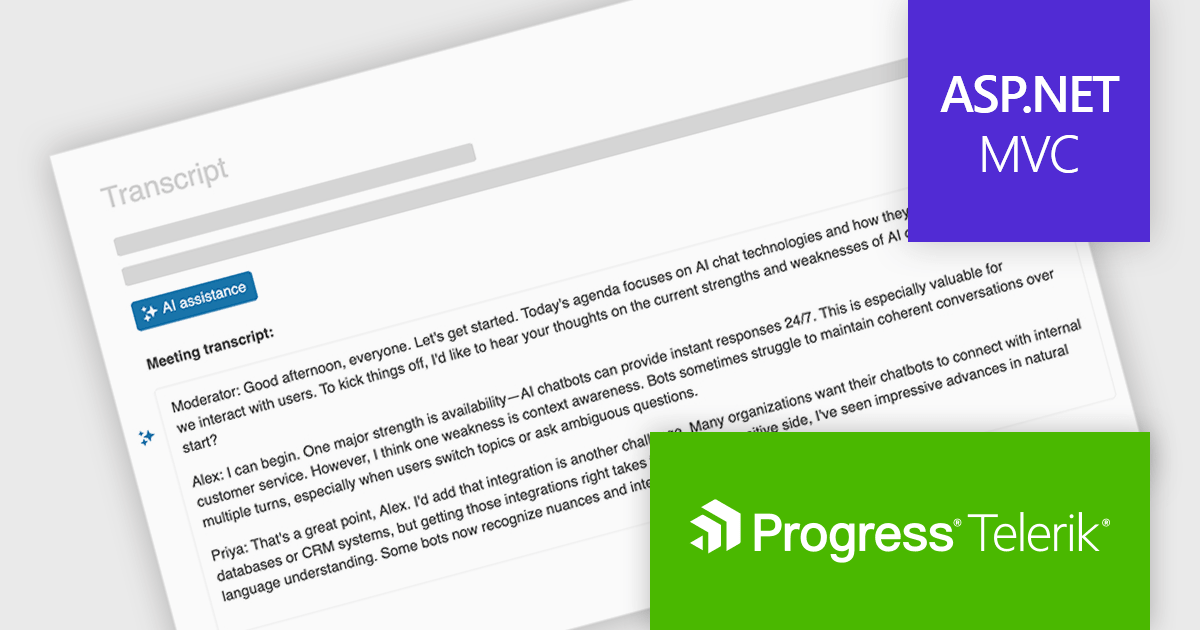
The Telerik UI for ASP.NET MVC 2025 Q3 update introduces In-Context AI Assistance with the new Inline AI Prompt, enabling developers to integrate AI interactions directly into their applications through a lightweight, popup-based interface. This feature allows users to send prompts and receive streaming responses without leaving their workflow, supports inline editing for refining outputs, and handles chunked responses for more efficient delivery of long-form content. In addition, built-in events provide flexibility for customizing the behavior of the AI prompt and responding to user actions, making it easier to deliver tailored, intelligent experiences within ASP.NET MVC applications.
To see a full list of what's new in 2025 Q3 (2025.3.812), see our release notes.
Telerik UI for ASP.NET MVC is licensed per developer and has two licensing models: an annual Subscription License and a Perpetual License. The Subscription license provides access to the latest product updates, technical support, and exclusive benefits for a flat annual fee, and must be renewed to continue using the software. The Perpetual license is a one-time purchase granting access to the current released version and includes a one-year subscription for product updates and technical support. After this initial period, users can choose to renew the subscription element to continue receiving updates and support; otherwise, they may continue using the installed version available during their active subscription term but will forgo future updates and support. See our Telerik UI for ASP.NET MVC licensing page for full details.
Telerik UI for ASP.NET MVC is available to buy individually or as part of the following products:
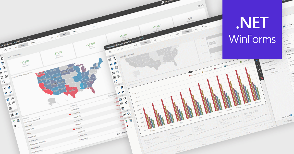
UI layouts define the structural arrangement of elements within an application, determining how content, controls, and navigation are organized and presented to users. A well-designed layout ensures consistency, responsiveness, and usability across different devices and screen sizes, making applications more intuitive and efficient to interact with. Benefits include improved user experience through predictable navigation and flexibility to scale as application requirements evolve. For example, dashboards can automatically adjust width and height to fit available space, web apps can employ responsive grid systems to adapt to mobile and desktop displays, and enterprise software can apply consistent layouts across modules to improve complex processes.
Several .NET WinForms UI suites offer layout components including:
For an in-depth analysis of features and price, visit our .NET WinForms UI suites comparison.
Blazorise is a versatile component library that empowers developers to build modern and feature-rich web applications using Blazor, a client-side web development framework from Microsoft. It offers a comprehensive collection of user interface components, including buttons, forms, charts, and navigation elements, all built with accessibility and responsiveness in mind.
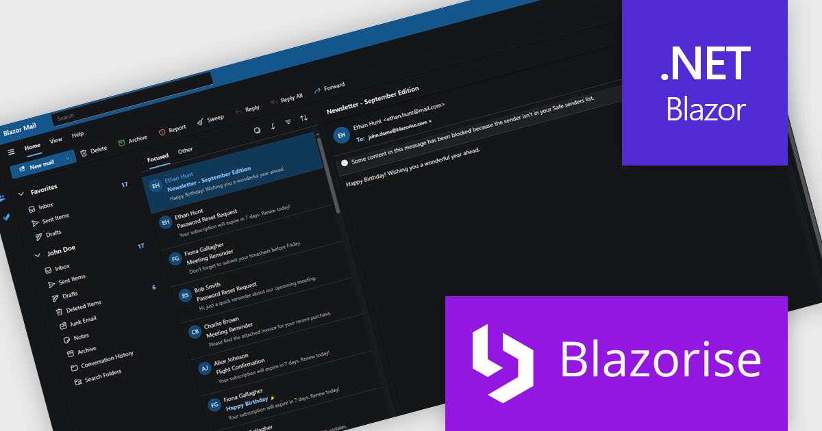
The Blazorise 1.8.2 update introduces a Fluent UI Dark Theme that enables developers to deliver a consistent and accessible dark mode experience across their applications. It provides a complete set of tuned color tokens covering surfaces, typography, and accents, ensuring all Fluent UI components such as DataGrid, Modal, Sidebar, Dropdown, Button, and Tabs maintain visual coherence without additional customization. The theme also integrates with existing light and dark mode toggling, automatically adapting to the application’s current color scheme.
To see a full list of what’s new in version 1.8.2, see our release notes.
Blazorise is licensed per developer and includes a 1 year subscription for updates and support. Professional, Enterprise, and Enterprise Plus editions are available, each offering tailored levels of support and service to meet varying business needs. See our Blazorise licensing page for full details.
For more information, visit our Blazorise product page.
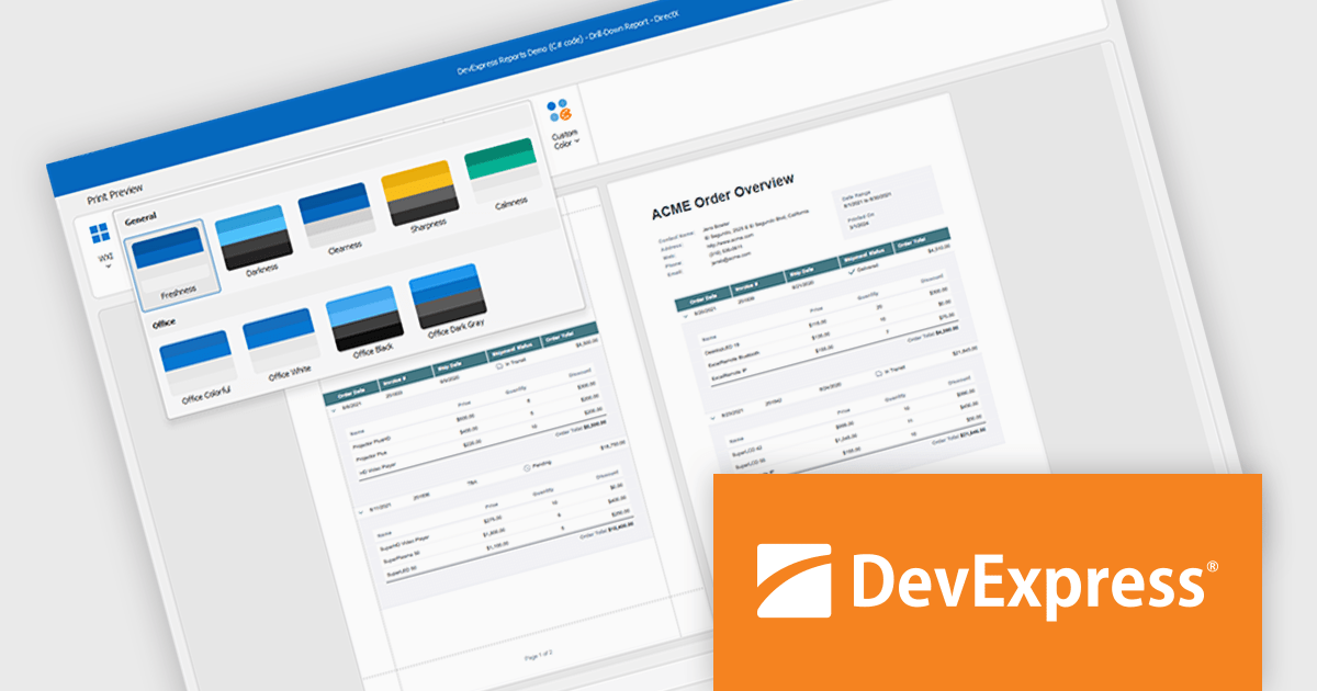
DevExpress DXperience is a comprehensive development suite that enables developers to build high-performance applications for Windows, Web, mobile, and tablet platforms using a unified set of controls and tools. It includes hundreds of desktop UI controls for WinForms, WPF, and reporting, as well as web UI controls for Blazor, ASP.NET, MVC, Core, Bootstrap Web Forms, JavaScript, Angular, React, Vue, and web reporting, plus productivity tools like XPO ORM and CodeRush for Visual Studio. With its extensive component library, DXperience accelerates development, ensures visually consistent and responsive interfaces, and is ideal for creating enterprise applications, data-driven web apps, dashboards, and reporting solutions.
DevExpress DXperience enhances application development with new app-wide themes and skins, allowing developers to apply a consistent, modern visual style across entire projects with minimal configuration. By providing professionally designed themes that align with Microsoft Office and Windows 11 aesthetics, along with built-in tools for customizing these designs, it improves the UI design process and reduces the need for manual styling. This enables developers to focus on functionality while delivering polished, cohesive user interfaces that improve usability and maintain a professional appearance across all application modules.
DevExpress DXperience is licensed per developer and is available as a Perpetual License with a 12 month support and maintenance subscription. See our DevExpress DXperience licensing page for full details.
For more information, visit our DevExpress DXperience product page.


Tél : (888) 850 9911
Fax : +1 770 250 6199


