DevExpress Universal
Inclut plus de 600 contrôles d'interface utilisateur, DevExpress Dashboard, eXpressApp Framework et bien plus encore.
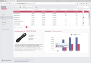
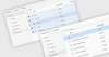
ASP.NET Core Controls - DevExpress ASP.NET les contrôles côté client Core sont complétés par des extensions de traitement de données web côté serveur. Par conséquent, quelle que soit la taille du jeu de données, vous pouvez rapidement développer et analyser les informations essentielles à votre mission.


 (2)
(2)


 (2)
(2)
 (83)
(83)