


Fornitore ufficiale
In qualità di distributori ufficiali e autorizzati, forniamo licenze software legittime direttamente da più di 200 autori di software.
Vedi tutte le nostre marche
Continua a leggere in inglese:
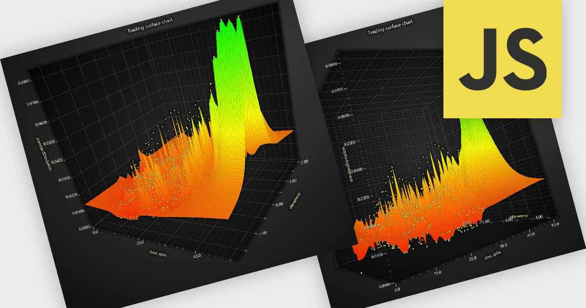
A surface chart is a powerful data visualization tool used to represent three-dimensional data, where the relationships between three numerical variables are plotted across a surface. By mapping values on the X, Y, and Z axes, and optionally applying dynamic color gradients to introduce a fourth variable, surface charts reveal patterns and correlations not easily detected in 2D charts. This makes them particularly valuable in fields such as engineering, scientific research, and finance. The ability to interpret multiple data dimensions simultaneously enables clearer insights and supports more informed, data-driven decisions.
Several JavaScript chart controls offer Surface Charts including:
For an in-depth analysis of features and price, visit our JavaScript chart controls comparison.


Tel: (888) 850 9911
Fax: +1 770 250 6199


