


Fornitore ufficiale
In qualità di distributori ufficiali e autorizzati, forniamo licenze software legittime direttamente da più di 200 autori di software.
Vedi tutte le nostre marche
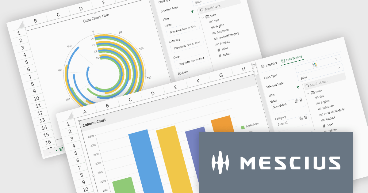
SpreadJS by MESCIUS is a high-performance JavaScript spreadsheet component designed to seamlessly integrate Excel-like functionality into web applications. It empowers developers to deliver robust spreadsheet experiences within their applications, complete with features like data import/export, complex formulas, conditional formatting, and extensive customization options. To extend its capabilities, SpreadJS offers a variety of optional add-ons, such as tools for reporting, charting, and data management. SpreadJS caters to a wide range of use cases, from financial modeling and data analysis to project management and interactive dashboards, ultimately allowing developers to build feature-rich and user-friendly web applications.
SpreadJS v18 introduces the DataCharts Add-On, a powerful new feature that lets you bind charts directly to external data managed by the Data Manager, eliminating the need to embed data within the workbook. This innovation streamlines workflows by reducing redundancy, simplifying updates, and enabling dynamic charting for both standalone spreadsheets and reports. For users of the ReportSheets Add-On, the DataCharts Add-On is seamlessly integrated, enhancing report creation with interactive, data-driven visuals. Developers seeking a flexible solution for external data visualization in other contexts can license the DataCharts Add-On separately, making it ideal for projects that demand adaptable, visually engaging charts.
For more information see our release notes.
SpreadJS is licensed per developer and includes 1 Year Maintenance (major and minor version releases and unlimited support phone calls). SpreadJS requires an Annual or Perpetual Deployment License. The optional Add-ons are available at an additional cost, and require a SpreadJS license. See our SpreadJS licensing page for full details.
For more information, visit our SpreadJS product page.
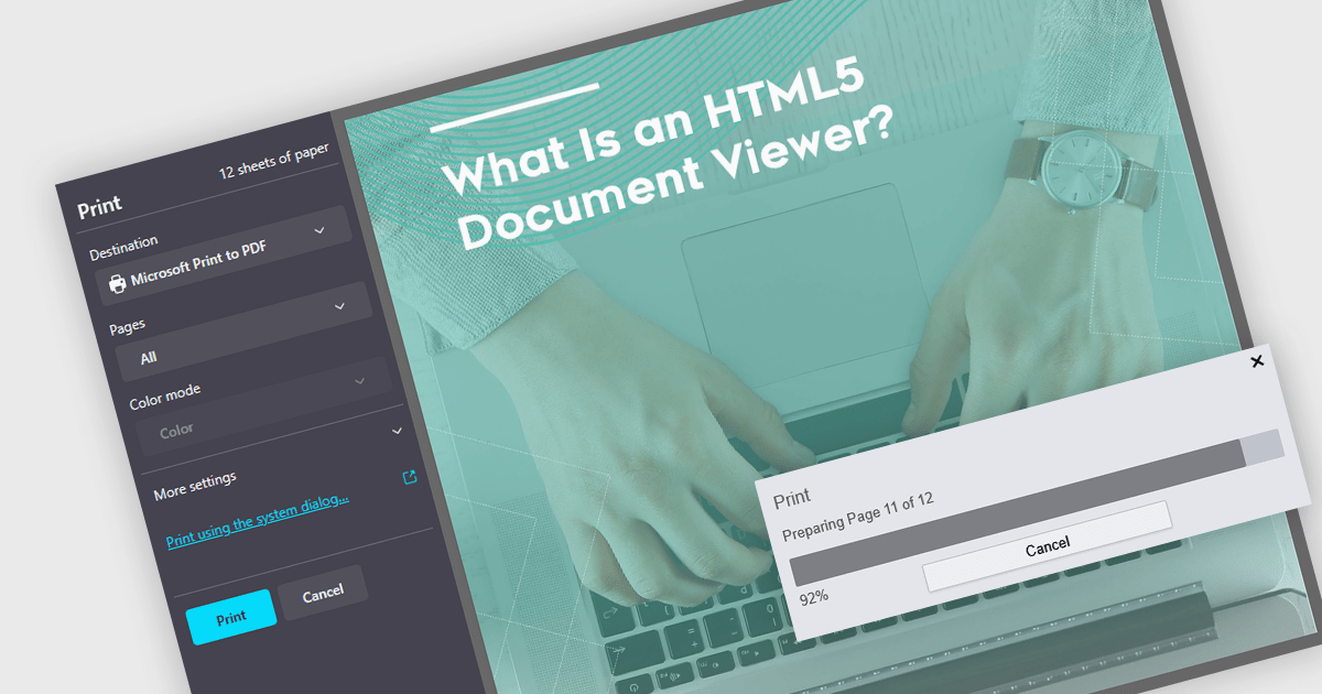
Printing to PDF allows users to save an existing document, webpage, or file as a PDF by using a virtual printer. It captures the document exactly as it would appear if printed, preserving the formatting, layout, and styling. The resulting document is typically static and cannot be edited, ideal for archiving or sharing finalized versions of a document. This feature is particularly useful for standardizing outputs across different software, ensuring consistent presentation, and providing an easy way to generate PDFs from files that do not natively support the format. By integrating PDF viewers with this functionality, developers can streamline the creation of high-quality, portable documents directly from a wide range of applications.
Several JavaScript PDF viewers allow users to print to PDF, including:
For an in-depth analysis of features and price, visit our comparison of JavaScript PDF viewers.
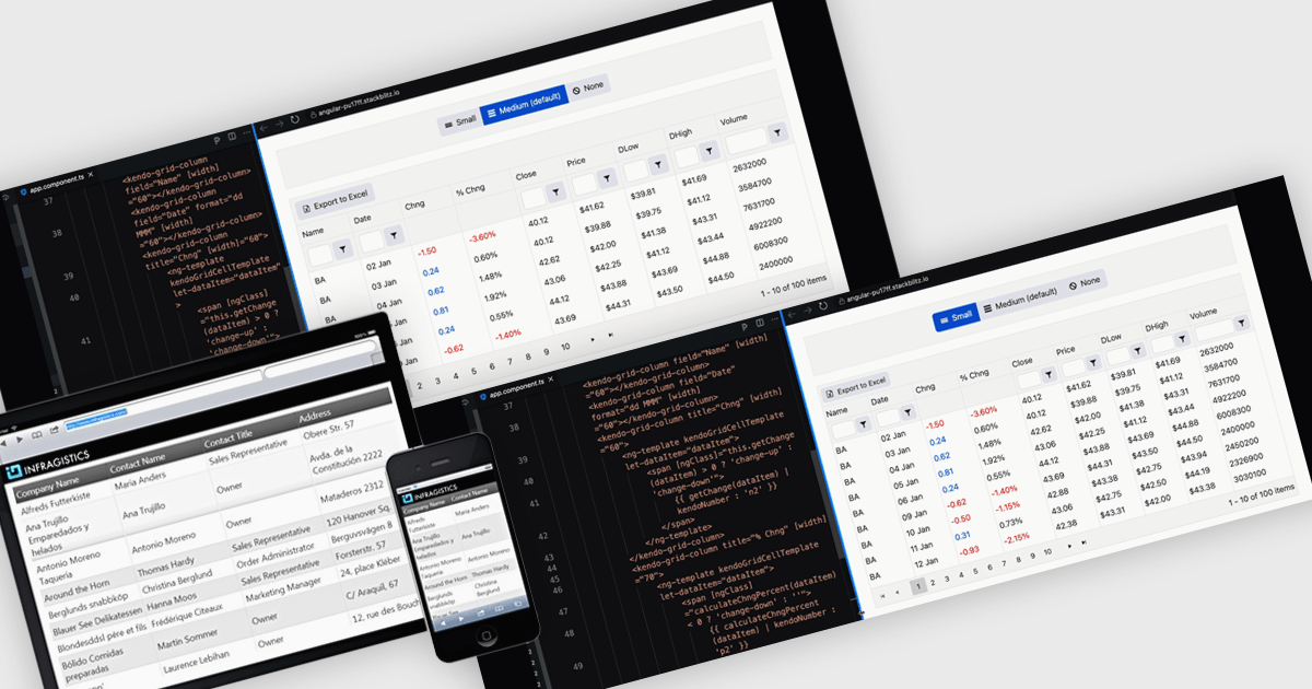
A responsive layout is a design approach that enables web and application interfaces to automatically adjust and optimize their structure, content, and elements for different screen sizes and devices. By using flexible grids, scalable images, and adaptable components, responsive layouts ensure a consistent and user-friendly experience across desktops, tablets, and mobile devices. For software developers, this approach simplifies the creation of cross-platform applications, improves accessibility, and enhances user satisfaction by delivering interfaces that perform seamlessly in diverse environments.
Several Angular grid components support responsive layouts including:
For an in-depth analysis of features and price, visit our comparison of Angular grid controls.
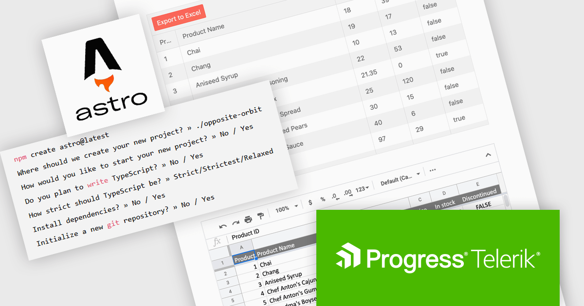
KendoReact by Telerik is a comprehensive library of UI components specifically designed for building modern, feature-rich React applications, enabling developers to create intuitive, responsive, and visually appealing interfaces with ease. It includes robust components like data grids, charts, form elements, and navigation tools, optimized for high performance with features such as virtualization for large datasets and adherence to accessibility standards. Ideal for dashboards, enterprise apps, and data-driven applications, KendoReact empowers teams to accelerate development, ensure design consistency, and deliver inclusive user experiences.
The KendoReact v9.0.0 update introduces integration with Astro, a modern static site builder that supports multiple front-end frameworks, including React. This enhancement enables developers to seamlessly incorporate KendoReact components into Astro projects, leveraging Astro's performance benefits such as minimal JavaScript delivery and support for server-side rendering (SSR) and static site generation (SSG). By following the provided getting started guide, developers can efficiently set up Astro projects with KendoReact, thereby enhancing development workflows and application performance.
To see a full list of what’s new in 2024 Q4 (v9.0.0), see our release notes.
KendoReact is licensed per developer and is available as a perpetual license with a 1 year support subscription, which is available in 3 tiers: Lite, Priority or Ultimate. See our KendoReact licensing page for full details.
KendoReact is available individually or as part of the following products:
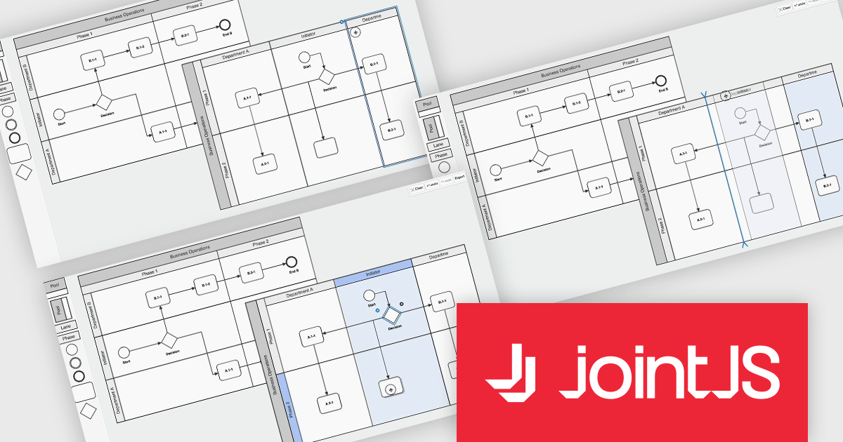
JointJS+ is a diagramming library that offers advanced features like custom shapes, data binding, and advanced layout algorithms, enabling you to create complex, interactive, and visually appealing diagrams. It includes a ready-to-use demo application that showcases its functionality and serves as a starting point for your own diagramming projects.
The JointJS+ v4.1 update introduces significant improvements to Business Process Model and Notation (BPMN) modeling, enabling developers to work more efficiently with enhanced pools, swimlanes, and milestones. These enhancements streamline the process of inserting, resizing, and reordering elements while maintaining content alignment and preventing out-of-bound resizing. The addition of vertical pools and milestones with drag-and-drop functionality further expands modeling capabilities, offering greater flexibility to meet diverse design requirements. Features like content awareness, automatic adjustments, and real-time previews ensure accuracy and ease of use, empowering developers to create precise and dynamic process diagrams with minimal effort.
To see a full list of what's new in v4.1, see our release notes.
JointJS+ is licensed per developer and is available as a Perpetual license with 1 year support and maintenance. See our JointJS+ licensing page for full details.
Learn more on our JointJS+ product page.


Tel: (888) 850 9911
Fax: +1 770 250 6199


