













공식 공급 업체
200 이상의 소프트웨어 개발처와 판매 계약을 맺은 공인 디스트리뷰터로서 합법적인 라이선스를 제공합니다.
모든 브랜드 보기.
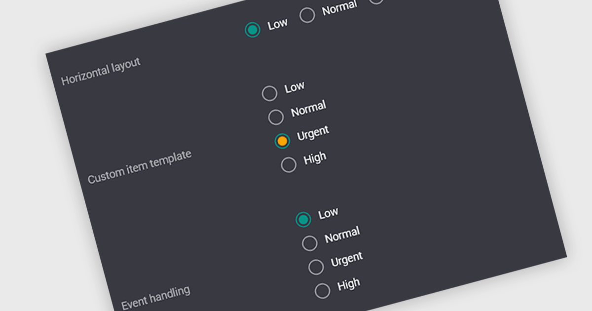
A radio group is a user interface element that presents a set of predefined options where only one value can be selected at a time for a particular field. It allows users to choose a single state, category, or configuration directly within the editing interface, with the selected option mapped to the underlying data value. This approach improves data consistency by preventing invalid combinations, simplifies validation logic by constraining input to known values, and accelerates data entry by replacing manual text input with clear, clickable choices that reduce ambiguity and input errors.
Several Vue.js data editor collections include radio group functionality, including:
For an in-depth analysis of features and price, visit our comparison of Vue.js data editor collections.

Jspreadsheet Pro is a flexible JavaScript-based spreadsheet solution that enables developers to create customizable, feature-rich data grids for web applications. It offers advanced formulas, data validation, and API integrations. Ideal for tasks like financial modeling, inventory management, and project tracking, it helps businesses efficiently manage and analyze data.
Jspreadsheet Pro introduces pivot table functionality that allows developers to summarize and analyze large datasets directly within browser based spreadsheet applications. It enables users to group data across multiple rows and columns, apply aggregation methods such as sum or average, and refine results through filtering and sorting. With built in spreadsheet formulas and cross worksheet references, developers can provide interactive data analysis capabilities without requiring external tools or additional backend processing.
Jspreadsheet Pro is licensed as an Annual or a Perpetual License with support and maintenance. We can supply any Jspreadsheet Pro license including new licenses, maintenance renewals, and upgrade licenses. See our Jspreadsheet Pro for full details.
For more information, visit our Jspreadsheet Pro product page.

Handsontable is a JavaScript library designed to help developers build interactive data grids into their web applications. Offering a familiar spreadsheet-like interface, it allows users to edit, sort, and filter data with ease. Highly customizable and compatible with popular frameworks like React and Angular, Handsontable empowers developers to build robust data manipulation features into their web applications.
The Handsontable 17.0.0 update adds a new MultiSelect cell type that allows a single cell to hold multiple values, making it well suited for data such as tags, user roles, product categories, or shipment contents. Instead of restricting entries to one option, users can choose any number of items from a dropdown interface that includes search and filtering capabilities for quickly locating options. Full keyboard navigation ensures efficient interaction for power users.
To see a full list of what's new in version 17.0.0, see our release notes.
Handsontable is licensed per developer and is available as an Annual or Perpetual license with 1 year support and maintenance. See our Handsontable licensing page for full details.
For more information, visit our Handsontable product page.
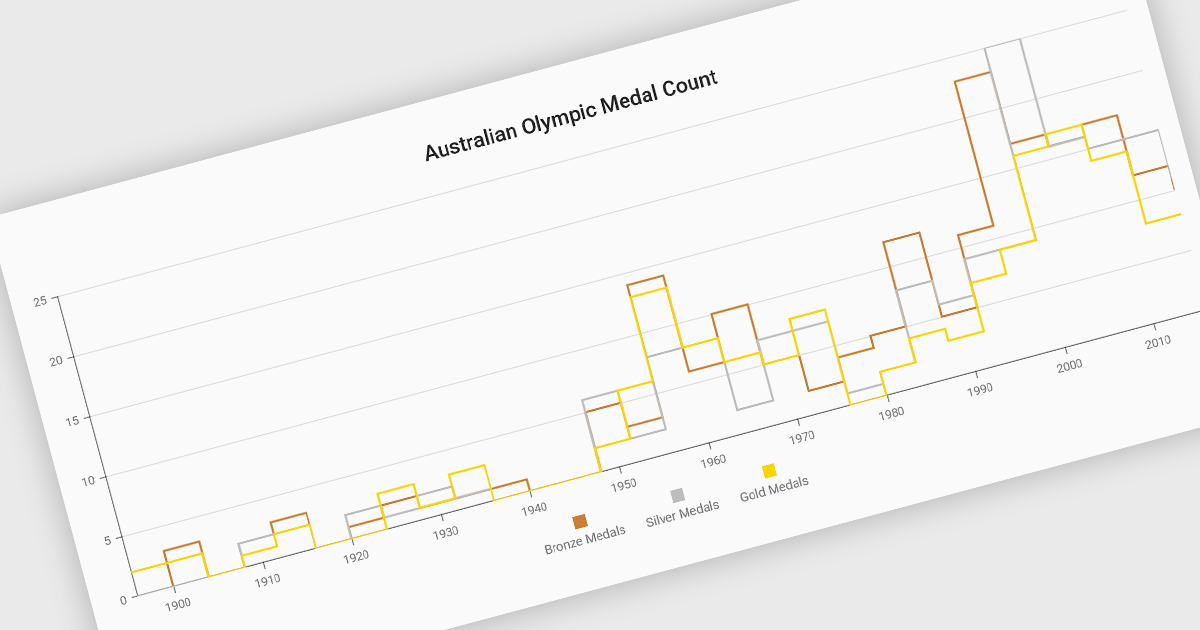
Step line charts are a variation of line charts that display changes between data points as a series of horizontal and vertical segments rather than diagonal lines. This structure highlights discrete transitions between values, making it easier to show when a change occurs and how long a value remains constant before the next update. Step line charts are useful for representing processes where values shift at specific moments, such as pricing tiers, system states, or configuration thresholds. By clearly separating periods of stability from points of change, the chart type helps developers and analysts interpret state-based or event-driven data with greater precision.
Several Vue.js chart components support the step line chart type, including:
For an in-depth analysis of features and price, visit our comparison of Vue.js charting components.
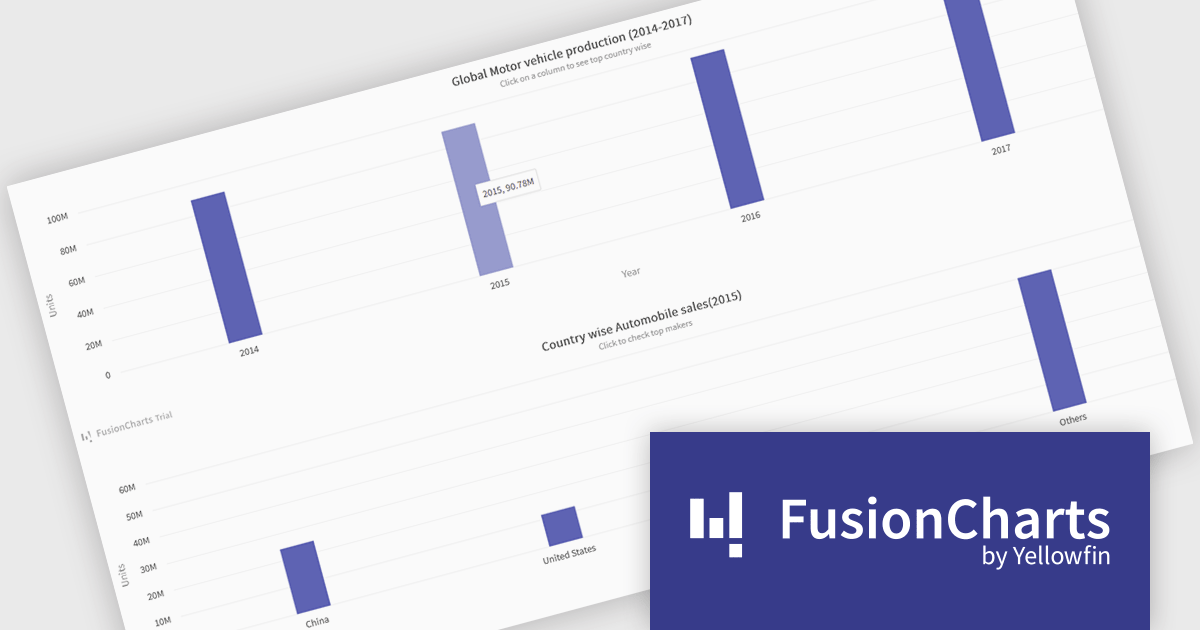
FusionCharts Suite XT is a collection of charting and mapping tools that helps developers create interactive and data-driven dashboards for their web and mobile applications. It provides a wide range of features, including over 100 chart types, data-driven maps, and a variety of customization options. FusionCharts Suite XT helps you visualize and present data in a clear and engaging way.
FusionCharts Suite XT allows developers to implement drill down charts that let users click individual data points to view related charts with more detailed information. This functionality helps developers present large or complex datasets in a structured way, allowing applications to display high level summaries while providing access to deeper data when required. By supporting multiple levels of drill down across most chart types, it supports scalable and interactive data exploration without overloading the initial visualization.
FusionCharts Suite XT is licensed through tiered plans, including Basic, Pro, Enterprise, and Enterprise+, available as annual or perpetual licenses for different developer and deployment needs. See our FusionCharts Suite XT licensing page for full details.
For more information, visit our FusionCharts Suite product page.
전화 : 00798 14 800 6332
팩스 : +1 770 250 6199


