

공식 공급 업체
200 이상의 소프트웨어 개발처와 판매 계약을 맺은 공인 디스트리뷰터로서 합법적인 라이선스를 제공합니다.
모든 브랜드 보기.
everviz makes it possible to share your data through attractive, interactive charts and maps. No matter who your are or what you do, journalist, researcher or content creator, everviz makes it simple for you to create stunning data visualizations. Enter data directly, drop a CSV file into the editor, copy and paste from Microsoft Excel, or connect to live data via Google Sheet integration.
Use the intuitive editor to choose chart type, edit text, fonts and colors to make your data stand out and then easily publish the result by embedding your interactive visualizations on your website, blog or intranet, or export them as images.
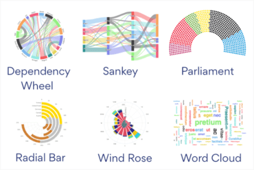
Added more chart types to everviz:
전화 : 00798 14 800 6332
팩스 : +1 770 250 6199


