


Offizieller Lieferant
Als offizieller und autorisierter Distributor beliefern wir Sie mit legitimen Lizenzen direkt von mehr als 200 Softwareherstellern.
Sehen Sie alle unsere Marken.
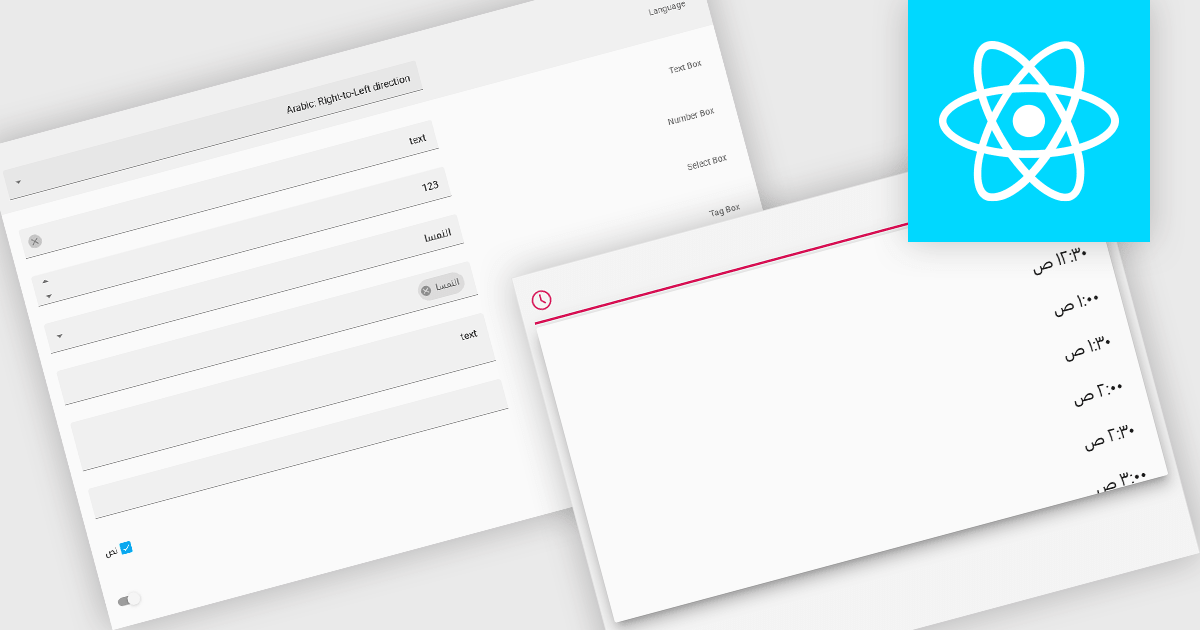
Right-to-left (RTL) support in a data editor component enables the user interface and content layout to be displayed in a direction consistent with languages that are read from right to left, such as Arabic or Hebrew. This includes aligning text, input fields, table structures, and control elements to the right side of the screen, while preserving correct data formatting and interaction behavior. For software developers, RTL support ensures that applications can be properly localized for RTL language audiences without compromising usability or data readability.
Several React data editors offer right to left (RTL) support including:
For an in-depth analysis of features and price, visit our React data editors comparison.
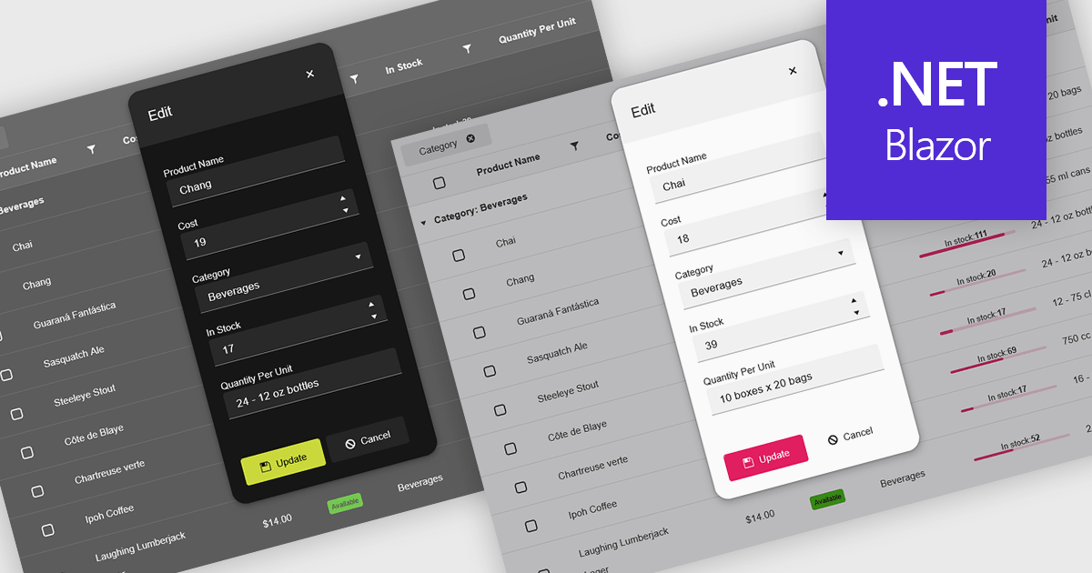
Themes in data editors provide a simple and efficient way to customize the visual appearance of data editing controls, including elements such as color schemes, fonts, and overall styling. By applying themes, developers and designers can create a consistent and professional look across multiple components, ensuring that applications align with brand guidelines and deliver a polished user experience. This flexibility enhances readability and usability while improving the design process, allowing visual updates to be made globally without modifying individual controls. For example, a dark theme can improve focus in data-intensive dashboards, while a light and minimalist theme can enhance clarity in business forms or reporting tools. Overall, themed data editors help maintain design consistency, reduce development time, and elevate the overall aesthetic of modern applications.
Several .NET Blazor data editor collections offer support for themes including:
For an in-depth analysis of features and price, visit our .NET Blazor data editor controls comparison.
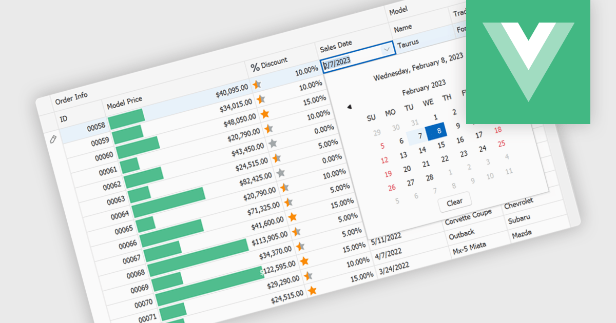
A date editor enables users to easily input, modify, and validate date values through an intuitive interface such as a calendar picker or spinner. This feature ensures consistent date formats across datasets, reduces manual entry errors, and improves overall data integrity. By enforcing validation rules and supporting localization, date editors accommodate a wide range of user needs and regional formats. Common use cases include managing records in applications such as employee databases, scheduling systems, financial reporting tools, and project management dashboards where accurate and consistent date information is essential for reliable data analysis and decision-making.
Several Vue.js data editor collections provide date editors including:
For an in-depth analysis of features and price, visit our Vue.js Data Editors comparison.
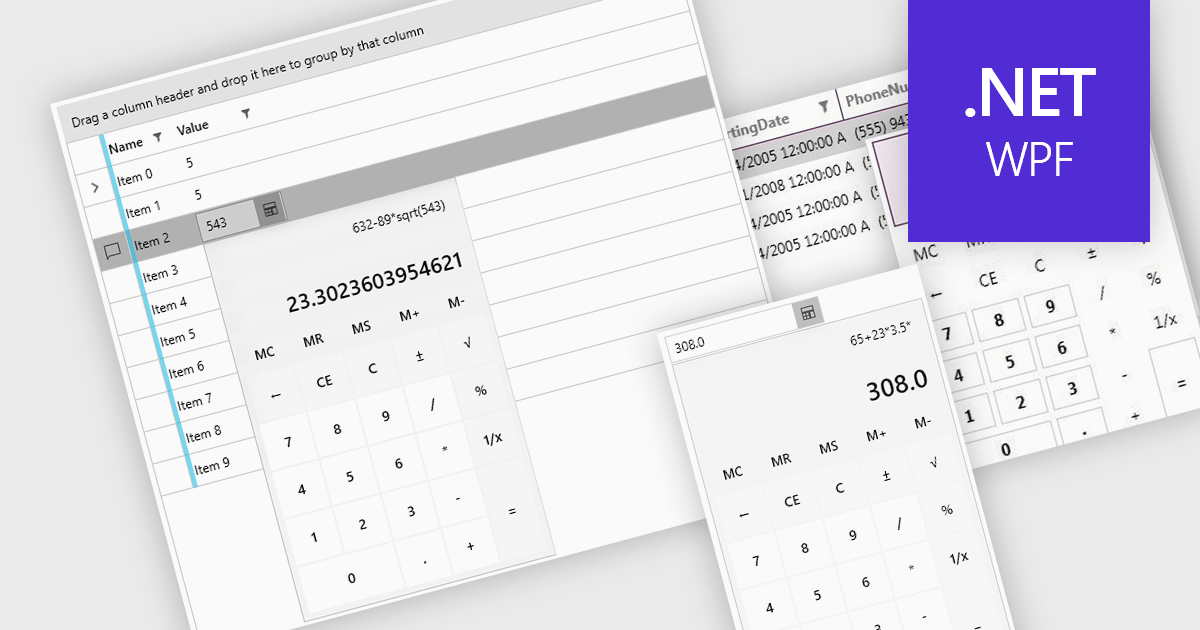
Dropdown calculators are interactive user interface components that integrate a compact calculator directly into a standard dropdown control, allowing users to perform quick calculations or adjust numerical values without navigating away from the current input field. This interaction pattern is particularly useful in data-heavy applications where users frequently need to input or modify numerical data, such as e-commerce pricing, financial tools, form-based systems, or configuration panels. By integrating calculation capabilities directly into the dropdown, these components reduce the need for external tools, help maintain focus, and improve the overall speed and accuracy of user input.
Several WPF data editor collections offer a dropdown calculator, including:
For an in-depth analysis of features and price, visit our comparison of WPF data editors collections.
Syncfusion Essential Studio Enterprise provides a comprehensive collection of UI components and frameworks for building modern cross-platform applications. It offers over 1,800 components compatible with .NET WinForms, WPF, ASP.NET Core & MVC, WinUI, MAUI, JavaScript, Blazor, and more, enabling seamless application development across diverse devices and operating systems.
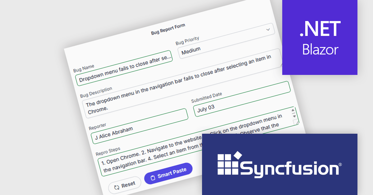
The Syncfusion Essential Studio Enterprise 2025 Volume 3 (31.1.17) release adds new Blazor Smart Paste Button and Smart TextArea components, embedding AI‑assisted intelligence directly in data entry workflows. The Smart Paste Button component analyzes clipboard content, such as structured forms, text snippets, or multi-field data, and pastes it intelligently into relevant form fields with proper formatting and mapping. Meanwhile, the Smart TextArea offers context-aware sentence‑level autocompletion, suggesting text continuations as users type to reduce keystrokes and improve writing consistency. Together, these components reduce user friction, speed up form filling, minimize input errors, and help developers deliver more polished, intelligent interfaces with less custom logic.
To see a full list of what's new in 2025 Volume 3 (31.1.17), see our release notes.
Syncfusion Essential Studio Enterprise is licensed per developer and is available as a 12 Month Timed Subscription License which includes support and maintenance. See our Syncfusion Essential Studio Enterprise licensing page for full details.
Learn more on our Syncfusion Essential Studio Enterprise product page.


Tel.: (888) 850 9911
Fax: +1 770 250 6199


