


Offizieller Lieferant
Als offizieller und autorisierter Distributor beliefern wir Sie mit legitimen Lizenzen direkt von mehr als 200 Softwareherstellern.
Sehen Sie alle unsere Marken.
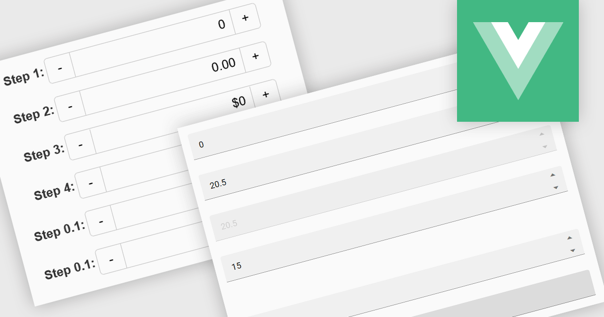
Numeric Spin data editor controls are intended for the efficient and precise input of numerical values. By combining an edit box with up/down spin buttons, users may either type to input directly or utilize the spin buttons to increase or decrease the value. This method promotes faster and less error-prone data entry than manual typing, particularly for large quantities or recurrent value revisions. Many spin editors include built-in validation, range limitations, data type selection, and formatting choices, which further improve data accuracy.
Several Vue.js data editor collections contain numeric spin components including:
For an in-depth analysis of features and price, visit our Vue.js data editors comparison.
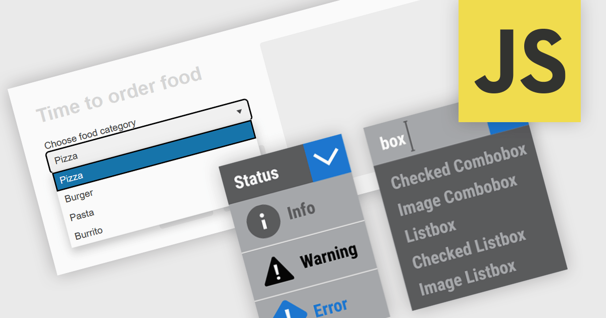
Dropdowns and list-based data editors in JavaScript are versatile UI components that offer flexibility and control to both users and developers. They facilitate the selection of options, with a structured way to display and interact with predefined data sets. These editors enhance the user experience by allowing streamlined input, offering features like single or multiple selection, visual representation with images, and checkbox integration. They are widely used in web applications for tasks such as form filling, filtering data, or setting configuration options.
Common dropdowns and list-based data editors include:
For an in-depth analysis of features and price, visit our JavaScript data editors comparison.
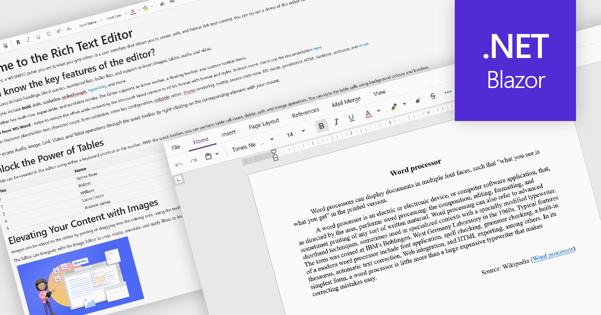
Rich Text Format (RTF) are specialized tools that enable the creation and manipulation of richly formatted text within development environments. The WYSIWYG (What You See Is What You Get) interface allows end users to easily design and format content visually without needing to write code, enhancing usability and reducing the learning curve. These editors commonly offer features such as text formatting, alignment options, list creation, image embedding, and table support, facilitating seamless incorporation of formatted content into applications, documentation, and user interfaces. Benefits include increased productivity, consistent cross-platform formatting, and minimized coding effort for managing text styles. Common use cases involve designing user documentation, generating dynamic web and mobile content, creating rich-text emails, and developing content management systems. By providing intuitive WYSIWYG capabilities, RTF editors are essential for developers aiming to integrate sophisticated text features efficiently into their projects.
Several Blazor data editor collections offer RTF editing capabilities including:
For an in-depth analysis of features and price, visit our Blazor data editors comparison.
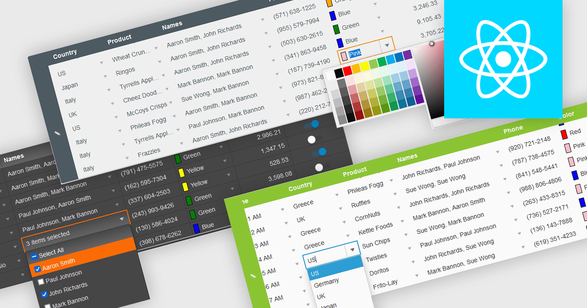
In the field of data editors, themes are style configurations that define the visual appearance and behavior of the interface. They provide developers with a consistent design framework, ensuring alignment with brand guidelines while enhancing usability and accessibility. By supporting features like dark and light modes, responsive design, and unified styling across components, themes enable developers to create a visually cohesive and user-friendly experience. They streamline maintenance, improve scalability, and reduce development overhead by offering a centralized system for managing design updates and ensuring consistency throughout the application.
Several React data editor collections offer support for themes including:
For an in-depth analysis of features and price, visit our React data editor controls comparison.
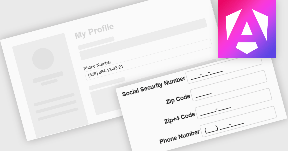
Input masking is a technique used in data editor components to format and restrict user input to specific patterns. By defining a predefined structure with placeholders, input masks guide users to enter data in a consistent and accurate manner. This approach significantly reduces data entry errors, improves data quality, and streamlines data processing. Input masks also enhance user experience by providing clear visual cues and automatically formatting input as it is typed, reducing the cognitive load on the user.
Several Angular data editors offer support for input masking including:
For an in-depth analysis of features and price, visit our Angular data editors comparison.


Tel.: (888) 850 9911
Fax: +1 770 250 6199


