Actipro Editors for UWP Features
Edit Boxes for .NET Types - Specialized edit boxes have been created for Brush, Byte, Color, CornerRadius, Date, DateTime, Double, Enum, Guid, Int16, Int32, Int32Rect, Int64, Point, Rect, Single, Size, Thickness, Time, TimeSpan and Vector data entry.
- Easy Value Entry - Type values directly into edit boxes, use arrow keys to increment them, or show the drop-down to select a value from one of many unique value pickers.
- Cycling Values - Edit box values can typically be incremented or decremented using the up/down arrow keys or the mouse wheel. Page Up/Down can also adjust larger step values.
- Moving Between Parts - Some edit boxes have multiple part values (e.g. hour, minutes, seconds). The left/right arrow keys move between parts and select the entire value for efficient data entry.
- Min/Max Values - Minimum and maximum values can be specified for most of the edit boxes. For aggregate types with multiple part values (e.g. Rect), you can restrict each part.
- Placeholder Text - All edit boxes support null values as an option for when the edit box is cleared. Placeholder text can appear in the edit area to prompt the user for values.
- Auto-Complete TextBox - The AutoCompleteBox control is a TextBox that also has a popup for presenting a list of suggested items as values are typed. Suggested items can be filtered and highlighted.
- Masked TextBox - The MaskedTextBox control is a powerful TextBox that can restrict user input based on a regular expression or wildcard pattern, intelligently prompting for masked characters.
- Country and Currency - The country and currency ComboBox controls are pre-populated with ISO country and currency data that can be filtered however you require.
- Month Calendar - Select one or more dates using MonthCalendar, a customizable control with animated view transitions, day name and week number display options, and disabled day support.
- Rating - The Rating control renders glyphs that can be used to present or collect a user rating. The glyphs are customizable and support two orientations.
- Gradient Stop Slider - The GradientStopSlider control is specialized to support modifying the stops within a gradient brush. Double-click to add, drag to reorder, and drag away to remove a slot.
Value Pickers - Value pickers are specialized input panels for various data types, generally used in edit box drop-downs.
- Color - Colors are picked via a radial hue slider and saturation/brightness square, or RGB values are entered directly. Alpha transparency can optionally be input as well.
- Brush - Solid and gradient Brush values are supported with a picker that combines the Color selection interface with a gradient stop slider for managing stops.
- Enumeration - Quickly select values for both flags and non-flags enum types. Flags enums allow for multiple value selection and grouping of related items.
- Number - Numerical data types (e.g. Int32, Double) can utilize a radial slider for quick value selection or buttons to step the value.
- Calculator - Numerical data types have an alternate calculator interface where numeric results can be generated by common mathematical operations.
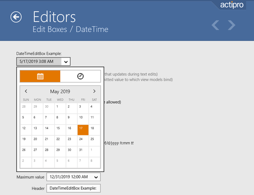
- Date - Dates can be selected via a month calendar control with fluent animations between month, year, decade, and century views.
- Time - Time values can be selected via two radial sliders with a familiar design similar to a standard analog clock.
- Tabbed Parts - Aggregate types with multiple part values (e.g. Rect, TimeSpan) have a tabbed interface to access an appropriate picker for each part.
Interoperability - All controls can be used standalone or easily integrated into various other usage scenarios.
- Property Grid - Editors can be automatically injected as property editors within PropertyGrid for comprehensive natural data entry.
- Data Grid - Integrate editors with a DataGrid to provide user-friendly input and presentation of data values for individual data columns in the grid.
- Standalone Usage - The control appearances align with other native controls, allowing them to be dropped right into an app and be instantly approachable by end users.


