





Fournisseur officiel
Comme nous somme les distributeurs officiels et autorisés, nous vous fournissons des licences légitimes directement à partir de 200+ éditeurs de logiciels.
Voyez toutes nos marques.
ONLYOFFICE Docs is a comprehensive online editor, allowing users to create text documents, spreadsheets, presentations, and forms. It enables your users to edit, share, and collaborate on documents online in their preferred browser, within your own application. It is fully compatible with OOXML (Office Open XML) formats and supports popular Microsoft Office and other document formats such as CSV, DOC, DOCX, EPUB, HTML, ODP, ODS, ODT, PDF, PPT, PPTX, RTF, TXT, XLS, and XLSX.
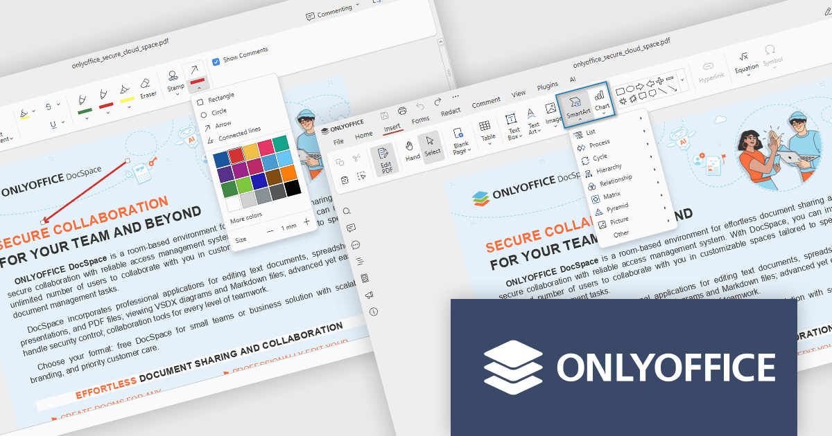
The ONLYOFFICE Docs v9.1 update enhances the PDF Editor to provide a more efficient and secure document management experience for developers and teams. It introduces advanced redaction tools that allow precise removal of sensitive information, including the ability to find and redact specific terms or entire pages. The update also expands annotation capabilities with customizable shapes and drawing tools for clearer document markup. Additionally, developers can now embed charts and SmartArt graphics directly within PDFs, enabling better visualization of data and smoother integration of visual elements without leaving the editing environment.
To see a full list of what's new in v9.1.0, see our release notes.
ONLYOFFICE Docs Developer Edition is licensed by the number of simultaneous document connections and is available as an annual license with 1 year support and upgrades. See our ONLYOFFICE Docs Developer Edition licensing page for full details.
For more information, see our ONLYOFFICE Docs Developer Edition product page.

Stimulsoft Reports.JS provides a robust reporting toolkit designed specifically for JavaScript applications. This library leverages a client-side architecture, offering a pure JavaScript report engine for efficient report rendering directly within web browsers. The solution includes a user-friendly report designer for building reports with various data sources and visualizations, along with a report viewer for seamless integration and display within your JavaScript applications. This eliminates the need for server-side dependencies or browser plugins, simplifying the development process for embedding powerful reporting functionalities into your web projects.
The Stimulsoft Reports.JS 2025.4.1 update introduces new 3D Surface and Area charts that enhance data visualization capabilities in reports and dashboards. These charts allow developers to represent complex data relationships with added depth and perspective, improving analytical clarity and user comprehension. By visualizing three-dimensional data and trends more effectively, developers can deliver more informative and visually engaging reporting solutions without additional complexity in implementation.
To see a full list of what's new in 2025.4.1, see our release notes.
Stimulsoft Reports.JS is licensed per developer and is available as a Perpetual license with 1 year support and maintenance. See our Stimulsoft Reports.JS licensing page for full details.
Stimulsoft Reports.JS is available individually or as part of Stimulsoft Ultimate.
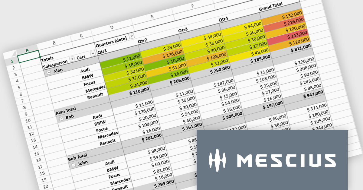
SpreadJS is a complete enterprise JavaScript spreadsheet solution used to create financial reports and dashboards, budgeting and forecasting models, scientific, engineering, healthcare, education, science lab notebooks, and other similar JavaScript business applications. Leverage the high-speed calculation engine with over 500 Excel built-in functions in 19 languages, to deliver true Excel-like spreadsheet experiences with zero dependencies on Excel.
In this blog post, MESCIUS Product Marketing Specialist Mackenzie Albitz shows you the steps for integrating a Pivot Table directly into your Vue application using the SpreadJS Vue Spreadsheet component with its optional Pivot Table add-on. Steps include:
Detailed code is included and you can even download the sample app to get started.
Read the complete blog to get started creating and customizing powerful Vue Spreadsheet Pivot Tables.
SpreadJS is licensed per developer and includes 1 Year Maintenance (major and minor version releases and unlimited support phone calls). SpreadJS requires an Annual or Perpetual Deployment License. The optional Add-ons are available at an additional cost, and require a SpreadJS license. See our SpreadJS licensing page for full details.
For more information, visit our SpreadJS product page.
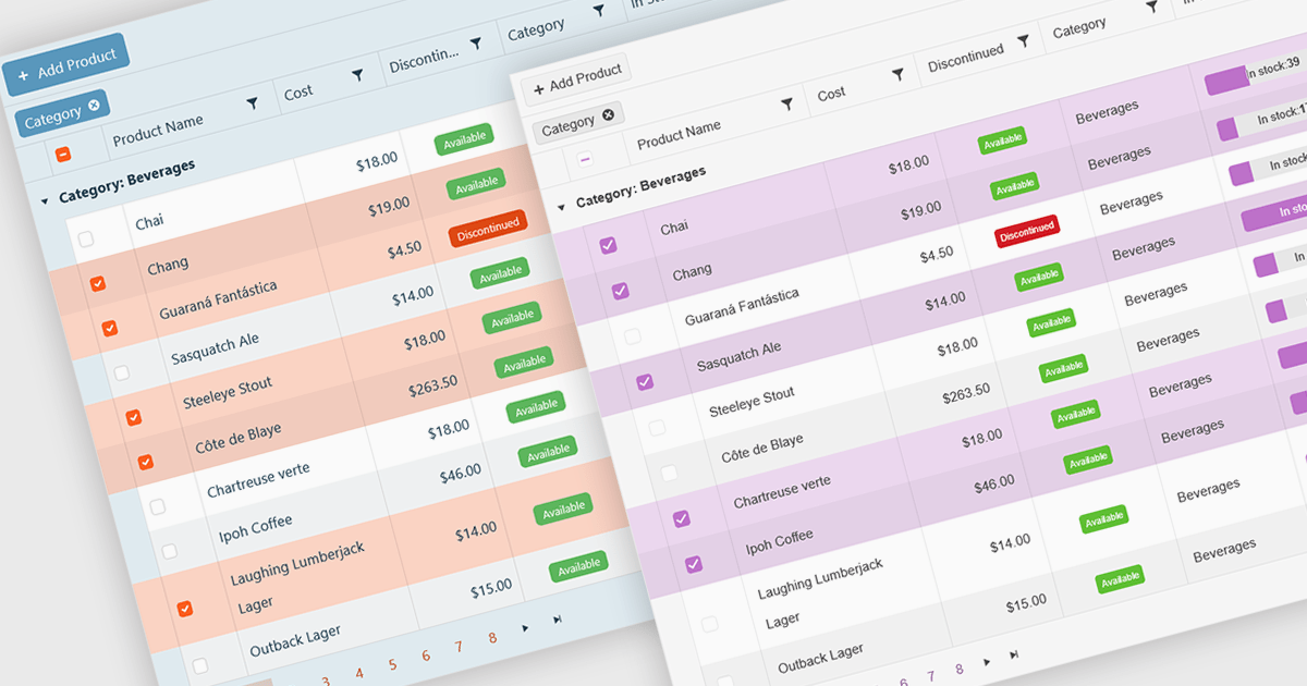
A checkbox cell type in a grid allows users to easily manage Boolean (true or false) data through a simple and visual interface. Instead of typing values manually, users can quickly toggle a checkbox to indicate states such as active or inactive, complete or incomplete, or enabled or disabled. This interaction reduces input errors and enhances data clarity, making it easy to scan and understand information at a glance. Checkbox cells improve productivity by supporting quick edits, bulk selections, and efficient filtering based on checked or unchecked values. Common use cases include task tracking, user permissions, product availability, and feature toggles where a binary choice improves workflow efficiency and usability.
Several Vue.js grid components offers checkbox cell type support, including:
For an in-depth analysis of features and price, visit our comparison of Vue.js grid components.
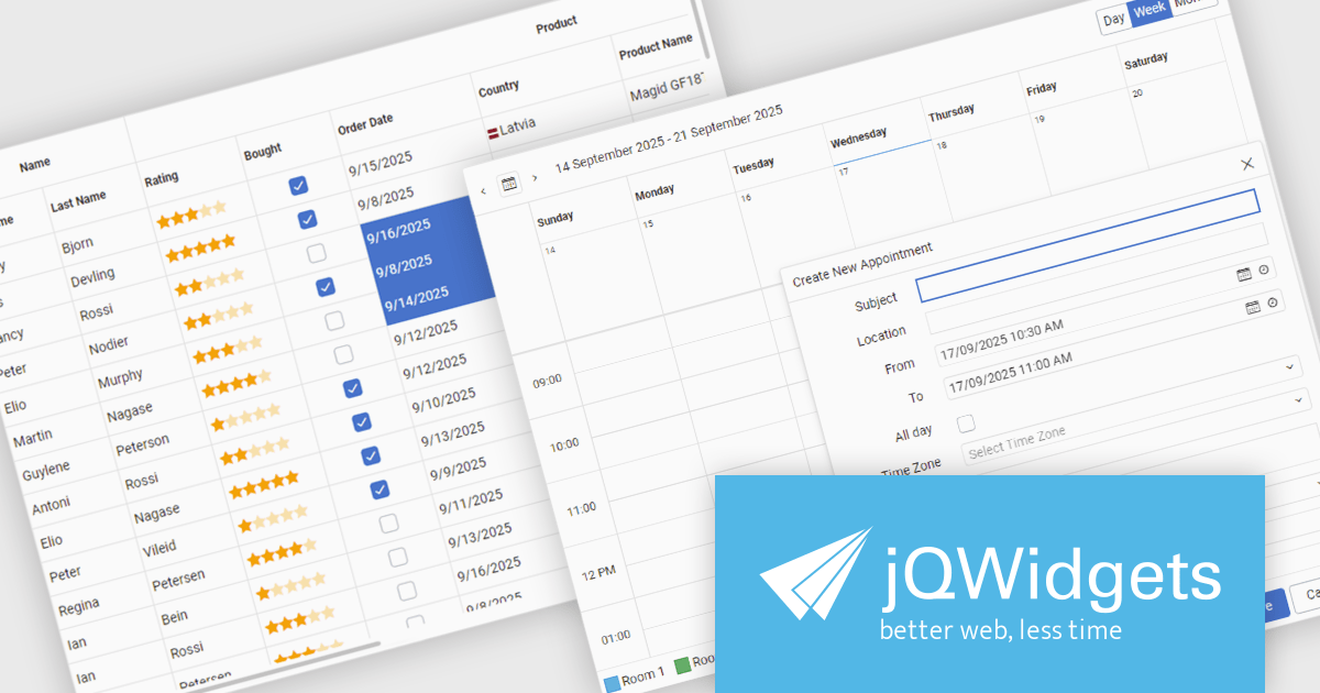
jQWidgets is a comprehensive JavaScript UI framework offering a robust collection of over 60 widgets, themes, and utilities for building professional-grade, cross-platform web applications. Built on jQuery, HTML5, and CSS, it provides extensive functionality including data grids, charts, navigation, input validation, and more. jQWidgets simplifies web development, ensuring your applications work seamlessly across desktop browsers, tablets, and smartphones.
The jQWidgets v24.0.0 update introduces a new Tailwind CSS-based theme that improves the process of styling and customizing user interfaces. By leveraging Tailwind’s utility-first framework, it enables flexible UI customization directly within markup, reducing the need for custom CSS and complex overrides. This integration ensures consistent design across components, promotes cleaner code, and aligns with modern front-end development practices. This release allows teams to deliver responsive, cohesive, and visually consistent applications with greater speed and precision.
To see a full list of what's new in v24.0.0, see our release notes.
jQWidgets is licensed per developer and is available as a Perpetual license 1 year support and maintenance. See our jQWidgets licensing page for full details.
Learn more on our jQWidgets product page.





Tél : (888) 850 9911
Fax : +1 770 250 6199


