


Fournisseur officiel
Comme nous somme les distributeurs officiels et autorisés, nous vous fournissons des licences légitimes directement à partir de 200+ éditeurs de logiciels.
Voyez toutes nos marques.
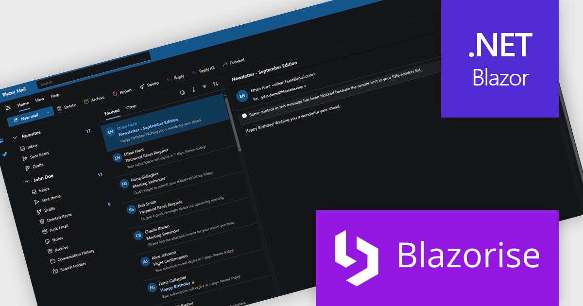
Blazorise is a versatile component library that empowers developers to build modern and feature-rich web applications using Blazor, a client-side web development framework from Microsoft. It offers a comprehensive collection of user interface components, including buttons, forms, charts, and navigation elements, all built with accessibility and responsiveness in mind.
The Blazorise 1.8.2 update introduces a Fluent UI Dark Theme that enables developers to deliver a consistent and accessible dark mode experience across their applications. It provides a complete set of tuned color tokens covering surfaces, typography, and accents, ensuring all Fluent UI components such as DataGrid, Modal, Sidebar, Dropdown, Button, and Tabs maintain visual coherence without additional customization. The theme also integrates with existing light and dark mode toggling, automatically adapting to the application’s current color scheme.
To see a full list of what’s new in version 1.8.2, see our release notes.
Blazorise is licensed per developer and includes a 1 year subscription for updates and support. Professional, Enterprise, and Enterprise Plus editions are available, each offering tailored levels of support and service to meet varying business needs. See our Blazorise licensing page for full details.
For more information, visit our Blazorise product page.

ComponentSource and Pranas.NET have partnered since 2015, working together to deliver innovative SQL backup and management tools. This long-standing collaboration ensures developers and businesses have access to trusted, high-quality software through ComponentSource.
Founded in 2003, Pranas.NET has built a reputation for creating reliable and intuitive solutions that simplify database management. Their flagship products, SQLBackupAndFTP and SqlBak, have become go-to tools for developers, streamlining SQL backup and monitoring tasks.
Through this partnership, ComponentSource customers benefit from proven SQL tools that save time, reduce costs, and boost productivity. With Pranas.NET’s continued focus on innovation and ease of use, the collaboration is set to deliver even greater value to developers and organizations worldwide in the years ahead.
Learn more about Pranas.NET.
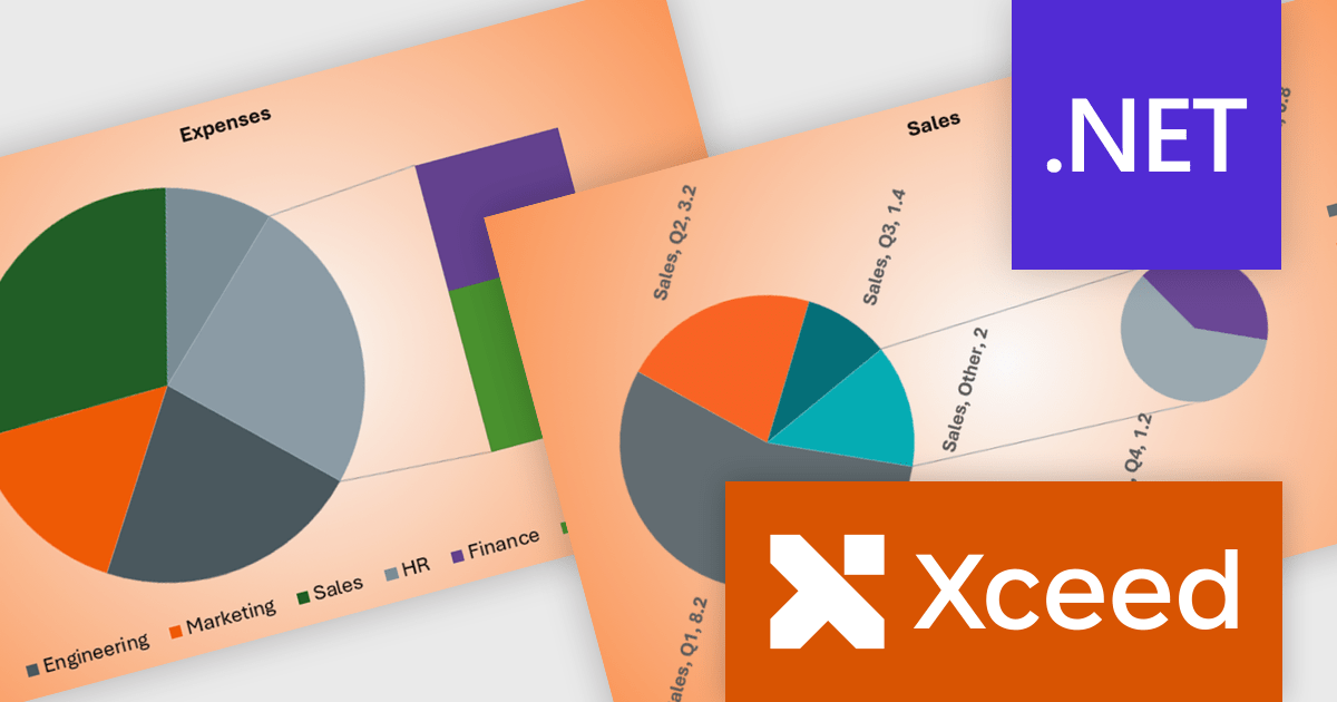
Xceed Words for .NET is designed to enable .NET developers to programmatically create, modify, and convert Microsoft Word (.docx) documents without requiring Microsoft Word or Office to be installed. It provides a comprehensive API for manipulating document elements, including paragraphs, tables, images, and formatting, and extends functionality to include PDF conversion, allowing for robust document generation and processing within .NET applications.
The Xceed Words for .NET 5.1 update introduces a new ComboChart class that enables developers to combine multiple chart types within a single chart, allowing different data series to be represented in the most appropriate format while maintaining a unified layout. This improves the clarity and efficiency of data presentation by reducing the need for multiple separate charts and simplifying the process of building complex visualizations within word processing documents.
To see a full list of what's new in version 5.1, see our release notes.
Xceed Words for .NET is licensed per developer and is available as a perpetual license with 1 year of updates and support. See our Xceed Words for .NET licensing page for full details.
Xceed Words for .NET is available individually or as part of Xceed Ultimate Suite.
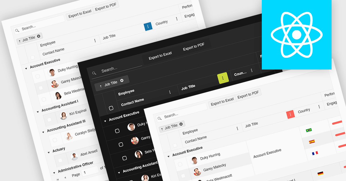
Built-in theme support in a React grid refers to the component's ability to natively integrate and adapt to predefined visual styles without requiring extensive custom CSS. This feature allows developers to quickly apply consistent, professional-looking designs that align with widely used UI frameworks such as Material UI, Bootstrap, or custom enterprise branding. It simplifies the process of maintaining visual consistency across applications, reduces front-end development time, and ensures that the grid remains visually coherent with the rest of the user interface, particularly during updates or when switching between themes.
Several React Grid controls offer support for built-in themes including:
For an in-depth analysis of features and price, visit our comparison of React Grid controls.
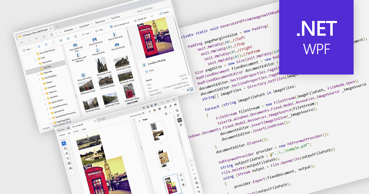
Image to PDF conversion is a common feature in document processing that enables the transformation of static image files, such as JPEG, PNG, or TIFF formats, into a Portable Document Format (PDF) file. PDFs support consistent rendering across different devices and platforms and are compact, secure, and easily viewable. This conversion is widely used to preserve visual content, including scanned documents, receipts, visual records, photos, or graphical outputs while making them easier to share, annotate, archive, or print in a universally accessible format.
Several WPF PDF components allow you to convert images to PDF, including:
For an in-depth analysis of features and price, visit our comparison of PDF components for WPF.


Tél : (888) 850 9911
Fax : +1 770 250 6199


