








Fornitore ufficiale
In qualità di distributori ufficiali e autorizzati, forniamo licenze software legittime direttamente da più di 200 autori di software.
Vedi tutte le nostre marche
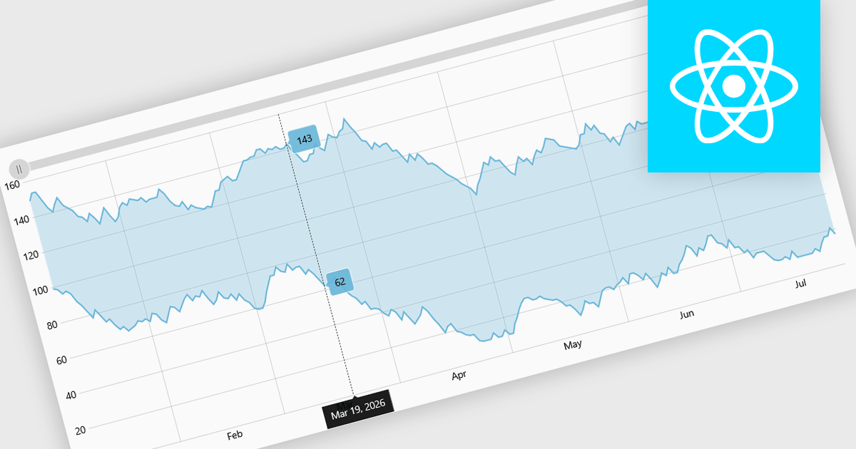
Range charts visualize financial data based on fixed price movements rather than time intervals, grouping activity into consistent ranges to highlight meaningful price action. By filtering out minor fluctuations and market noise, they make trends, volatility, support, and resistance levels easier to identify, especially in fast-moving or irregular markets. Common use cases include technical analysis for trading platforms, monitoring price volatility in equities or cryptocurrencies, and analyzing high-frequency financial data where understanding true market behavior is more important than tracking time-based changes.
Several React charting components provide you with range charts, including:
For an in-depth analysis of features and price, visit our React chart controls comparison.
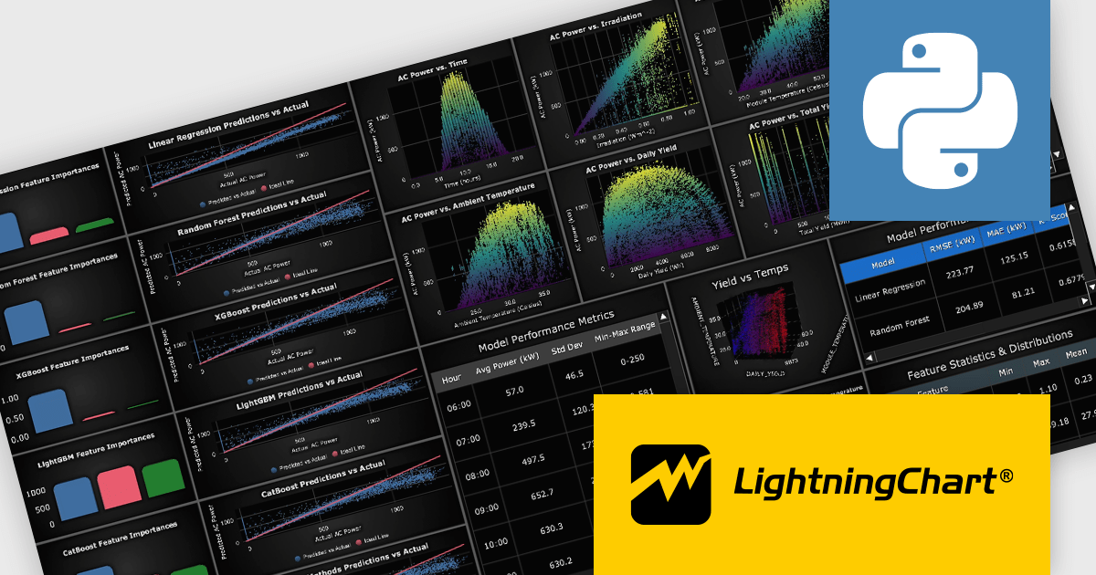
LightningChart Python is a high-performance visualization library designed for real-time analytics and large-scale data rendering. Utilizing GPU acceleration and WebGL, it efficiently processes millions of data points in 2D and 3D with smooth, interactive visuals. Some example chart types include Line graphs, Scatter plots, Heatmaps, Area plots, Box plots, 3D Surface graphs and Mesh plots, and it supports UI elements such as CustomTicks, interval Bands and Constant Lines. It integrates with Python’s data ecosystem, including numpy, pandas, and GUI frameworks like PyQt and PySide, making it a powerful tool for interactive dashboards, financial analytics, scientific simulations, and engineering applications.
The LightningChart Python v2.1 update introduces a new DataGrid component that allows software developers to present metrics, KPIs, and trend information in a single, structured view, combining textual data, numeric values, and compact in-cell charts. By embedding visual context such as sparklines, markers, and thresholds directly within the grid, developers can deliver clearer, more actionable insights without relying on separate chart components. The DataGrid also provides extensive control over styling, enabling consistent integration with existing application designs while reducing the effort required to build and maintain custom data presentation solutions.
To see a full list of what's new in v2.1, see our release notes.
LightningChart Python offers two licensing options: the subscription-based Data Scientist License for internal, non-public facing usage and the perpetual, per-seat Software Developer License for commercial use with professional support and deployment keys. Both licenses allow one active session per user, with developer licenses assigned individually. See our LightningChart Python licensing page for full details.
For more information, see our LightningChart Python product page.
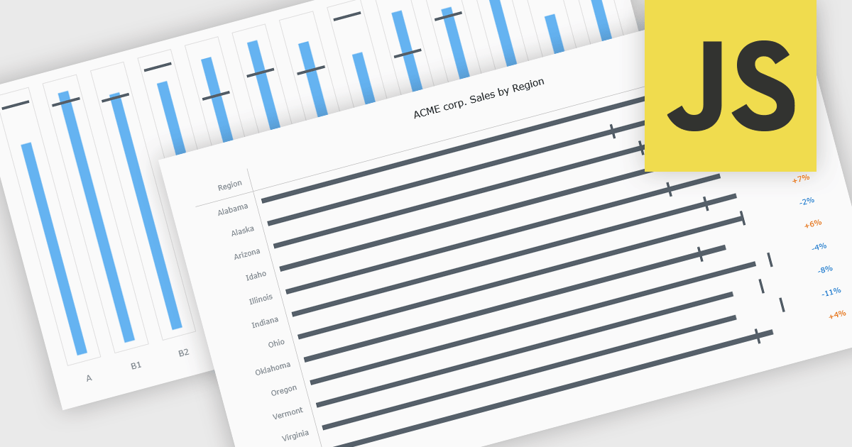
Bullet charts are goal-oriented visualizations that compare actual performance against targets and benchmarks such as budget and forecast values in a single, easy-to-read view. They offer a clear alternative to gauges and meters by showing progress toward goals while making variances and shortfalls immediately obvious. By presenting multiple reference points together, bullet charts help stakeholders interpret performance quickly and consistently across metrics. Common use cases include financial reporting, sales and margin tracking, KPI dashboards, operational scorecards, and executive summaries where fast, reliable comparisons support better decision-making.
Several JavaScript chart controls offer bullet chart support including:
For an in-depth analysis of features and price, visit our JavaScript bullet chart controls comparison.
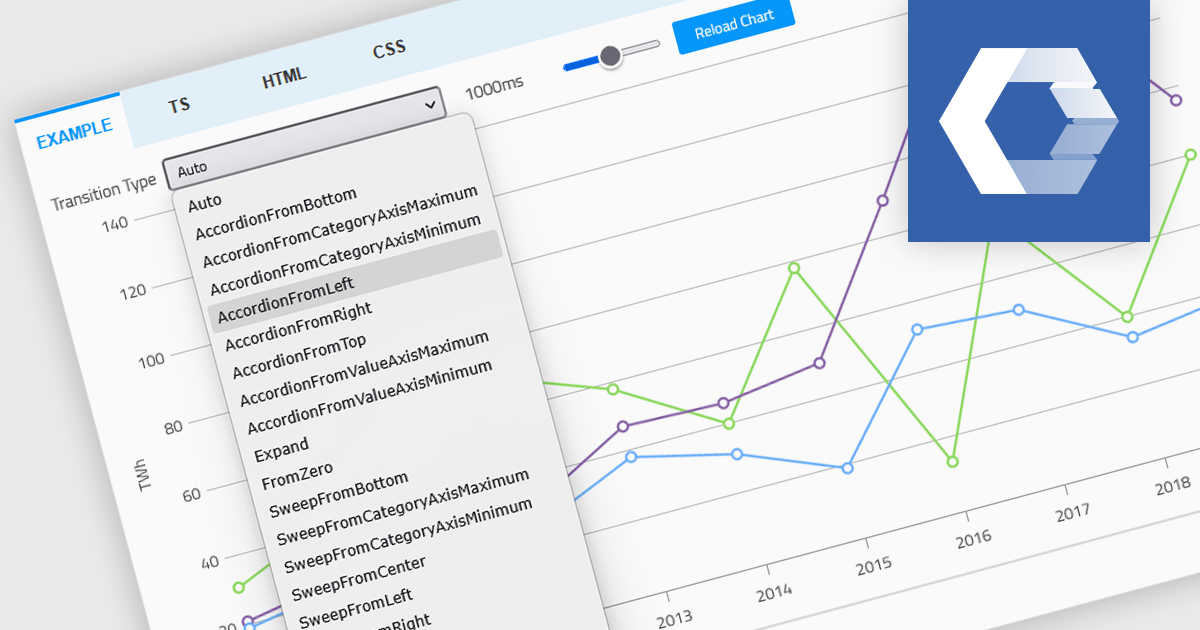
Animation in a Web Components Chart control refers to the visual transitions applied to chart elements as data is rendered, updated, or interacted with. It enhances the user experience by making changes in the data more perceptible and easier to follow, particularly when dealing with dynamic or real-time datasets. For developers, animation helps improve data readability and provides a more engaging and polished interface, especially when charts are updated frequently or involve user interaction. It also makes it easier for users to track what’s changed in the chart, even when the visuals are complex.
Several Web Components chart controls offer animation including:
For an in-depth analysis of features and price, visit our comparison of Web Components Chart Controls.
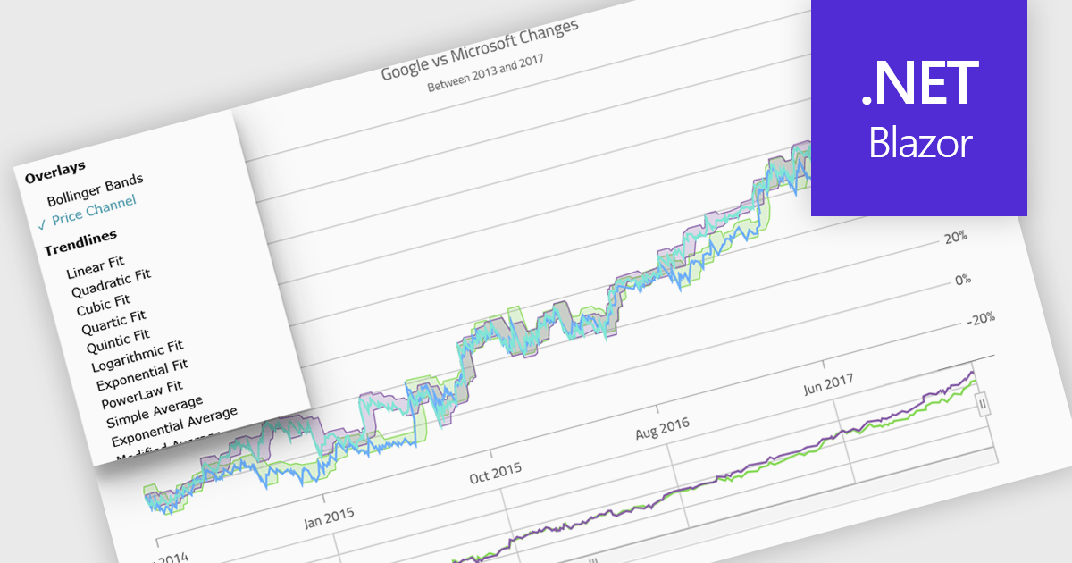
Indicators in a chart component are visual tools used to represent specific statistical or mathematical calculations directly on the chart, often to highlight trends, patterns, or key thresholds within the underlying data. Common in financial and analytical applications, indicators can include elements like moving averages, Bollinger Bands, or threshold lines. For software developers, implementing indicators provides a powerful way to enhance data interpretation by allowing users to see meaningful context and actionable insights without needing to leave the chart interface. This improves decision-making and supports more interactive and informative visualizations across a wide range of use cases.
Several .NET Blazor charting controls support indicators including:
For an in-depth analysis of features and price, visit our comparison of .NET Blazor Chart Controls.





Tel: (888) 850 9911
Fax: +1 770 250 6199


