

Fornitore ufficiale
In qualità di distributori ufficiali e autorizzati, forniamo licenze software legittime direttamente da più di 200 autori di software.
Vedi tutte le nostre marche
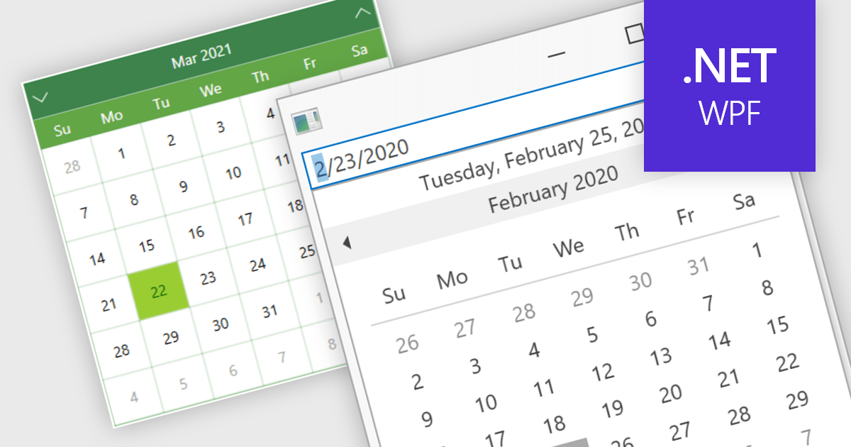
Calendar data entry components provide a familiar interface that allows users to visually navigate through days, months, and years, making it easier to find specific dates. They can also support features like multi-date selection or blackout dates for unavailable options. This functionality improves data entry accuracy and reduces the need for manual code to manage date operations, streamlining development workflows and potentially reducing errors.
Many .NET 8 WPF data editor collections contain calendar functionality including:
For an in-depth analysis of features and price, visit our comparison of .NET 8 WPF Data Editors.
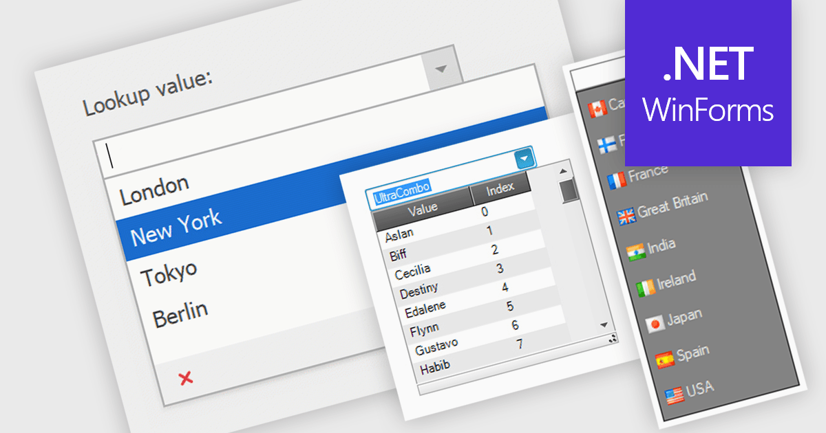
Comboboxes are user interface elements that provide a flexible input experience. They combine a text field with a drop-down list, allowing users to either choose a value from the pre-defined options or enter their own custom value directly into the field. This functionality makes them particularly useful for selecting from large datasets or enabling data entry that may not always have a perfect match within a predefined list.
Several WinForms data editor collections offer combobox components including:
For an in-depth analysis of features and price, visit our WinForms Data Editors comparison.
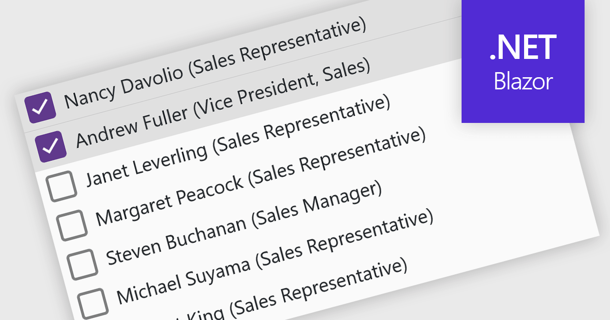
A checked listbox is a graphical user interface element that combines a listbox with checkboxes. It presents a list of options, similar to a standard listbox, but allows users to select multiple items by clicking on an adjacent checkbox for each option. This is useful for scenarios where users need to choose from various choices, but not be limited to a single selection.
Several Blazor data editor collections offer checked listboxes including:
For an in-depth analysis of features and price, visit our Blazor Data Editors comparison.
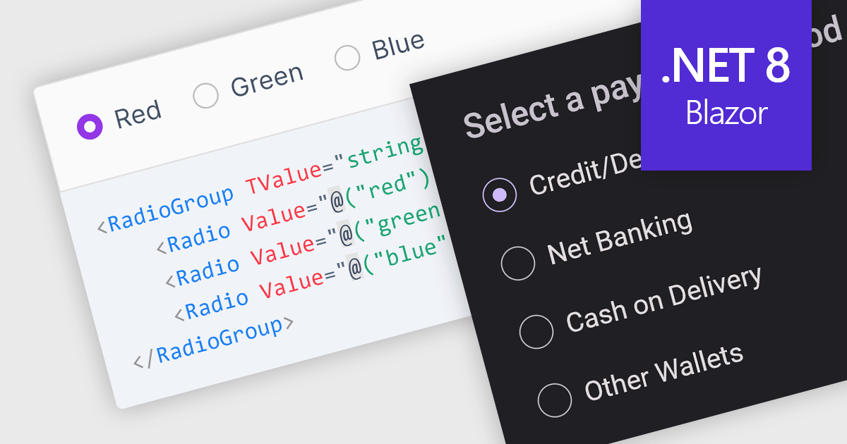
A radio group control is a user interface element that presents a collection of mutually exclusive possibilities within a data field. This control typically appears as a group of circular buttons, each representing a distinct option. Selecting one option automatically deselects any previously selected option within the same group. The primary benefit of a radio group is its ability to simplify the user interface by clearly displaying all available choices without ambiguity, which enhances user experience by making the selection processes straightforward and error-free. This is especially useful in forms or settings where a clear, singular choice must be made from a predefined set of options, ensuring that the user's input is constrained to valid selections and thereby reducing the likelihood of errors and simplifying data validation on the backend.
Several .NET 8 Blazor components offer radio group data editors, including:
For an in-depth analysis of features and price, visit our comparison of .NET 8 Blazor data editors.
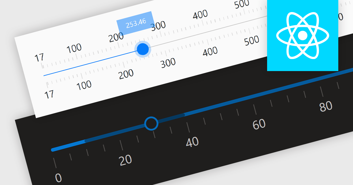
Trackbar controls, also known as sliders, are user interface (UI) elements that allow users to adjust a numerical value within a defined range by moving a slider along a bar. These controls are highly valuable for settings that require a visual representation of adjustment, such as volume, brightness, or other application-specific parameters. Trackbars enhance the user experience by providing a simple and effective method to input values, which can be particularly useful for fine-tuning settings without the need for direct numerical input. Their intuitive design promotes ease of use and quick interaction, making them an excellent choice for graphical user interfaces where space is limited and precision is necessary.
Several React components offer Trackbar Data Editors including:
For an in-depth analysis of features and price, visit our comparison of React Data Editors.





Tel: (888) 850 9911
Fax: +1 770 250 6199


