


Fornitore ufficiale
In qualità di distributori ufficiali e autorizzati, forniamo licenze software legittime direttamente da più di 200 autori di software.
Vedi tutte le nostre marche
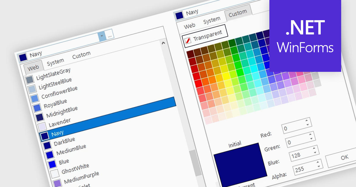
A color picker is user interface component that typically presents a visual spectrum or palette from which users can choose colors, input specific color values like RGB or HEX codes, or use sliders to adjust hue, saturation, and brightness. By enabling users to select and apply colors to various elements, such as text, backgrounds, or data visualizations, this type of data editor enhances the precision and efficiency of color selection and greatly improves the user experience.
Several WinForms data editors can provide you with a color picker, including:
For an in-depth analysis of features and price, visit our WinForms data editors comparison.
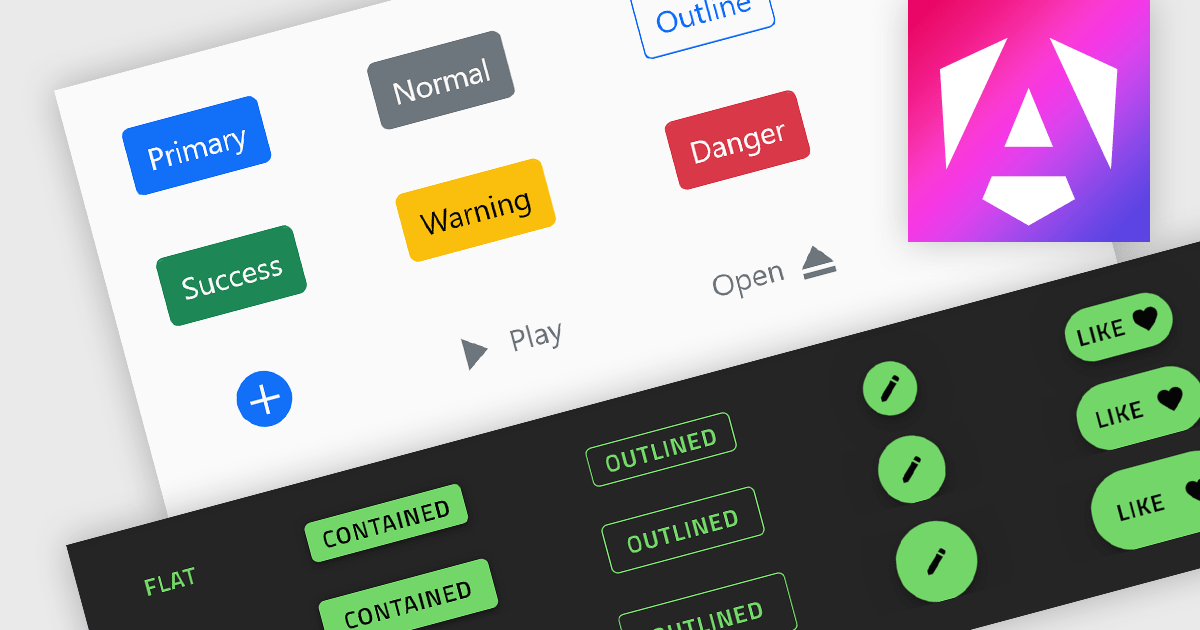
Button controls are specialized tools within design and content management systems that facilitate the creation, customization, and management of buttons. These controls empower users to effortlessly tailor button appearance, size, color, and functionality without requiring coding expertise, streamlining the design process and enhancing user interface consistency across digital platforms.
Several Angular data editor collections offer button editor controls including:
For an in-depth analysis of features and price, visit our Angular Data Editors comparison.
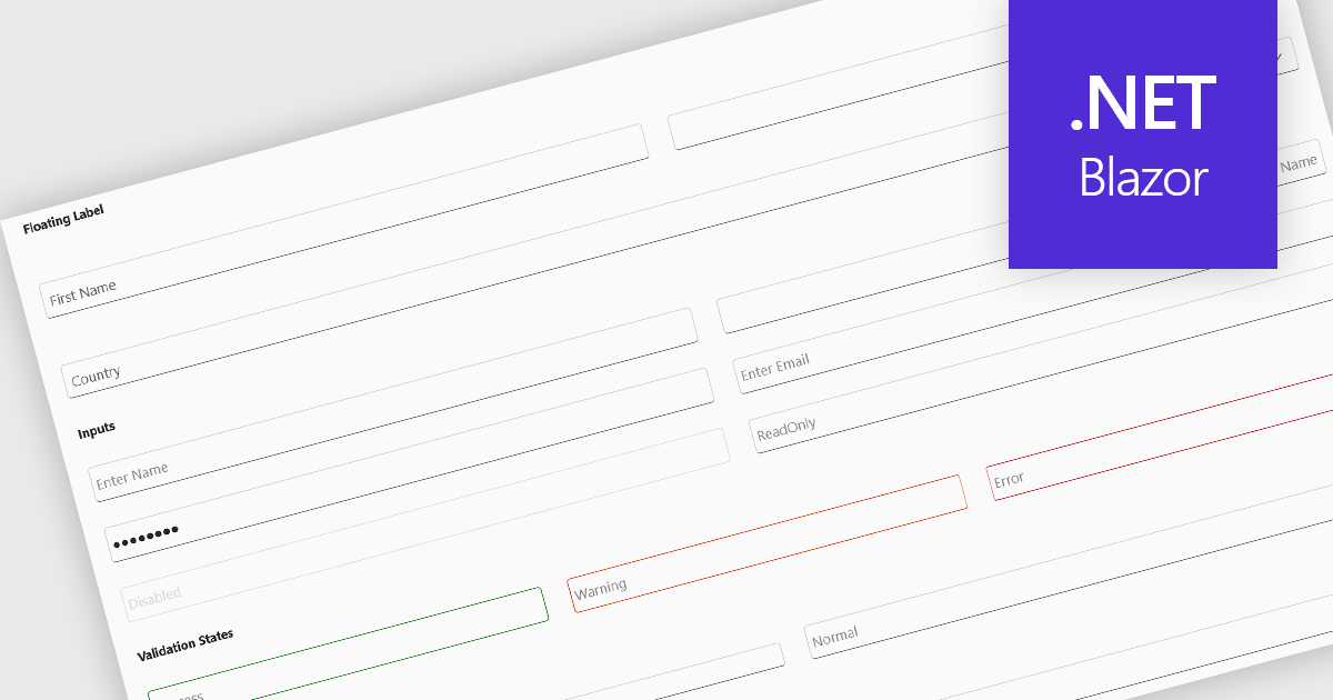
Text box components, also known as text fields, are essential elements allowing users to input and edit text within a user interface. They play a crucial role in forms and dialogs by facilitating data entry, improving user experience through clear labeling and validation, and ultimately enabling users to interact and provide information to the system.
Several Blazor data editor collections offer text box components including:
For an in-depth analysis of features and price, visit our Blazor data editors comparison.
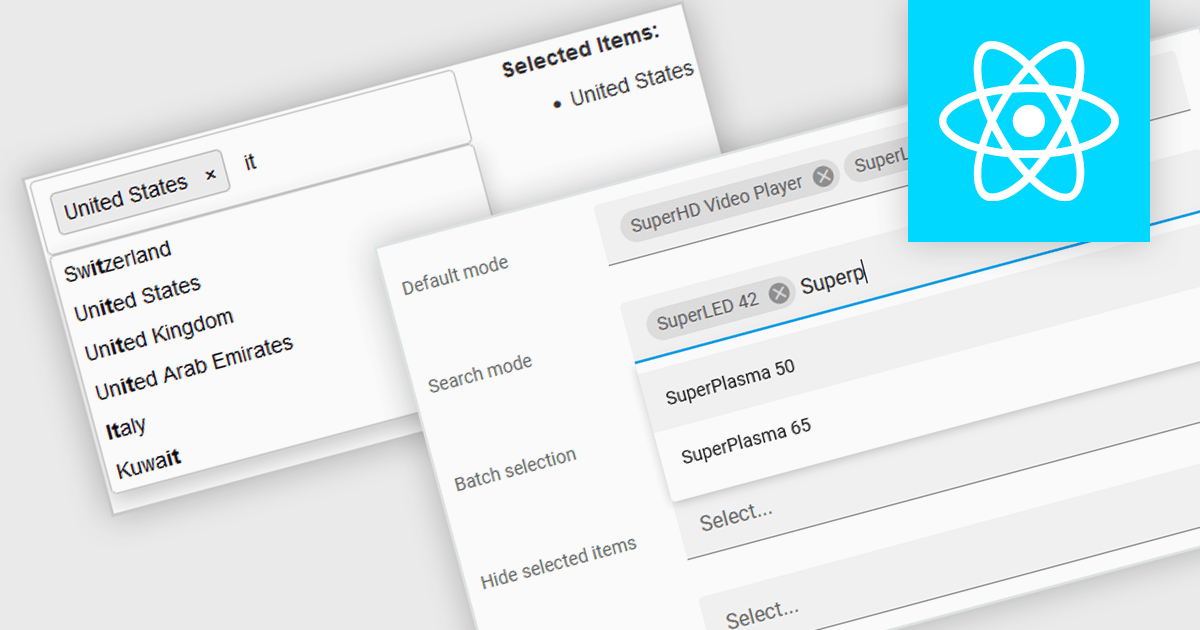
Token boxes, also known as token input controls, are user interface elements designed to streamline data entry for multiple values. They allow users to input, manage, and manipulate discrete pieces of data (tokens) within a single form field. This enhances user experience by facilitating tagging, categorization, and selection of multiple items, while providing developers with a robust tool for intuitive interfaces. The benefits include improved clarity through visual separation of values, efficient data handling, and ease of use in applications like search filters, email address inputs, and tagging systems.
Many React data editor collections contain token box / input controls including:
For an in-depth analysis of features and price, visit our comparison of React Data Editors.
Syncfusion Essential Studio ASP.NET MVC, available as part of Syncfusion Essential Studio Enterprise, is a comprehensive suite of web UI controls that empowers developers to craft rich, interactive ASP.NET MVC applications. Backed by the lightweight and modular Essential JS 2 library, it offers over 80 components ranging from data grids and charts to schedulers and pivot grids, while ensuring a seamless integration with the MVC framework for an efficient development experience.
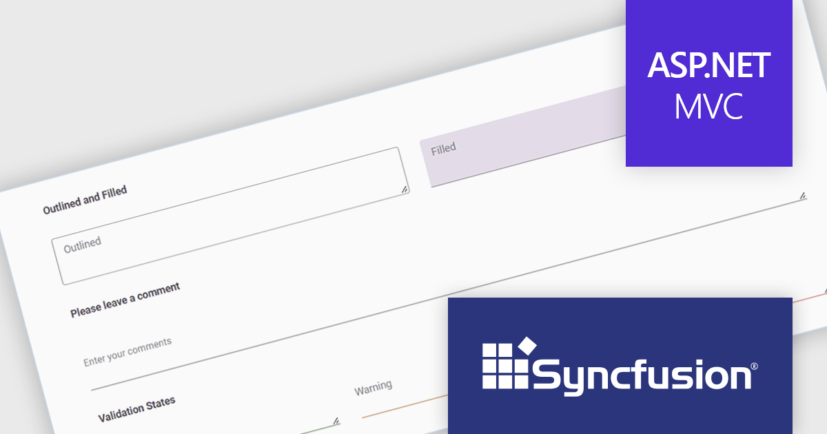
The Syncfusion Essential Studio ASP.NET MVC 2024 Volume 2 (26.1.35) release introduces the production-ready TextArea component. This enhanced control streamlines user input for multi-line text, perfect for capturing comments, messages, or any lengthy content. Beyond core functionality, the Syncfusion TextArea offers a rich feature set including intuitive icons, clear floating labels, flexible sizing options, and visual validation cues to empower a more user-friendly and informative data collection experience.
To see a full list of what's new in 2024 Volume 2 (26.1.35), see our release notes.
Syncfusion Essential Studio ASP.NET MVC is available as part of Syncfusion Essential Studio Enterprise which is licensed per developer starting with a Team License of up to five developers. It is available as a 12 Month Timed Subscription License which includes support and maintenance. See our Syncfusion Essential Studio Enterprise licensing page for full details.
Learn more on our Syncfusion Essential Studio ASP.NET MVC product page.


Tel: (888) 850 9911
Fax: +1 770 250 6199


