


공식 공급 업체
200 이상의 소프트웨어 개발처와 판매 계약을 맺은 공인 디스트리뷰터로서 합법적인 라이선스를 제공합니다.
모든 브랜드 보기.
영어로 계속 읽기:
FusionCharts Suite XT is a JavaScript charting library that provides developers with a wide range of options for creating data visualizations. The suite includes over 100 chart types, 2,000+ maps, and a variety of features for customizing charts, adding interactivity, and exporting charts to different formats. It is used by developers of all skill levels to create data visualizations for a wide range of applications, including dashboards, reports, websites, and mobile apps.
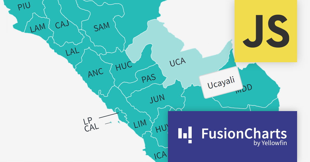
FusionCharts v3.21.0 introduces new maps for Argentina, Peru, and Costa Rica. With a total of 58 new maps, you can now drill down to each specific department within those countries. This version added all 27 Peruvian provinces, all 24 Argentinian provinces, and all 7 Costa Rican provinces.
There are many benefits to using maps in your data visualization apps. Maps are a great way to visualize spatial data, such as customer location, sales by region, or traffic patterns. You can also identify trends and patterns in your data that might otherwise be difficult to see. FusionCharts maps can be used to create interactive dashboards and reports that allow users to explore data in more depth. For example, users could click on different regions on a map to see more detailed information about sales in those regions.
To see a full list of what’s new in version 3.21.0, see our release notes.
For more information, visit our FusionCharts Suite XT product page.
전화 : 00798 14 800 6332
팩스 : +1 770 250 6199


