데이터 내의 추세 및 관계를 파악하세요

2월 7, 2024
영역 차트는 시간이 지남에 따라 데이터가 어떻게 변하는지 보여주고, 추세를 시각화하고, 크기를 확대하고, 사용자가 데이터를 비교할 수 있도록 지원합니다.

영어로 계속 읽기:

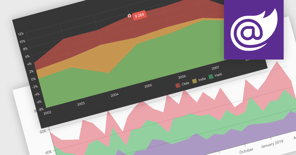
Area charts combine the strengths of line and bar charts, typically depicting how quantitative data changes over time. The area beneath the lines is shaded, emphasizing trends, comparisons between multiple data series, and the magnitude of change within each series. Ideal for showcasing cumulative totals and proportions, area charts excel in revealing trends and relationships within your data.

Several Blazor chart controls offer area charts including:

  • DevExpress Blazor Chart (Part of DevExpress ASP.NET and Blazor) empowers you to craft interactive area charts with rich customization options, from gradients to tooltips, for insightful data stories.
  • Telerik Blazor Chart (part of Telerik UI for Blazor) lets you create rich, interactive, responsive area visualizations to effectively showcase trends and comparisons within your Blazor application's data.
  • ComponentOne Charts for Blazor (part of ComponentOne Studio Blazor Edition by MESCIUS) allows you to generate pixel-perfect area charts with built-in zooming and panning for in-depth data exploration.
  • Syncfusion Blazor Chart (part of Syncfusion Essential Studio Enterprise) enables you to design dynamic area charts with extensive styling tools and animation effects to engage your audience.

For an in-depth analysis of features and price, visit our Blazor chart controls comparison.

Compare Blazor Chart Controls