


공식 공급 업체
200 이상의 소프트웨어 개발처와 판매 계약을 맺은 공인 디스트리뷰터로서 합법적인 라이선스를 제공합니다.
모든 브랜드 보기.
영어로 계속 읽기:
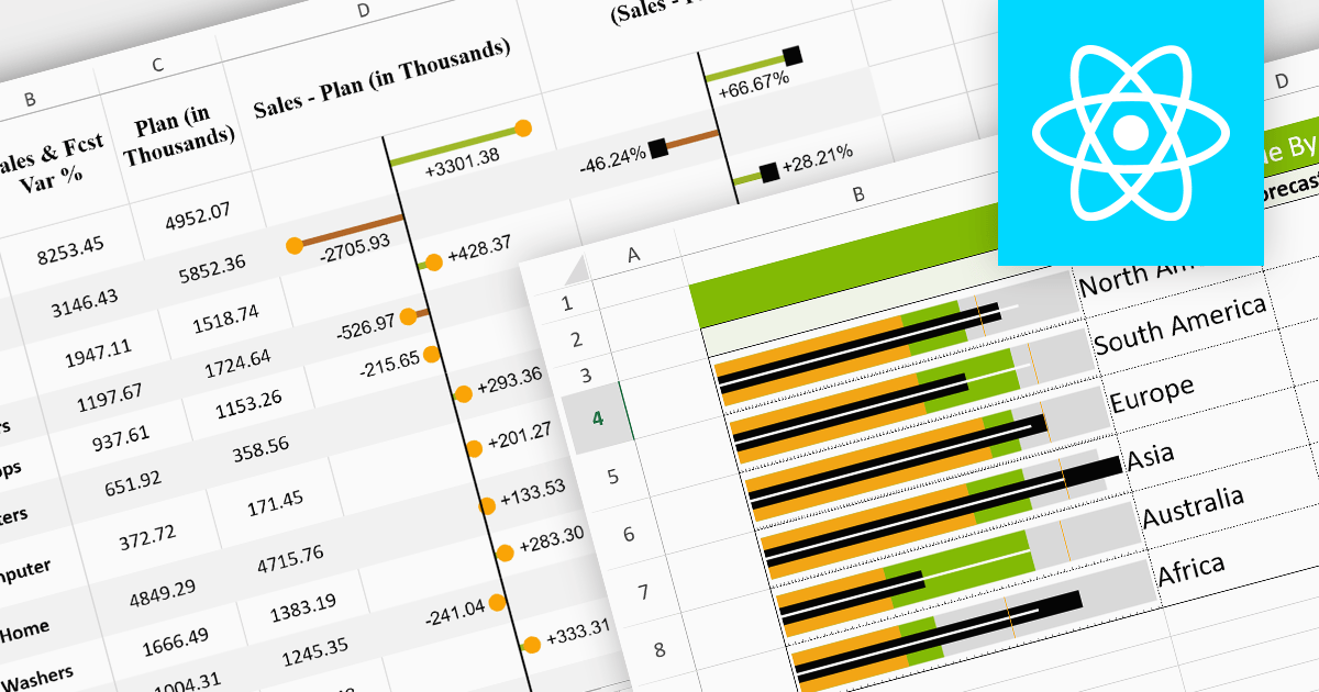
Sparklines are miniature charts embedded within the cells of a spreadsheet. Their compact size allows for dense visualizations, revealing trends and patterns in large datasets without sacrificing valuable screen space. Placed directly beside their corresponding data, they facilitate immediate comparisons and insights, enhancing understanding and communication. Their flexible nature allows for diverse chart types, from lines highlighting trends to columns showcasing comparisons, making them adaptable to various data presentations.
Here are some React spreadsheet controls that offer sparkline functionality:
For an in-depth analysis of features and price, visit our comparison of React spreadsheet controls.
전화 : 00798 14 800 6332
팩스 : +1 770 250 6199


