


공식 공급 업체
200 이상의 소프트웨어 개발처와 판매 계약을 맺은 공인 디스트리뷰터로서 합법적인 라이선스를 제공합니다.
모든 브랜드 보기.
영어로 계속 읽기:
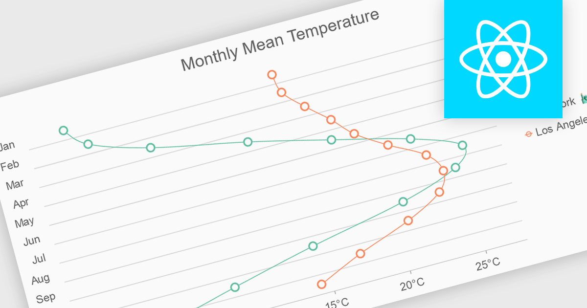
Spline charts are a type of line chart that uses smooth curves to connect data points, offering a visually appealing and intuitive representation of trends over time. Unlike traditional line charts with straight segments, spline charts emphasize the continuous nature of data, making them particularly effective for visualizing patterns, cycles, and gradual changes, commonly used in fields like finance, economics, and engineering to highlight the evolution of metrics and predict future trajectories
Several React chart controls offer spline charts including:
For an in-depth analysis of features and price, visit our React chart controls comparison.
전화 : 00798 14 800 6332
팩스 : +1 770 250 6199


