


공식 공급 업체
200 이상의 소프트웨어 개발처와 판매 계약을 맺은 공인 디스트리뷰터로서 합법적인 라이선스를 제공합니다.
모든 브랜드 보기.
영어로 계속 읽기:
Nevron Chart for SSRS is a robust charting tool for SQL Server Reporting Services, offering a variety of chart types such as bar, line, pie, and advanced options like financial and gauge charts. It enables users to create highly customizable, data-driven visuals integrated with their reports. Key features include multiple axes, customizable legends, and dynamic data grouping. Nevron Chart is ideal for organizations looking to enhance their reports with clear, actionable data visualizations, making it a valuable tool for data analysis and decision-making.
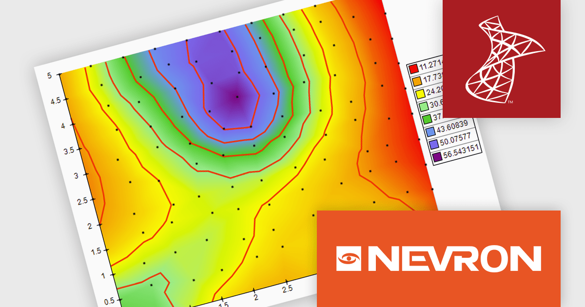
The Nevron Chart for SSRS 2024.1 release adds new Triangulated HeatMap that enables intuitive visualization of complex data by transforming X, Y, and Z coordinates into a smooth, color-interpolated heatmap. It automatically generates a Delaunay triangular network for optimal data representation and adds isolines to highlight equal elevation points, making it ideal for analyzing patterns in multi-dimensional datasets. This feature streamlines complex data analysis, offering faster insights and precise visualizations for informed decision-making.
To see a full list of what's new in 2024.1, see our release notes.
Nevron Chart for SSRS is licensed per developer and is available as a perpetual license with 1 year support and maintenance. See our Nevron Chart for SSRS licensing page for full details.
Nevron Chart for SSRS is available in the following products:
전화 : 00798 14 800 6332
팩스 : +1 770 250 6199


