


공식 공급 업체
200 이상의 소프트웨어 개발처와 판매 계약을 맺은 공인 디스트리뷰터로서 합법적인 라이선스를 제공합니다.
모든 브랜드 보기.
영어로 계속 읽기:
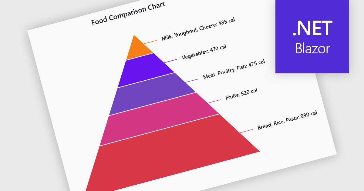
Pyramid charts are a type of graphical representation that organizes data hierarchically, with each layer of the pyramid representing a category or level within the dataset. These charts are particularly useful for displaying proportions, relationships, or workflows where data is segmented into tiers, such as organizational structures, population distributions, or sales funnels. Their clear visual hierarchy makes it easy to compare the relative size of categories or levels at a glance. Pyramid charts are beneficial in highlighting the relative contribution of parts to a whole, visualizing attrition or progression across stages, and presenting data in an intuitive and compact format. Popular use cases include illustrating business sales funnels, demographic distributions in marketing, and resource allocation in project management, making them a versatile tool in both strategic planning and data analysis.
Several Blazor chart controls offer pyramid charts including:
For an in-depth analysis of features and price, visit our Blazor chart controls comparison.
전화 : 00798 14 800 6332
팩스 : +1 770 250 6199


