


공식 공급 업체
200 이상의 소프트웨어 개발처와 판매 계약을 맺은 공인 디스트리뷰터로서 합법적인 라이선스를 제공합니다.
모든 브랜드 보기.
영어로 계속 읽기:
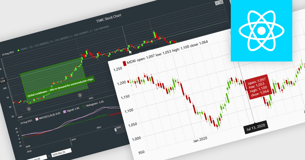
Candlestick charts are a powerful data visualization tool used to represent price movements within a specific time frame, displaying the opening, closing, high, and low prices in a single, compact graphical format. For software developers, integrating candlestick charts into applications enables users to analyze market trends, identify potential reversals, and make informed decisions with precise, actionable data. These charts are adaptable across various time frames, work seamlessly with technical indicators, and offer a clear visual representation that aids in interpreting complex financial data efficiently, making them an essential feature in trading platforms and analytics tools.
Several React chart controls offer candlestick chart support including:
For an in-depth analysis of features and price, visit our React chart controls comparison.
전화 : 00798 14 800 6332
팩스 : +1 770 250 6199


