


공식 공급 업체
200 이상의 소프트웨어 개발처와 판매 계약을 맺은 공인 디스트리뷰터로서 합법적인 라이선스를 제공합니다.
모든 브랜드 보기.
영어로 계속 읽기:
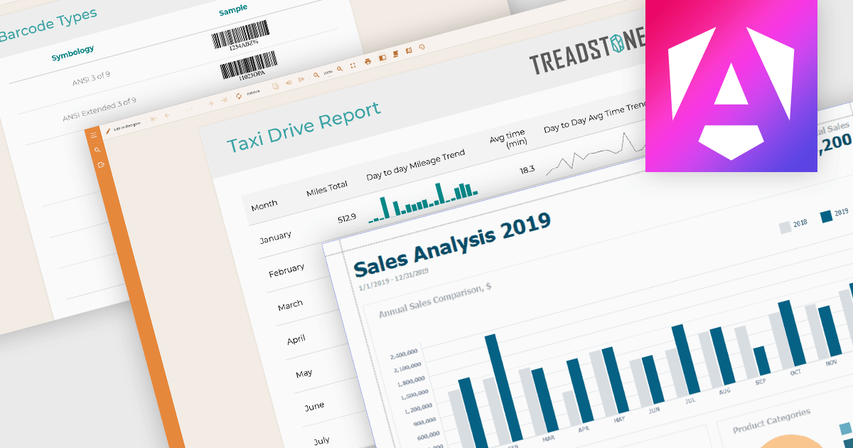
Data visualization plays a central role in reporting components by translating complex datasets into visual formats that are easier to understand and analyze. These tools help users identify patterns, monitor performance, and communicate key information at a glance. By integrating visuals directly into reports, organizations can enhance readability, support data-driven storytelling, and improve overall user engagement.
Common features include:
For an in-depth analysis of features and price, visit our Angular reporting components comparison.
전화 : 00798 14 800 6332
팩스 : +1 770 250 6199


