


공식 공급 업체
200 이상의 소프트웨어 개발처와 판매 계약을 맺은 공인 디스트리뷰터로서 합법적인 라이선스를 제공합니다.
모든 브랜드 보기.
영어로 계속 읽기:
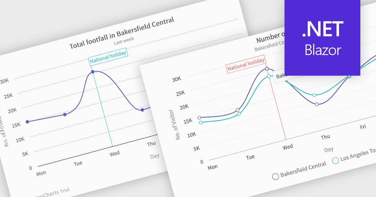
Spline charts are a type of line graph that displays continuous data points connected by smooth, curved lines, offering a visually fluid representation of trends and changes over time. This smoothing effect helps to highlight the overall trajectory of the data and can provide estimations of values between plotted points. Multi-Series Spline Charts extend this functionality by plotting multiple related datasets on the same graph, enabling direct visual comparison of their trends and the identification of correlations or divergences.
Several .NET Blazor chart controls offer spline charts including:
For an in-depth analysis of features and price, visit our .NET Blazor chart controls comparison.
전화 : 00798 14 800 6332
팩스 : +1 770 250 6199


