


공식 공급 업체
200 이상의 소프트웨어 개발처와 판매 계약을 맺은 공인 디스트리뷰터로서 합법적인 라이선스를 제공합니다.
모든 브랜드 보기.
영어로 계속 읽기:
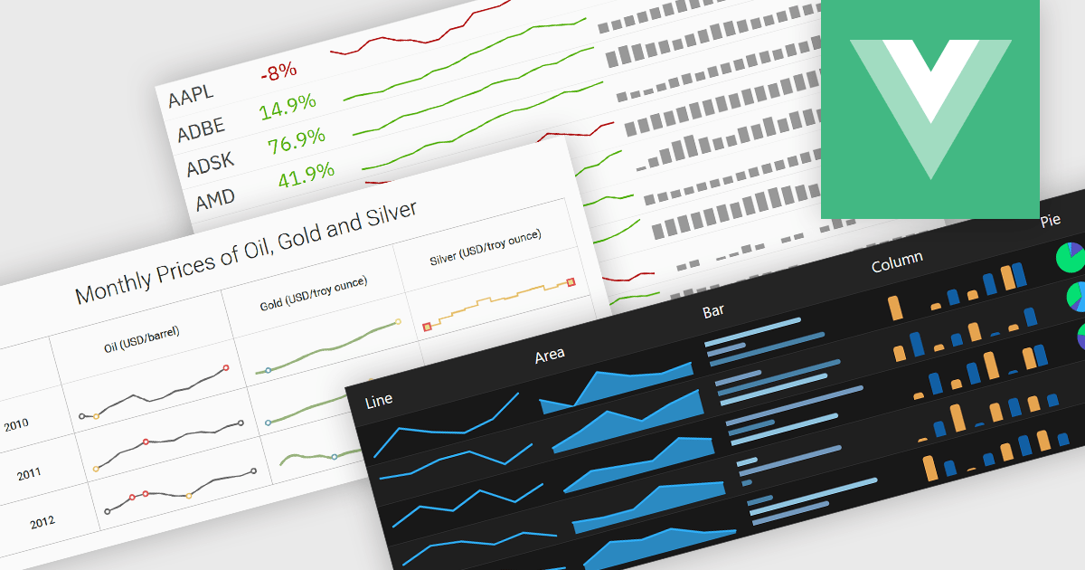
Typically embedded within text, tables/grids, or dashboards, sparklines are small-scale, data-driven graphics that present trends, patterns, or fluctuations within a dataset in a visually compact format. Unlike full-scale charts, sparklines do not include axes or labels, allowing them to present time-series or categorical data in a condensed form to deliver immediate visual cues without interrupting the flow of surrounding content. This design makes sparklines well-suited for highlighting patterns and changes over time or comparing multiple values side-by-side whilst helping users quickly identify key insights without leaving the context of the data.
Several Vue.js charting components offer sparkline functionality, including:
For an in-depth analysis of features and price, visit our comparison of Vue.js chart components.
전화 : 00798 14 800 6332
팩스 : +1 770 250 6199


