


공식 공급 업체
200 이상의 소프트웨어 개발처와 판매 계약을 맺은 공인 디스트리뷰터로서 합법적인 라이선스를 제공합니다.
모든 브랜드 보기.
영어로 계속 읽기:
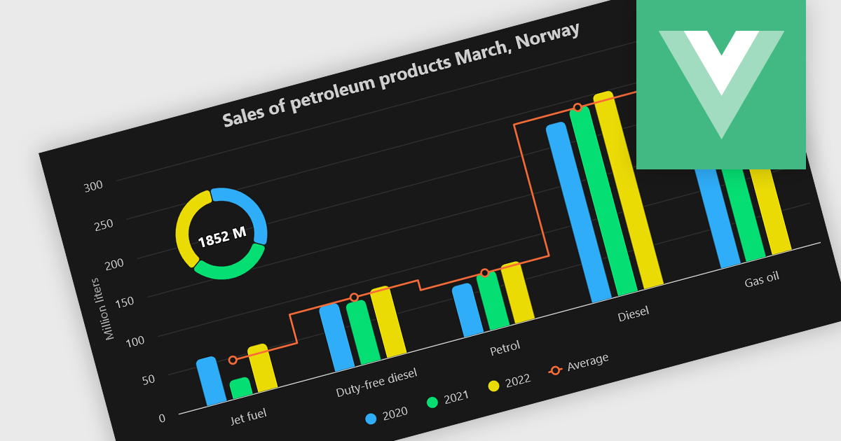
A combination chart or combo chart is a versatile type of data visualization that displays multiple chart types, such as columns, lines, or areas, to represent different data series within a single graphic. Combination charts are especially useful in scenarios where a single data type cannot fully convey the complexity of the dataset. By presenting different series types together, combination charts enhance the clarity and depth of insight available in a single view, be it on the same axis or across dual axes. This helps users to analyze complex relationships, trends and correlations between metrics more effectively than separate charts would allow.
Several Vue.js chart components allow you to combine series types on the same chart, including:
For an in-depth analysis of features and price, visit our comparison of Vue.js chart components.
전화 : 00798 14 800 6332
팩스 : +1 770 250 6199


