


공식 공급 업체
200 이상의 소프트웨어 개발처와 판매 계약을 맺은 공인 디스트리뷰터로서 합법적인 라이선스를 제공합니다.
모든 브랜드 보기.
영어로 계속 읽기:
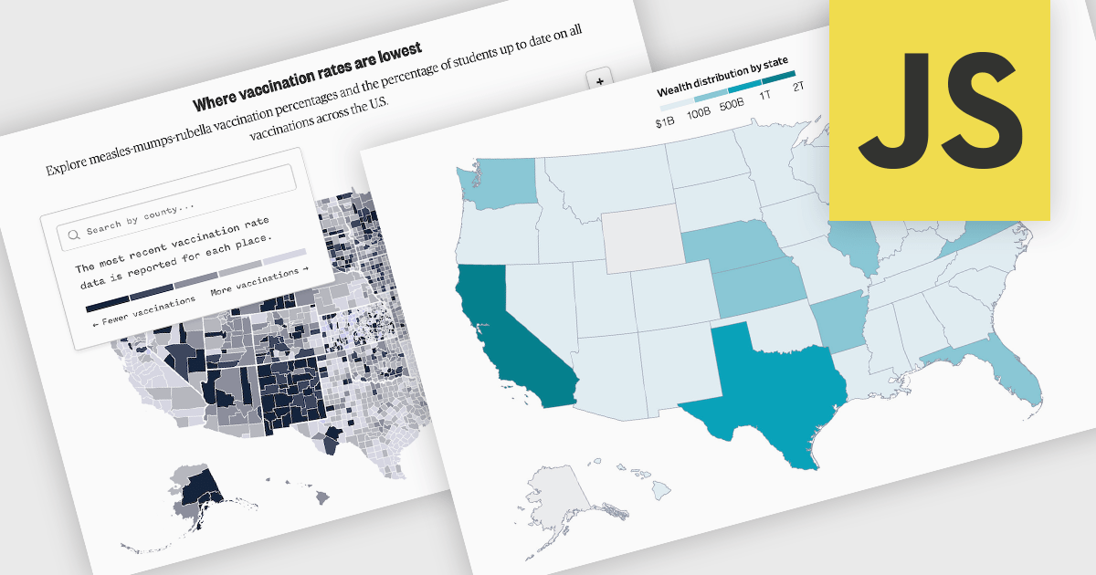
A map chart is a data visualization tool that displays information across geographic regions, helping users uncover spatial patterns, trends, and relationships. By plotting values onto countries, states, or custom areas, it transforms complex datasets into clear, location-based insights. Features like color-coding, zooming, and drill-down navigation allow for interactive exploration and comparison across regions. Common use cases include analyzing sales performance by region, tracking market coverage, visualizing customer distribution, or monitoring demographic trends, all of which support data-driven decision-making with a strong geographic context.
Several JavaScript chart controls offer map charts including:
For an in-depth analysis of features and price, visit our JavaScript chart controls comparison.
전화 : 00798 14 800 6332
팩스 : +1 770 250 6199


