


공식 공급 업체
200 이상의 소프트웨어 개발처와 판매 계약을 맺은 공인 디스트리뷰터로서 합법적인 라이선스를 제공합니다.
모든 브랜드 보기.
영어로 계속 읽기:
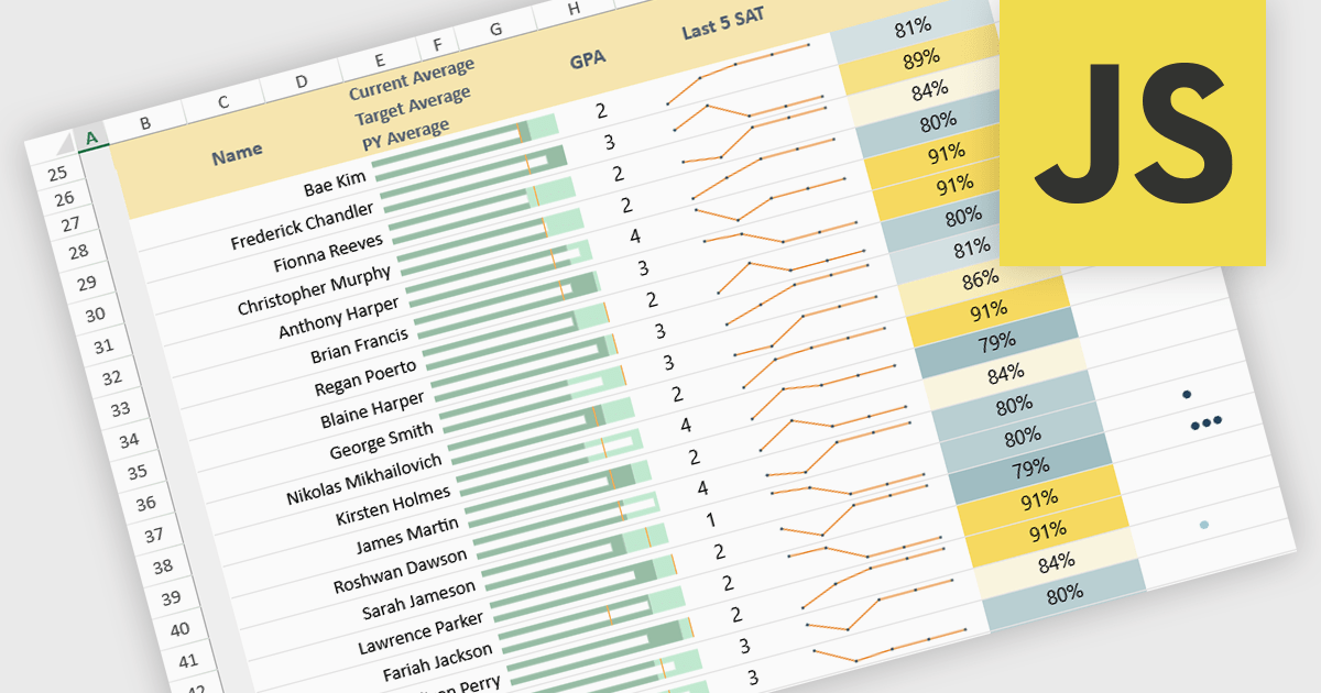
Sparklines in spreadsheets are small, in-cell charts that provide a concise visual summary of data trends without the need for full-sized graphs. They help users quickly identify patterns such as growth, decline, and volatility, making complex information easier to understand at a glance. Because sparklines update automatically with underlying data, they improve real-time analysis and are ideal for dashboards, performance tracking, and financial reporting. Common use cases include monitoring monthly sales performance, comparing product trends side by side, spotting anomalies in operational metrics, and enhancing executive summaries with clear, space-efficient visual context.
Several JavaScript spreadsheet controls offer sparkline functionality:
For an in-depth analysis of features and price, visit our comparison of JavaScript spreadsheet controls.
전화 : 00798 14 800 6332
팩스 : +1 770 250 6199


