표준 차트로 데이터를 명확하게 제시하세요

3월 10, 2026
익숙한 차트 유형을 사용하여 애플리케이션 데이터 전반의 추세, 비율, 관계, 프로세스 단계를 표시하세요.

영어로 계속 읽기:

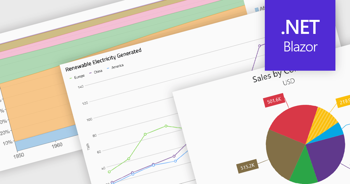
Standard chart types form the foundation of most charting components, providing widely recognized visual formats for representing numerical and categorical data. These charts help developers present trends, comparisons, distributions, and relationships in ways that are immediately understandable to end users. Because these visualizations are familiar across industries, they are commonly included as built-in options in charting libraries and dashboards, allowing applications to communicate insights clearly while supporting interactive features such as tooltips, legends, and dynamic data updates.

Common chart types include:

  • Area charts display quantitative trends over time while emphasizing cumulative values through filled regions beneath a line.
  • Column & Bar charts compare values across categories using vertical or horizontal bars, making them suitable for ranking and side-by-side comparisons.
  • Funnel charts represent sequential stages in a process, typically used to visualize conversion rates or drop-off between steps.
  • Line charts illustrate continuous data trends across time or ordered categories using connected data points.
  • Pie charts show proportional relationships within a whole by dividing a circle into segments representing percentage contributions.
  • Radar & Polar charts plot multiple variables on circular axes, enabling comparison of multivariate data across several dimensions.
  • Scatter & Bubble charts visualize relationships between variables by plotting points across two axes, with bubble variations adding a third value through marker size.

For an in-depth analysis of features and price, visit our Blazor charts components comparison.

Explore Blazor Standard Charts