


공식 공급 업체
200 이상의 소프트웨어 개발처와 판매 계약을 맺은 공인 디스트리뷰터로서 합법적인 라이선스를 제공합니다.
모든 브랜드 보기.
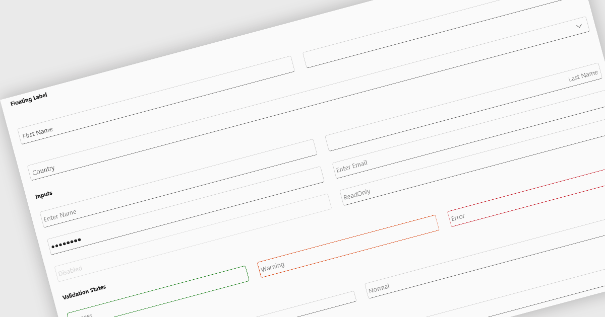
Text box components, also known as text fields, are essential elements allowing users to input and edit text within a user interface. They play a crucial role in forms and dialogs by facilitating data entry, improving user experience through clear labeling and validation, and ultimately enabling users to interact and provide information to the system.
Several Blazor data editor collections offer text box components including:
For an in-depth analysis of features and price, visit our Blazor data editors comparison.
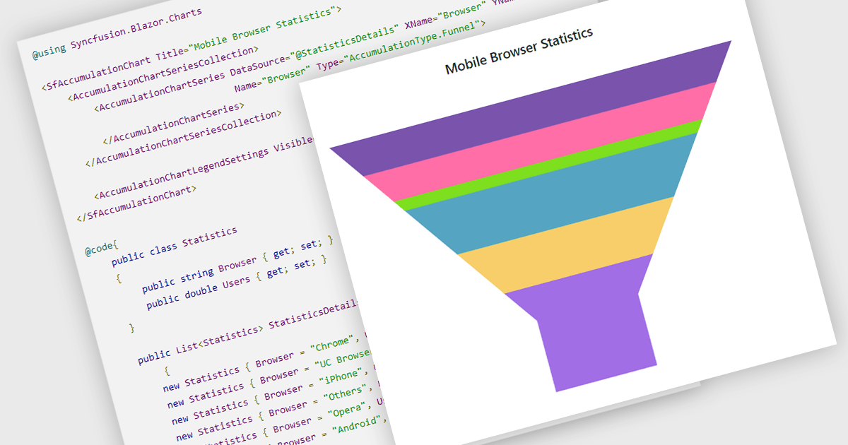
Funnel charts are a type of data visualization that depicts data in a linear process that often narrows down at each stage, resembling a funnel. They are especially useful for emphasizing steps in a process, displaying drop-off rates, and finding bottlenecks in workflows. Funnel charts are useful because they visually show the continual reduction of data throughout phases, providing clear insights into conversion rates and process efficiency. This enables engineers and business analysts to quickly find areas for improvement, optimize procedures, and create more accurate data-driven decisions.
Several .NET Blazor chart controls offer funnel charts including:
For an in-depth analysis of features and price, visit our .NET Blazor chart controls comparison.
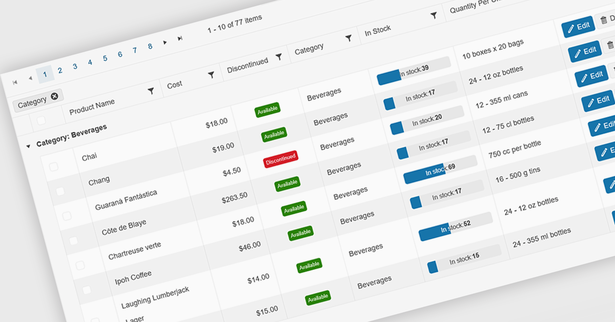
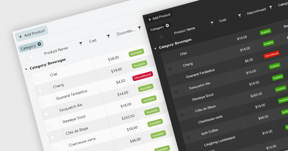
Grid paging is a user interface technique that divides large datasets into smaller, manageable pages within a grid or table. This significantly enhances performance by reducing the amount of data processed and displayed at once, improving load times and responsiveness, particularly when dealing with extensive datasets. Paging also enhances user experience by providing a clear structure for navigating through information, helping to prevent the user from being overwhelmed with excessive data.
Several Blazor grid controls offer paging support including:
For an in-depth analysis of features and price, visit our Blazor grid controls comparison.
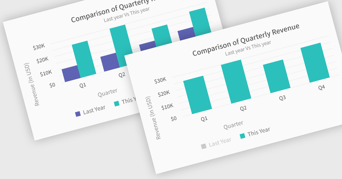
In chart controls, show/hide series functionality empowers developers to dynamically control the visibility of individual data sets. This allows users to focus on specific series, enhancing data comprehension and analysis. By selectively hiding irrelevant series, developers can declutter the chart, making it easier for users to identify trends and patterns within the data of interest.
Several .NET Blazor chart controls offer show/hide series support including:
For an in-depth analysis of features and price, visit our .NET Blazor chart controls comparison.
UI suites with theming support provide pre-built themes and the ability to customize them. This lets you easily change the look and feel of your application, from colors and fonts to overall design style (like Material Design or Bootstrap), ensuring a cohesive user experience that aligns with your brand identity. Theming not only improves aesthetics but also simplifies development by offering a pre-defined styling base and reducing the need for extensive custom styling.
Several Blazor UI suites offer Theming controls including:
For an in-depth analysis of features and price, visit our Blazor UI suites comparison.
전화 : 00798 14 800 6332
팩스 : +1 770 250 6199


