


공식 공급 업체
200 이상의 소프트웨어 개발처와 판매 계약을 맺은 공인 디스트리뷰터로서 합법적인 라이선스를 제공합니다.
모든 브랜드 보기.
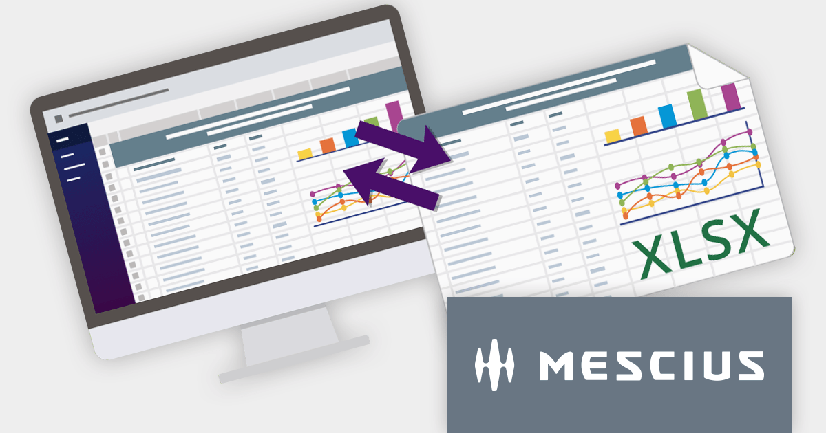
SpreadJS is a complete enterprise JavaScript spreadsheet solution used to create financial reports and dashboards, budgeting and forecasting models, scientific, engineering, healthcare, education, science lab notebooks, and other similar JavaScript business applications. Spreadsheets are a primary medium for displaying and sharing vital company data and it is crucial that this data can be easily viewed and updated in your JavaScript applications.
In this blog post, MESCIUS Product Manager Kevin Ashley shows you how to leverage the power of SpreadJS to import and export Excel spreadsheets into your enterprise web applications. Steps include:
View the complete blog and start working directly with Excel files in your JavaScript applications.
For more information visit our SpreadJS product page.
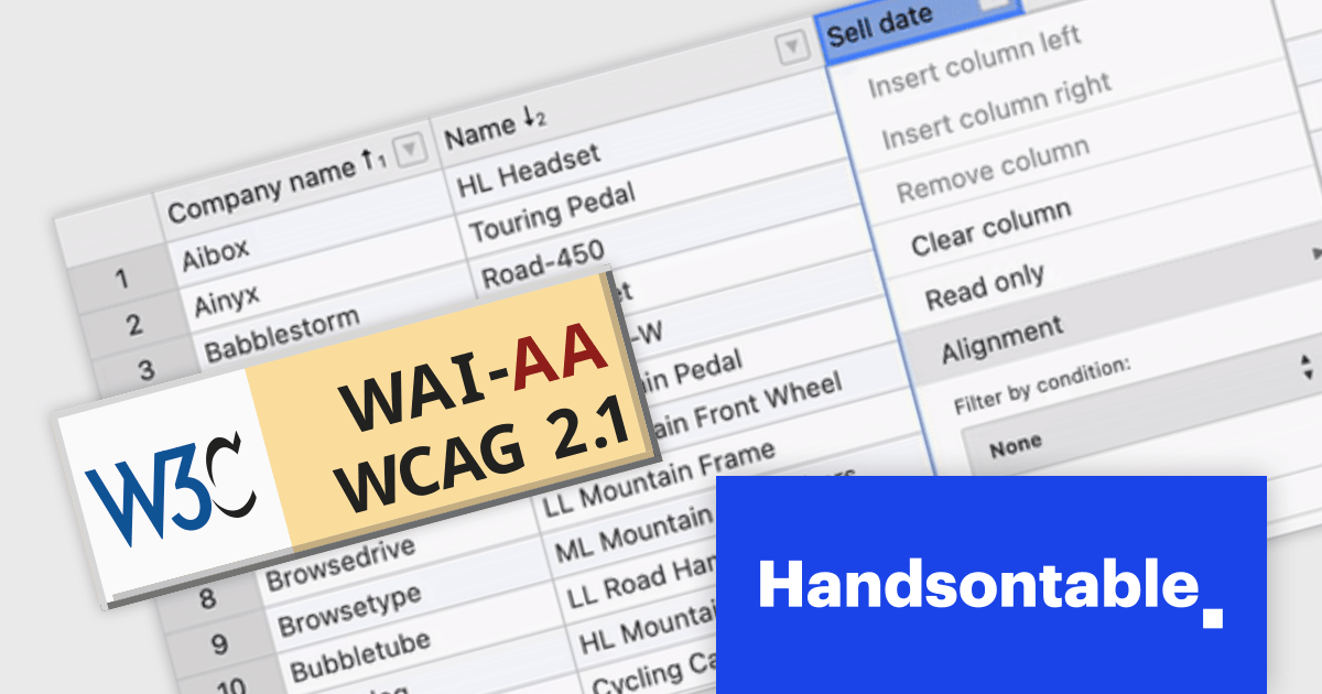
Handsontable is a JavaScript data grid component that provides a spreadsheet-like user experience for web applications. It allows developers to easily integrate data tables into their web pages, enabling users to manipulate data in a familiar and intuitive way.
Handsontable V14 now meets Web Content Accessibility Guidelines (WCAG) 2.1 AA standards, making it easier for people with disabilities to use the grid. This release also enhances screen reader compatibility by incorporating ARIA attributes into the HTML markup, ensuring seamless navigation for users of NVDA and JAWS on Windows, and VoiceOver on macOS.
To see a full list of what's new in version 14.0.0, see our release notes.
For more information, visit our Handsontable product page.

SmartClient is a comprehensive JavaScript component suite compatible with React, Vue, Angular, and more, that empowers you to craft large-scale, high-productivity Enterprise web applications. Its modern class system fosters clean encapsulation of application modules and screens, resulting in a more maintainable and comprehensible codebase.
In this blog post, Alex Fashakin demonstrates how to use SmartClient's built-in feature to save search preferences on grids. Steps include:
Read the complete blog to learn how to boost productivity with the SmartClient saved search feature.
For more information visit our SmartClient product page.
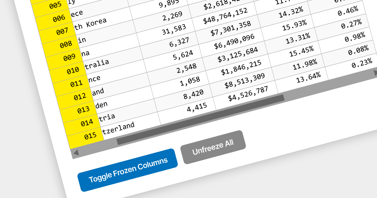
Locked column functionality (also known as frozen or pinned column) allows users to keep one or more columns static while scrolling horizontally through a grid. This is an essential feature for comparing data across a wide grid, ensuring that key information, such as a row identifier column, remains in view.
Several React grid components offer column freezing functionality including:
For an in-depth analysis of features and price, visit our comparison of React Grid components.

amCharts 5: Stock Chart provides analytical tools for displaying time-based data, be it financial, stock or otherwise. It is a ready-made library that allows you to add interactive financial charts to a vast array of applications.
amCharts v5.5.3 adds built-in support for the Stochastic Momentum Index (SMI) to its bundled indicator control, allowing you to add the SMI to your charts via a simple user interface. This indicator reduces false signals by measuring the distance between the current closing price and the midpoint of the high/low price range. The SMI is a valuable technical indicator that can help traders identify potential trend reversals, capture momentum shifts, and make more informed trading decisions. Adding the SMI to your stock charts can help users gain a competitive edge in the market.
To see a full list of what's new in v5.5.3, see our release notes.
For more information, see our amCharts 5: Stock Chart product page.
전화 : 00798 14 800 6332
팩스 : +1 770 250 6199


