


공식 공급 업체
200 이상의 소프트웨어 개발처와 판매 계약을 맺은 공인 디스트리뷰터로서 합법적인 라이선스를 제공합니다.
모든 브랜드 보기.
SmartClient is a comprehensive JavaScript component suite compatible with React, Vue, Angular, and more, that empowers you to craft large-scale, high-productivity Enterprise web applications. It provides a comprehensive set of tools for developers, including advanced UI components, robust data management capabilities, and seamless integration with modern backend technologies. Key features include dynamic data fetching, customizable grids, and a responsive interface for a wide range of devices. SmartClient enables developers to create applications with optimized performance, scalability, and a superior user experience. Ideal for enterprise-grade use cases, such as financial analytics, inventory management, and real-time reporting, SmartClient empowers organizations to deliver feature-rich applications that handle complex data requirements with ease.
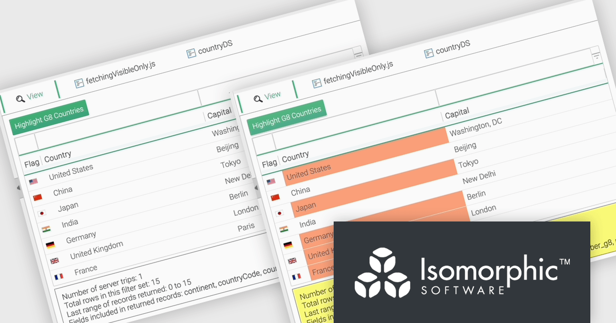
The SmartClient 13.1 update introduces the Fetch Only Needed Data feature, enabling developers to optimize performance in data-intensive applications by dynamically retrieving only the fields required at a given moment. This targeted data retrieval reduces unnecessary data transfers, minimizes backend load, and enhances responsiveness. Developers can configure grids to fetch additional fields on demand, ensuring efficient resource usage while maintaining flexibility to adapt to dynamic application requirements. By integrating this feature, applications can scale effectively, provide a smoother user experience, and meet the demands of high-performance environments.
To see a full list of what’s new in version 13.1, see our release notes.
SmartClient is licensed per developer and is available as both perpetual and subscription licenses. Product updates and technical support is also available. See our SmartClient licensing page for full details.
For more information, visit our SmartClient product page.

LightningChart JS is a high-performance JavaScript charting library optimized for real-time data visualization. Leveraging WebGL and GPU acceleration, it enables developers to create interactive, complex charts capable of handling massive datasets with high refresh rates. Ideal for applications demanding rapid data updates and smooth interactions, LightningChart JS provides a robust API for customization and integration into web-based projects.
The LightningChart JS v6.1 update introduces the Parallel Coordinate Chart, a powerful tool designed for advanced data visualization and exploration. It allows developers to work with large-scale datasets, supporting over 100,000 series and multiple axes while maintaining high performance. This chart type is optimized for real-time data input, enabling smooth updates at high stream rates. With features like value-based coloring, range-based highlighting, and interactive cursors, it provides an intuitive way to analyze and interpret complex data relationships, making it an essential addition for creating data-driven applications.
To see a full list of what's new in v6.1, see our release notes.
LightningChart JS is licensed based on method of deployment with options including SaaS Developer Licenses, Application Developer Licenses, and Publisher Developer Licenses. Each license is perpetual and includes 1 year subscription for technical support and software updates. See our LightningChart JS licensing page for full details.
Learn more on our LightningChart JS product page.
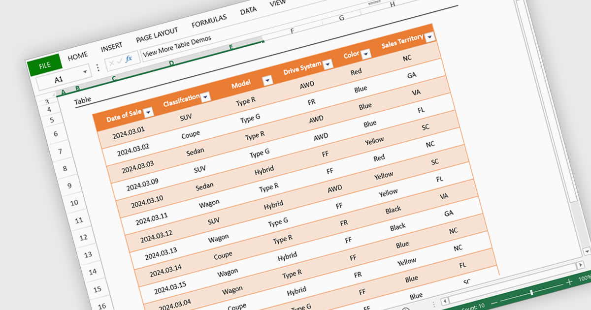
Spreadsheet display functionality allows developers to seamlessly integrate dynamic, tabular data into their applications. This capability enables users to visualize, analyze, and manipulate data directly within the application's interface, streamlining workflows and enhancing user experience. By providing a familiar and intuitive spreadsheet environment, developers can significantly improve data accessibility, comprehension, and productivity for their users.
Several Vue.js spreadsheet controls offer the ability to display spreadsheets including:
For an in-depth analysis of features and price, visit our Vue.js spreadsheet controls comparison.
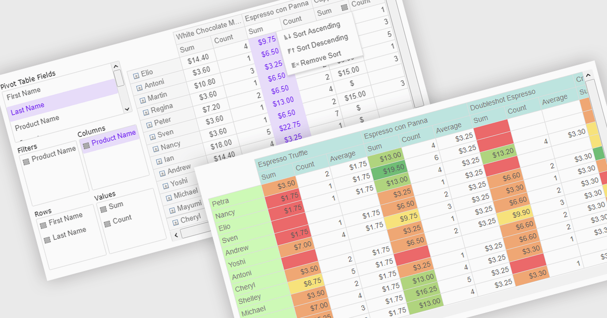
Pivot grids or tables are dynamic tools that allow users to organize and analyze large datasets interactively by allowing them to group, filter, and summarize data across multiple dimensions. This functionality makes it easier to spot patterns and insights, supporting faster decision-making and data processing. Common use cases include help to identify trends in product performance or customer demographics, or financial applications, where users can analyze and forecast expense patterns. Pivot grids empower users with an adaptable and user-friendly interface, offering both high-level overviews and detailed insights with minimal effort.
Several Vue.js UI suites offer pivot grid components including:
For an in-depth analysis of features and price, visit our comparison of Vue.js UI suites.

Charts in a dashboard component transform raw data into clear, actionable visuals, making it easy to monitor trends, track performance, and spot critical insights in real time. These interactive tools support various use cases, from sales forecasting and KPI tracking to project progress monitoring and customer behavior analysis. By offering a centralized, intuitive view of essential metrics, charts help teams make faster, data-driven decisions, optimize operational efficiency, and respond proactively to emerging opportunities or issues.
Several JavaScript products offer chart components with dashboard support including:
Explore our range of JavaScript dashboard components.
Need help to find the right software license, upgrade or renewal? Call, Email, or Live Chat with our experts.
전화 : 00798 14 800 6332
팩스 : +1 770 250 6199


