


공식 공급 업체
200 이상의 소프트웨어 개발처와 판매 계약을 맺은 공인 디스트리뷰터로서 합법적인 라이선스를 제공합니다.
모든 브랜드 보기.
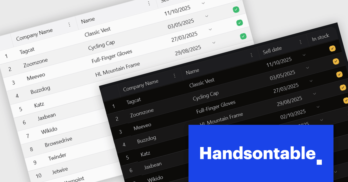
Handsontable is a JavaScript library designed to help developers build interactive data grids into their web applications. Offering a familiar spreadsheet-like interface, it allows users to edit, sort, and filter data with ease. Highly customizable and compatible with popular frameworks like React and Angular, Handsontable empowers developers to build robust data manipulation features into their web applications.
The 15.0.0 release introduces a significant enhancement in terms of styling flexibility. The underlying CSS framework has been entirely overhauled, granting developers unprecedented control over the visual presentation of their grids. This update boasts a comprehensive library of over 180 CSS variables, allowing for meticulous customization of every visual aspect. From subtle adjustments to font sizes and colors to more radical transformations of borders, cell padding, and overall layout, users can seamlessly align the table's appearance with their specific design preferences and branding guidelines. This level of granular control empowers designers and developers to create truly unique and visually compelling data tables that seamlessly integrate with their existing user interfaces.
To see a full list of what's new in version 15.0.0, see our release notes.
Handsontable is licensed per developer and is available as an Annual or Perpetual license with 1 year support and maintenance. See our Handsontable licensing page for full details.
For more information, visit our Handsontable product page.
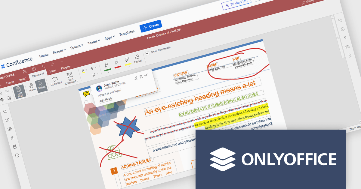
The ONLYOFFICE Connector for Confluence Cloud seamlessly integrates professional document editing and collaboration tools into the Atlassian Confluence ecosystem. It allows users to create, edit, and co-author documents, spreadsheets, and presentations in real-time without leaving their Confluence workspace. Designed to support a variety of file formats, the connector provides robust tools for team collaboration, including simultaneous editing, version control, and advanced formatting options. With its intuitive interface and integration capabilities, the ONLYOFFICE Connector streamlines workflows, enhances communication, and boosts productivity for teams managing projects, sharing knowledge, or collaborating on documents.
The ONLYOFFICE Connector for Confluence Cloud v1.2.0 update introduces powerful PDF annotation features designed to enhance document collaboration within development teams. These features enable precise feedback and efficient reviews by allowing users to highlight, underline, and strike through text, add comments, and create freehand drawings directly within PDFs. By centralizing annotation capabilities in Confluence, the update eliminates the need for external tools, streamlining workflows and maintaining version control. This functionality is particularly valuable for developers working with technical documentation, contracts, or design specifications, as it ensures clarity, fosters collaboration, and accelerates project timelines.
To see a full list of what's new in ONLYOFFICE Docs Enterprise Edition v8.0.1 with Confluence Connector v8.2.2 (1.2.0), see our release notes.
ONLYOFFICE Docs Enterprise Edition with Confluence Connector is licensed per server and is available as an annual license with 1 year of support and updates, or as a perpetual license with 3 years of support and updates. See our ONLYOFFICE Confluence connector licensing page for full details.
For more information, see our ONLYOFFICE Confluence Connector product page.
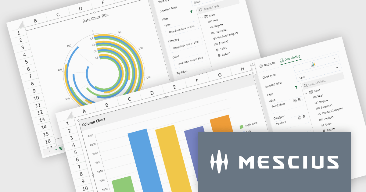
SpreadJS by MESCIUS is a high-performance JavaScript spreadsheet component designed to seamlessly integrate Excel-like functionality into web applications. It empowers developers to deliver robust spreadsheet experiences within their applications, complete with features like data import/export, complex formulas, conditional formatting, and extensive customization options. To extend its capabilities, SpreadJS offers a variety of optional add-ons, such as tools for reporting, charting, and data management. SpreadJS caters to a wide range of use cases, from financial modeling and data analysis to project management and interactive dashboards, ultimately allowing developers to build feature-rich and user-friendly web applications.
SpreadJS v18 introduces the DataCharts Add-On, a powerful new feature that lets you bind charts directly to external data managed by the Data Manager, eliminating the need to embed data within the workbook. This innovation streamlines workflows by reducing redundancy, simplifying updates, and enabling dynamic charting for both standalone spreadsheets and reports. For users of the ReportSheets Add-On, the DataCharts Add-On is seamlessly integrated, enhancing report creation with interactive, data-driven visuals. Developers seeking a flexible solution for external data visualization in other contexts can license the DataCharts Add-On separately, making it ideal for projects that demand adaptable, visually engaging charts.
For more information see our release notes.
SpreadJS is licensed per developer and includes 1 Year Maintenance (major and minor version releases and unlimited support phone calls). SpreadJS requires an Annual or Perpetual Deployment License. The optional Add-ons are available at an additional cost, and require a SpreadJS license. See our SpreadJS licensing page for full details.
For more information, visit our SpreadJS product page.
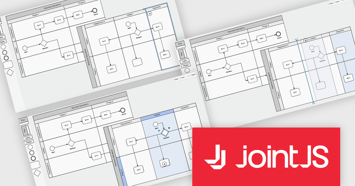
JointJS+ is a diagramming library that offers advanced features like custom shapes, data binding, and advanced layout algorithms, enabling you to create complex, interactive, and visually appealing diagrams. It includes a ready-to-use demo application that showcases its functionality and serves as a starting point for your own diagramming projects.
The JointJS+ v4.1 update introduces significant improvements to Business Process Model and Notation (BPMN) modeling, enabling developers to work more efficiently with enhanced pools, swimlanes, and milestones. These enhancements streamline the process of inserting, resizing, and reordering elements while maintaining content alignment and preventing out-of-bound resizing. The addition of vertical pools and milestones with drag-and-drop functionality further expands modeling capabilities, offering greater flexibility to meet diverse design requirements. Features like content awareness, automatic adjustments, and real-time previews ensure accuracy and ease of use, empowering developers to create precise and dynamic process diagrams with minimal effort.
To see a full list of what's new in v4.1, see our release notes.
JointJS+ is licensed per developer and is available as a Perpetual license with 1 year support and maintenance. See our JointJS+ licensing page for full details.
Learn more on our JointJS+ product page.

ComponentSource and Dynamsoft have enjoyed a successful 20-year partnership focused on delivering document capture and barcode reading tools to the global developer community. This long-standing cooperation demonstrates a shared commitment to providing developers with tools that enable precise data extraction, optimize workflow automation, and enhance the accuracy and efficiency of application processes.
Dynamsoft is a leading provider of software development kits (SDKs), specializing in barcode scanning, document capture, and TWAIN scanning solutions. Its core competencies lie in delivering high-performance, scalable solutions to enterprise-level financial, logistics, retail, and healthcare companies. Dynamsoft offers tools that enable seamless integration of computer vision functionalities into web, desktop, and mobile applications, empowering developers to build high-performance, scalable solutions tailored to diverse enterprise needs. Choosing Dynamsoft products enables businesses to drive digital transformation, improve operational efficiency, and achieve significant cost savings.
ComponentSource, a leading distributor of software components and development tools, has played a crucial role in expanding the reach of the Dynamsoft range. Through this partnership, ComponentSource has helped make products such as Dynamic Web TWAIN and Dynamsoft Barcode Reader accessible to a broader audience of developers.
The enduring collaboration between ComponentSource and Dynamsoft has had a significant, positive impact on the developer community by making advanced imaging and barcode scanning tools more accessible. As we celebrate this two decade partnership, we look forward to strengthening our relationship and continuing to provide developers worldwide with innovative, reliable solutions to meet their evolving technology needs.
Learn more about Dynamsoft.
전화 : 00798 14 800 6332
팩스 : +1 770 250 6199


