





공식 공급 업체
200 이상의 소프트웨어 개발처와 판매 계약을 맺은 공인 디스트리뷰터로서 합법적인 라이선스를 제공합니다.
모든 브랜드 보기.
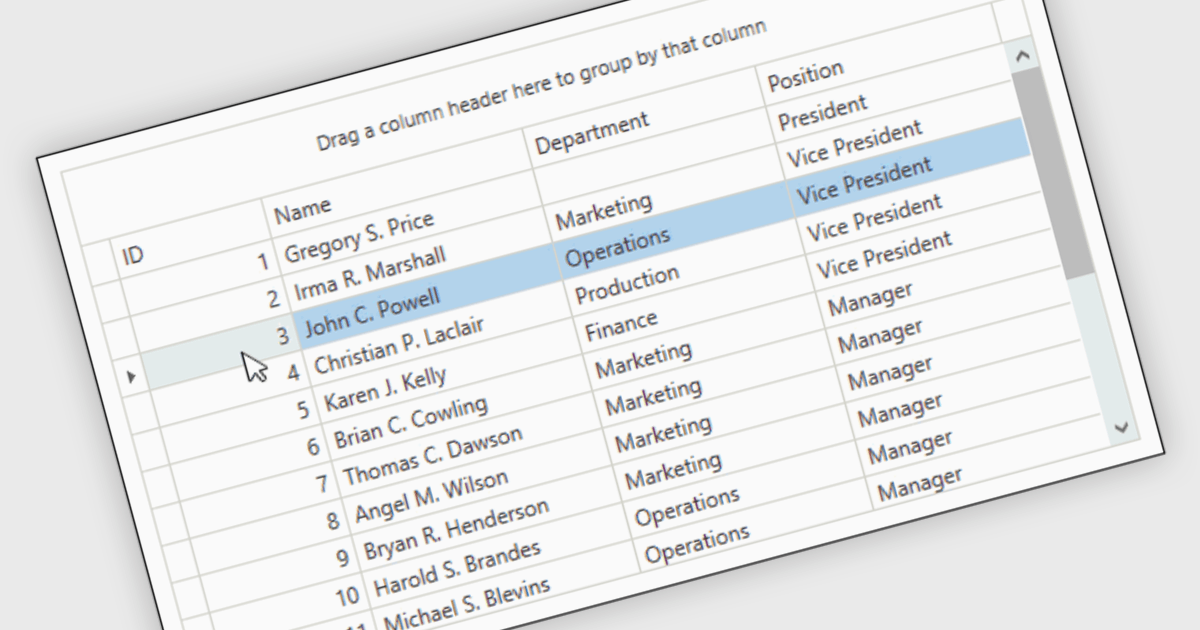
Reorder Rows is a WPF grid feature that lets users move a row by changing its display order directly in the control, usually through drag-and-drop, so data can be arranged in a meaningful custom sequence. For .NET developers, it is useful when row position represents business intent, such as task priority, processing order, or a user-defined layout, because it supports direct interaction while reducing the need for separate ordering controls or additional code for manual sequencing.
Many .NET WPF grid controls contain reorder row functionality including:
For an in-depth analysis of features and price, visit our comparison of .NET WPF grid controls.
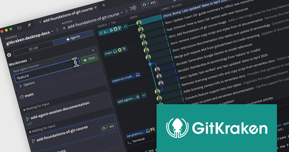
GitKraken is a suite of developer tools built around Git, a popular version control system. It offers a graphical user interface (GUI) that allows developers to interact with Git repositories visually instead of relying on the command line. This simplifies complex Git workflows like resolving merge conflicts and visualizing code history, making Git more accessible and efficient for developers of all experience levels.
The GitKraken Desktop V12.0.0 update introduces the Agent Sessions View, providing developers with a centralized interface to oversee multiple AI-driven workflows simultaneously, improving development efficiency by consolidating visibility into worktree status, branch progress, and associated pull requests while also delivering real time insight into agent activity.
To see a full list of what's new in V12.0.0, see our release notes.
GitKraken Desktop is licensed per user as an Annual license with free updates and technical support. See our GitKraken licensing page for full details.
Learn more on our GitKraken product page.
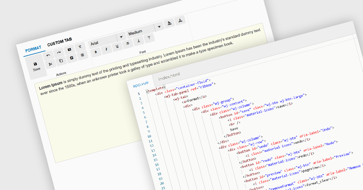
Ribbon bars are graphical user interface (GUI) patterns that organize commands and features into a series of tabs, each containing grouped controls such as buttons, dropdowns, and galleries. Widely adopted in modern software applications, ribbons present functionality in a structured and visually accessible layout to improve discoverability. This approach reduces reliance on deeply nested menus and toolbars, enabling users to locate relevant tools more quickly based on context.
Several Vue.js user interface suites provide ribbon functionality, including:
For an in-depth analysis of features and price, visit our comparison of Vue.js UI suites.
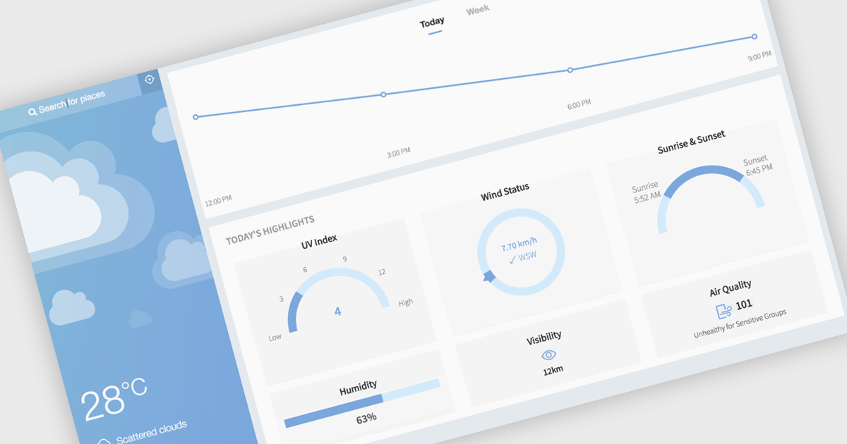
Gauge charts are data visualizations that display a single value within a defined range, making it easy to understand status or progress at a glance. Often styled like a speedometer, they show where a value sits between minimum and maximum thresholds, using color to indicate different levels. This provides clear, immediate insight without detailed analysis. Key benefits include quick understanding, intuitive design, and strong visual emphasis on limits or targets. Gauge charts are commonly used in dashboards to track KPIs, monitor targets, show completion percentages, or highlight key metrics in a simple and effective way.
Several React charting components also offer gauges, including:
For an in-depth analysis of features and price, visit our comparison of React chart components.
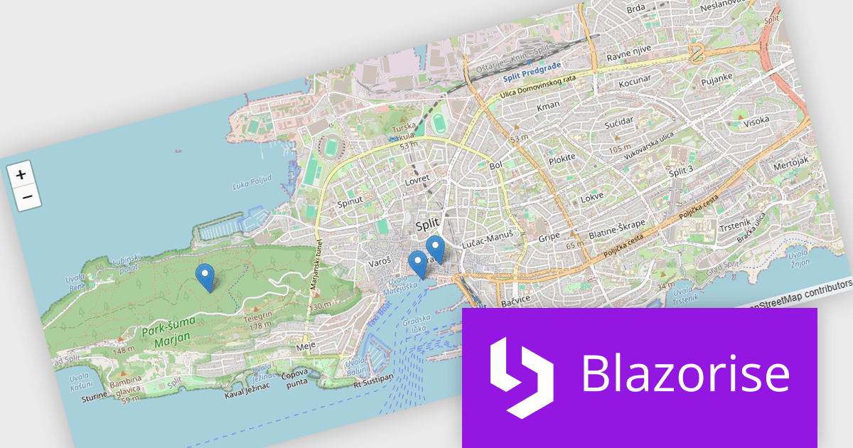
Blazorise is a versatile component library that empowers developers to build modern and feature-rich web applications using Blazor, a client-side web development framework from Microsoft. It offers a comprehensive collection of user interface components, including buttons, forms, charts, and navigation elements, all built with accessibility and responsiveness in mind.
The Blazorise 2.1 update introduces a new maps component that enables developers to build interactive mapping functionality using a provider-neutral component model, allowing applications to remain independent of any specific mapping library. By abstracting core concepts such as maps, layers, markers, and shapes, developers can implement rich, data-driven map experiences with support for events, programmatic control, and synchronization between application state and the rendered map, while retaining the flexibility to adopt additional mapping providers in the future without requiring significant code changes.
To see a full list of what’s new in version 2.1, see our release notes.
Blazorise is licensed per developer and includes a 1 year subscription for updates and support. Professional, Enterprise, and Enterprise Plus editions are available, each offering tailored levels of support and service to meet varying business needs. See our Blazorise licensing page for full details.
For more information, visit our Blazorise product page.
전화 : 00798 14 800 6332
팩스 : +1 770 250 6199


