


공식 공급 업체
200 이상의 소프트웨어 개발처와 판매 계약을 맺은 공인 디스트리뷰터로서 합법적인 라이선스를 제공합니다.
모든 브랜드 보기.
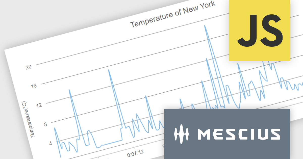
Wijmo by MESCIUS is a comprehensive suite of JavaScript UI controls for building interactive web applications. It offers a wide range of powerful components including grids, charts, inputs, and gauges, designed to streamline development processes and enhance user experiences. With its robust functionality and customizable features, Wijmo simplifies the creation of sophisticated web interfaces, empowering software developers to efficiently craft responsive and visually appealing applications without sacrificing performance or scalability.
The Wijmo 2024 v1 release includes significant rendering refinements for FlexChart and FlexPie. Notable improvements include smoother rounding for polylines and polygons in FlexChart, enhanced spline chart interpolation, and refined tooltips tailored specifically for small slices within FlexPie. These updates collectively enhance the visual quality, precision, and user experience of both chart components, providing developers with finer control over chart aesthetics and data representation.
To see a full list of what's new in 2024 v1, see our release notes.
Wijmo is licensed per developer. Developer Licenses are perpetual and include 1 year Subscription which provides upgrades, including bug fixes and new features. See our Wijmo licensing page for full details.
For more information, visit our Wijmo product page.
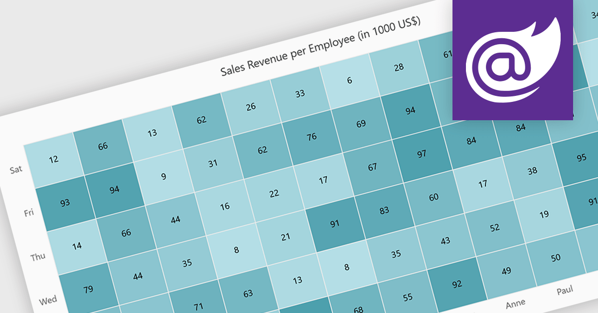
A heatmap is a data visualization tool that uses color intensity to represent magnitude within a dataset. This allows for quick identification of patterns and trends across two variables, depicted on the map's axes. Heatmaps are valuable for analyzing geographic data, user website interaction, and any other scenario where you need to visually grasp the distribution of data points.
Several Blazor chart controls offer Heatmaps including:
For an in-depth analysis of features and price, visit our Blazor chart controls comparison.
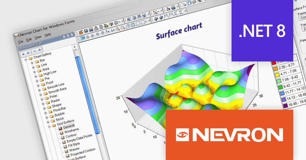
Nevron Chart for .NET is an advanced component suite designed for developers to add rich charting functionality to WinForms, WPF, ASP.NET and MVC applications. Covering any data visualization requirements it is an ideal solution for developing charting enabled presentation, business, scientific or financial applications. It boasts hardware acceleration for optimal performance, a flexible API for customization, and advanced interactivity features like zooming, panning, and tooltips to enhance user engagement with your data.
Nevron Chart for .NET 2024.1 adds support for Microsoft .NET Core 8.0 for the WinForms and WPF chart controls. This enables developers to leverage the latest features and performance improvements offered by the .NET ecosystem in their existing .NET applications, while still utilizing the comprehensive charting capabilities of Nevron Chart.
To see a full list of what's new in 2024.1, see our release notes.
Nevron Chart for .NET is licensed per developer machine and is available as a perpetual license with 1 year subscription and support. See our Nevron Chart for .NET licensing page for full details.
Nevron Chart for .NET is available to buy in the following products:
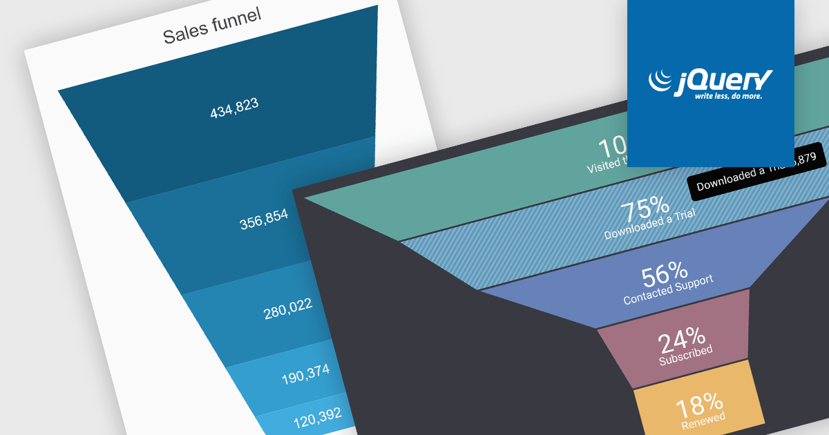
A funnel chart is a type of visualization that graphically depicts the stages of a process and the progressive flow of values through those stages. It gets its name from its shape, typically resembling a funnel with a wide top and narrow base. Funnel charts are particularly useful in sales and marketing contexts for tracking potential customers as they move through the sales pipeline, identifying bottlenecks, and pinpointing areas where performance might be improved.
Several jQuery chart controls offer Funnel charts including:
For an in-depth analysis of features and price, visit our jQuery chart controls comparison.
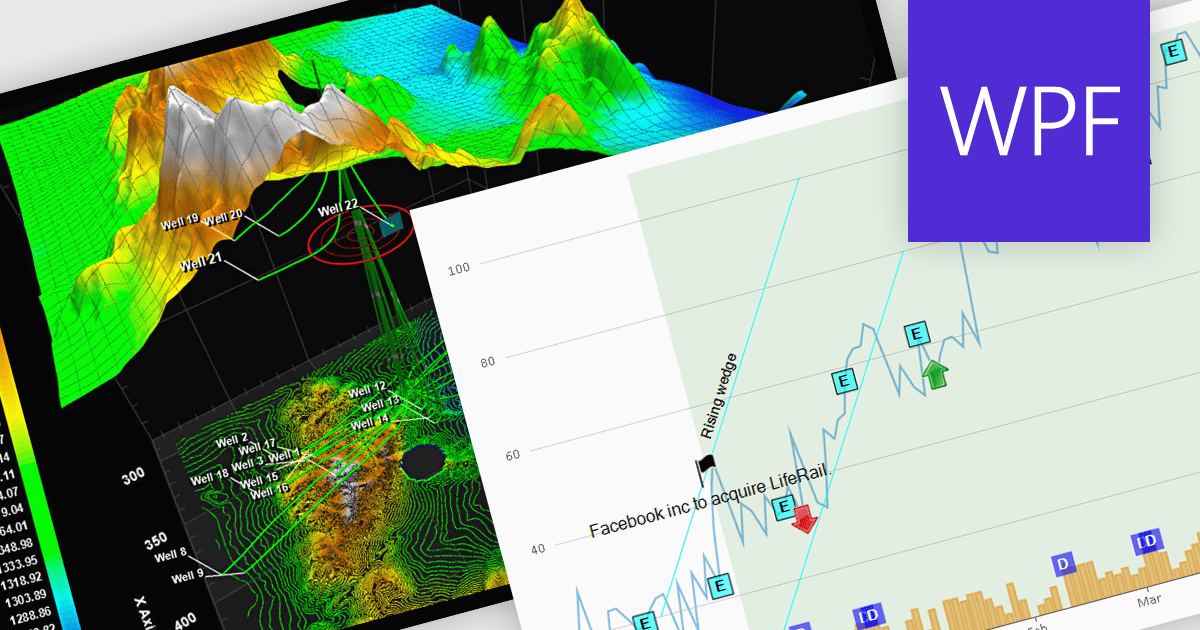
Annotations in a chart refer to additional textual or graphical elements overlaid onto the visual representation of data. They serve to provide context, explanations, or highlights within the chart, making it easier to understand. Software developers can utilize annotations to label specific data points, mark significant events, or add explanatory notes, thereby improving the clarity and insightfulness of the chart for end-users. By incorporating annotations, developers can effectively convey complex information, facilitate better data comprehension, and enable more informed decision-making processes within their applications.
Several WPF chart controls support annotations including:
Many WPF suites contain chart controls with annotation support including:
For an in-depth analysis of features and price, visit our comparison of WPF Chart Controls.
전화 : 00798 14 800 6332
팩스 : +1 770 250 6199


