


공식 공급 업체
200 이상의 소프트웨어 개발처와 판매 계약을 맺은 공인 디스트리뷰터로서 합법적인 라이선스를 제공합니다.
모든 브랜드 보기.
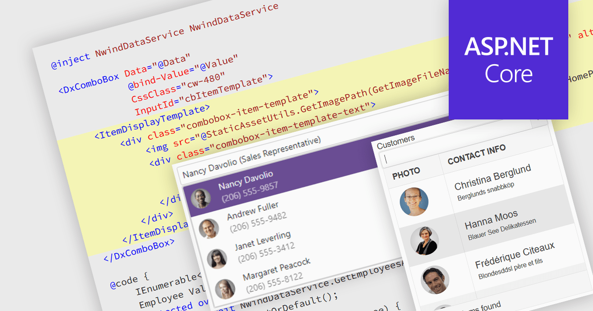
An image combobox is a custom UI component that combines a traditional dropdown menu with the ability to display an image alongside each item. Image comboboxes can enhance user experience by providing a more intuitive way to identify and select options, especially for items that benefit from visual representation. This approach can be particularly useful for non-text-based data or for catering to users who prefer visual cues. Image comboboxes are valuable for tasks like selecting product variations based on color or choosing countries with a flag icons.
Several ASP.NET Core data editor controls support image combobox functionality, including:
For an in-depth analysis of features and price, visit our ASP.NET Core data editors comparison.
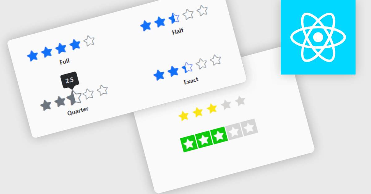
Rating controls for React are user interface components designed to allow users to input and edit rating values, typically represented by stars, numeric values, or other graphical symbols. These controls are essential in applications where user feedback or rating is required, such as e-commerce sites, review platforms, and survey forms. They provide an intuitive, interactive way for users to submit ratings, ensuring that the data is captured accurately and efficiently. These controls often come with customization options to fit the application's design and can handle various events and validations to enhance the user experience and data integrity.
Several React data editor collections offer Rating controls including:
For an in-depth analysis of features and price, visit our comparison of React data editors.
DevExtreme Complete by DevExpress is a collection of high-performance, pre-built UI components designed for web and mobile app development. It offers a rich set of widgets including data grids, charts, editors, and navigation tools that are responsive and work seamlessly across different browsers and devices. DevExtreme Complete allows developers to build feature-rich and user-friendly applications for modern web experiences.
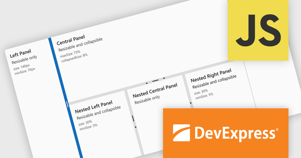
DevExtreme Complete 24.1 adds a new splitter component. This powerful addition allows you to create flexible page layouts with resizable and collapsible panes. Panes can be oriented horizontally or vertically and can contain various content types, including HTML and other DevExtreme components. The splitter offers customization options for handle size, appearance, and keyboard accessibility, making it a powerful tool for building adaptable web applications.
To see a full list of what's new in version 24.1, see our release notes.
DevExtreme Complete is licensed per developer and is available as a Perpetual License with a 12 month support and maintenance subscription. We can supply any DevExtreme Complete license including new subscriptions, subscription renewals, expired subscription renewals, and additional licenses. See our DevExtreme Complete licensing page for full details.
DevExtreme Complete is available to buy in the following products:
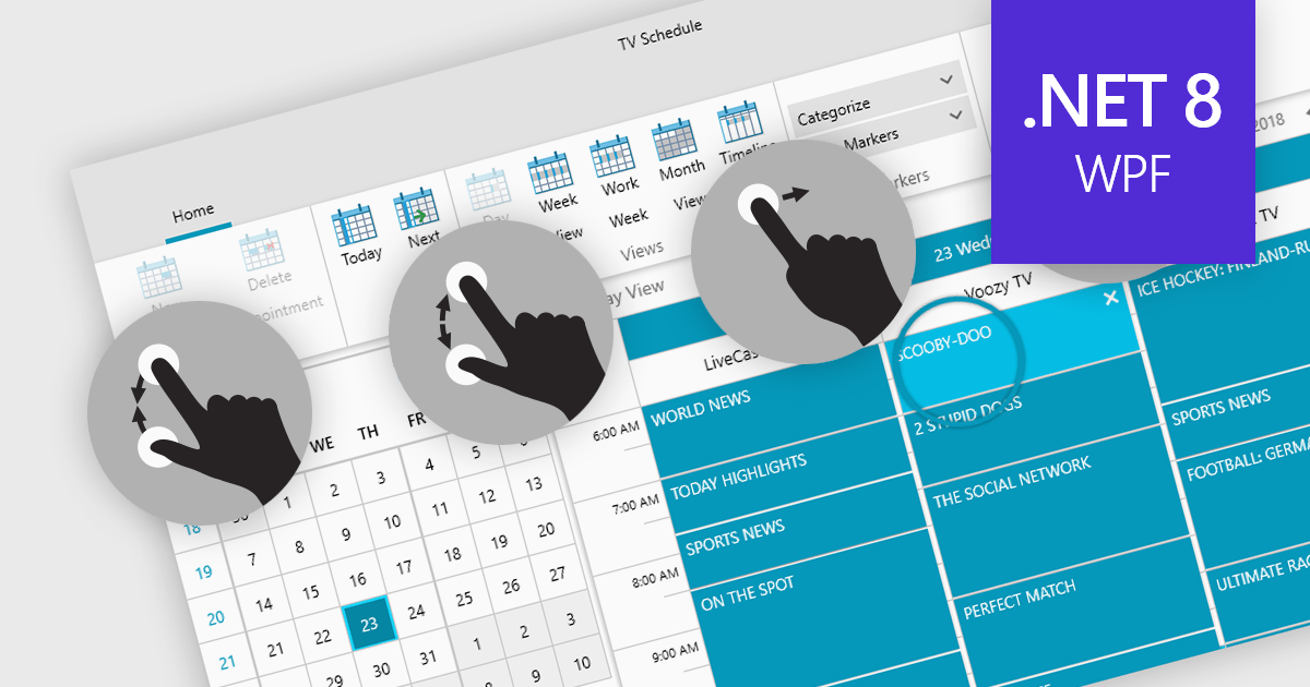
Data editors with touch support revolutionize user interaction by enabling intuitive gestures, taps, and swipes. This fosters a seamless experience, particularly on touchscreens found in smartphones, tablets, and even touch-enabled laptops. Developers can leverage this functionality to create applications with effortless navigation, data manipulation, and command execution through touch. This broader accessibility empowers a wider range of users, enhancing usability and fostering a more engaging and efficient interaction that capitalizes on the hardware capabilities of modern devices.
Many .NET 8 WPF collections contain Data Editors with Touch Support including:
For an in-depth analysis of features and price, visit our comparison of .NET 8 WPF Data Editors.
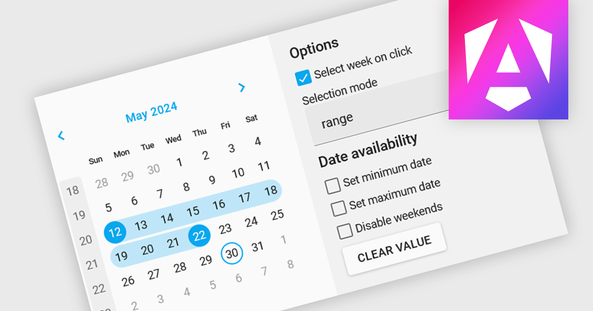
Calendar editing components provide a specialized way to interact with date and time data within the editor. These controls replace the standard input field with a visual calendar interface, allowing developers to offer a more intuitive and user-friendly experience for date selection and modification. This can significantly improve data entry accuracy and efficiency, especially when dealing with large datasets or complex date formats.
Several Angular data editor collections offer calendar editor controls including:
For an in-depth analysis of features and price, visit our Angular Data Editors comparison.
전화 : 00798 14 800 6332
팩스 : +1 770 250 6199


