


공식 공급 업체
200 이상의 소프트웨어 개발처와 판매 계약을 맺은 공인 디스트리뷰터로서 합법적인 라이선스를 제공합니다.
모든 브랜드 보기.

Handsontable is a JavaScript library designed to help developers build interactive data grids into their web applications. Offering a familiar spreadsheet-like interface, it allows users to edit, sort, and filter data with ease. Highly customizable and compatible with popular frameworks like React and Angular, Handsontable empowers developers to build robust data manipulation features into their web applications.
The Handsontable 17.0.0 update adds a new MultiSelect cell type that allows a single cell to hold multiple values, making it well suited for data such as tags, user roles, product categories, or shipment contents. Instead of restricting entries to one option, users can choose any number of items from a dropdown interface that includes search and filtering capabilities for quickly locating options. Full keyboard navigation ensures efficient interaction for power users.
To see a full list of what's new in version 17.0.0, see our release notes.
Handsontable is licensed per developer and is available as an Annual or Perpetual license with 1 year support and maintenance. See our Handsontable licensing page for full details.
For more information, visit our Handsontable product page.
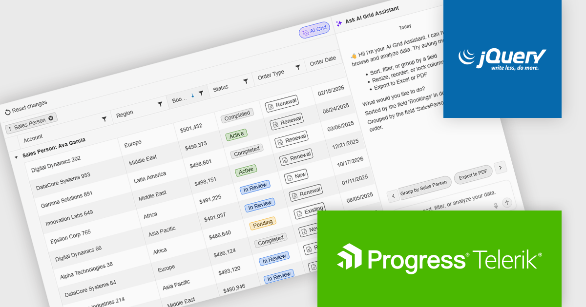
Kendo UI by Telerik is a comprehensive suite of JavaScript UI components designed to accelerate web application development. Offering pre-built, customizable elements for grids, charts, schedulers, and more, it streamlines UI creation across popular frameworks like jQuery, Angular, React, and Vue. Key features include responsive design, accessibility, and high performance, enhancing user experience. Developers benefit from reduced development time, consistent UI patterns, and the ability to build feature-rich applications faster.
The Kendo UI for jQuery v2026 Q1 update introduces AI Chat integration for the Smart Grid, enabling developers to incorporate a conversational interface into data-driven web applications. End users can explore and query structured Grid data using natural-language input, while the integration leverages the Grid’s schema, configuration, and current view to generate precise, context-aware responses. This approach minimizes the need for complex filtering configurations and custom-built query tools, reduces user training requirements, and enhances overall usability. For development teams, it improves implementation while delivering a more efficient and accessible data exploration experience within existing jQuery applications.
To see a full list of what’s new in version 2026 Q1 (2026.1.212), see our release notes.
Kendo UI is licensed per developer and has two licensing models: an annual Subscription License and a Perpetual License. The Subscription license provides access to the latest product updates, technical support, and exclusive benefits for a flat annual fee, and must be renewed to continue using the software. The Perpetual license is a one-time purchase granting access to the current released version and includes a one-year subscription for product updates and technical support. After this initial period, users can choose to renew the subscription element to continue receiving updates and support; otherwise, they may continue using the installed version available during their active subscription term but will forgo future updates and support. See our Kendo UI licensing page for full details.
Kendo UI is also available to buy individually or as part of:
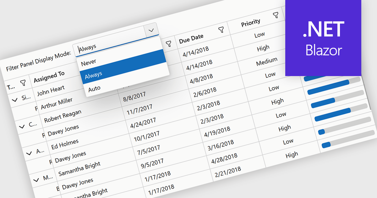
Grid filtering allows users to display only selected rows or columns by choosing specific values, categories, or ranges without modifying the underlying dataset. This capability simplifies navigation through large volumes of data and helps users focus immediately on the most relevant information. By minimizing manual searching and enabling faster comparisons, grid filtering improves productivity and supports more informed decision making. Common use cases include filtering sales data by date range, isolating transactions above a certain value, analyzing results by region or product category, and hiding non essential columns to create clearer, presentation ready reports.
Several .NET Blazor grid controls offer filtering support including:
For an in-depth analysis of features and price, visit our comparison of .NET Blazor grids.
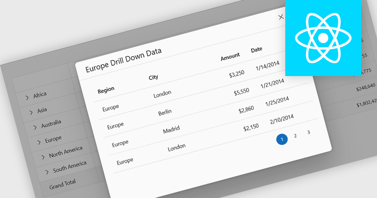
Drill-down support in a grid component allows users to move from summarized data to more detailed records within the same interface, often by expanding rows or selecting linked values that reveal related data. Instead of navigating to a separate page or view, users can access underlying information directly in context. For developers, this reduces the need for additional navigation and simplifies the presentation of hierarchical or related datasets. It also makes it easier to analyze data step by step, helping users inspect specific records or relationships without losing their place in the overall dataset.
Several React grid controls support drill-down features including:
For an in-depth analysis of features and price, visit our React grid controls comparison.
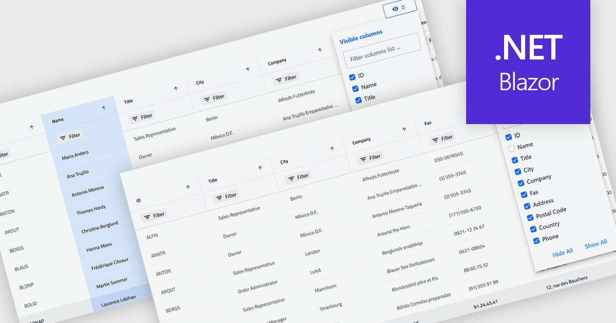
Column hiding in grids allows users to temporarily remove selected columns from view without deleting the underlying data. This provides a more focused and flexible way to work by showing only the fields relevant to a specific task or role. By reducing visual clutter and optimizing screen space, it improves readability and makes data easier to scan and analyze. For example, a financial analyst might display only revenue and profit columns for performance review, while a project manager may hide technical fields to focus on timelines and resources. Because columns can be restored at any time, the feature supports personalized, non-destructive customization.
Several .NET Blazor Grid controls offer the ability to hide columns including:
For an in-depth analysis of features and price, visit our .NET Blazor Grid controls comparison.
전화 : 00798 14 800 6332
팩스 : +1 770 250 6199


