





공식 공급 업체
200 이상의 소프트웨어 개발처와 판매 계약을 맺은 공인 디스트리뷰터로서 합법적인 라이선스를 제공합니다.
모든 브랜드 보기.
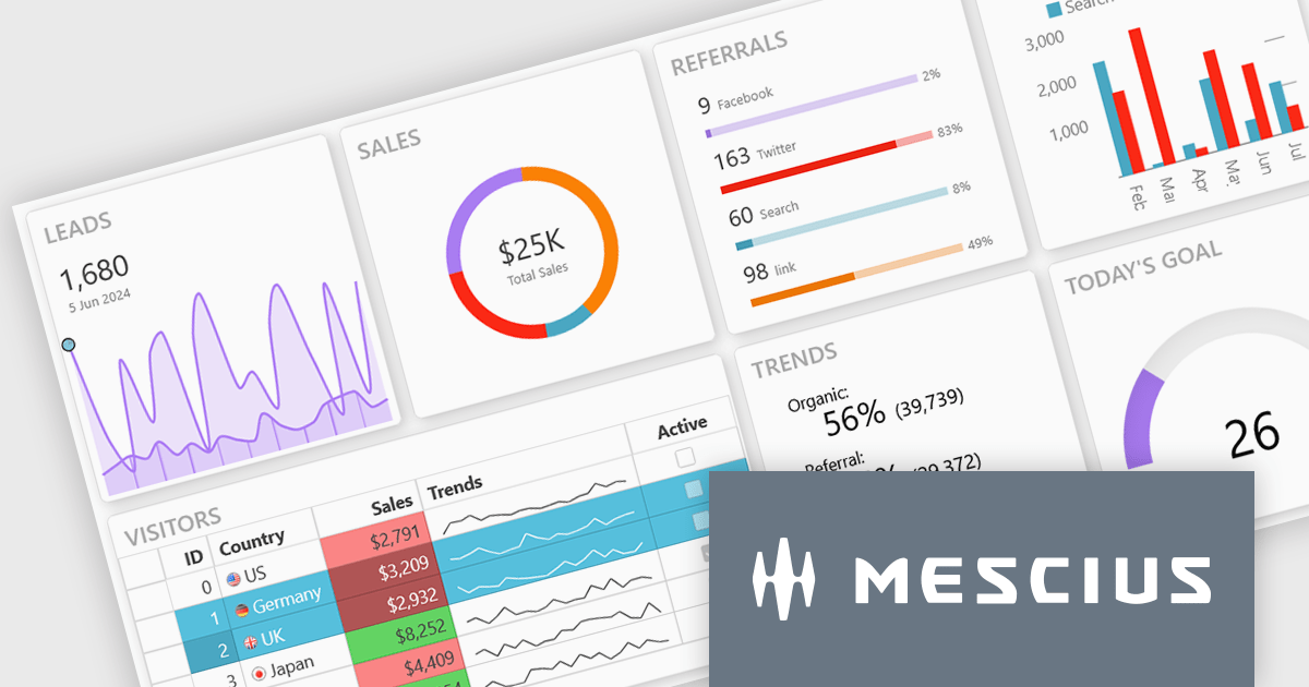
Wijmo is a complete collection of extensible, fast, flexible JavaScript UI components written in TypeScript. The framework-agnostic Wijmo components include first-class support for top frameworks including Angular, React, Vue and Web Components. Wijmo Enterprise has over 100 dynamic JavaScript UI components to help cut your development time in half and build lightweight, high-performance JavaScript applications using your favorite JavaScript framework.
On June 25, 2025 at 11:00 AM EDT, MESCIUS (formerly GrapeCIty) will be presenting a CodeClinic Live Webinar, exploring the 25 UX laws to give your apps an advantage over the competition. Learn why they are important, how to follow the industry's best practices, and how to apply them, assessing various popular web applications.
Register for the LIVE webinar today, and mark your calendar for June 25.
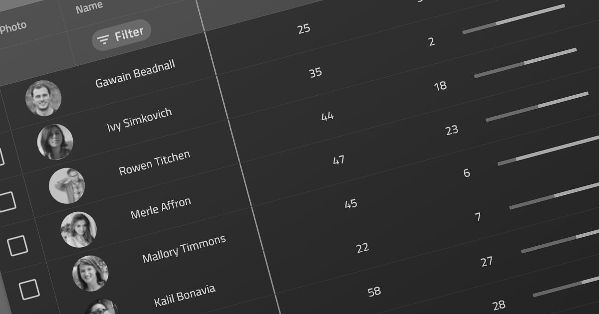
ComponentOne Studio WPF by MESCIUS is a comprehensive suite of controls designed to enhance the development of WPF applications. It offers a range of powerful and flexible UI components such as data grids, charts, and data visualization tools that integrate seamlessly into WPF projects. This suite enables developers to create modern, responsive, and visually appealing applications with greater efficiency, leveraging robust features and customization options. Its components are optimized for performance and ease of use, allowing for the rapid development of high-quality WPF applications that meet complex business requirements.
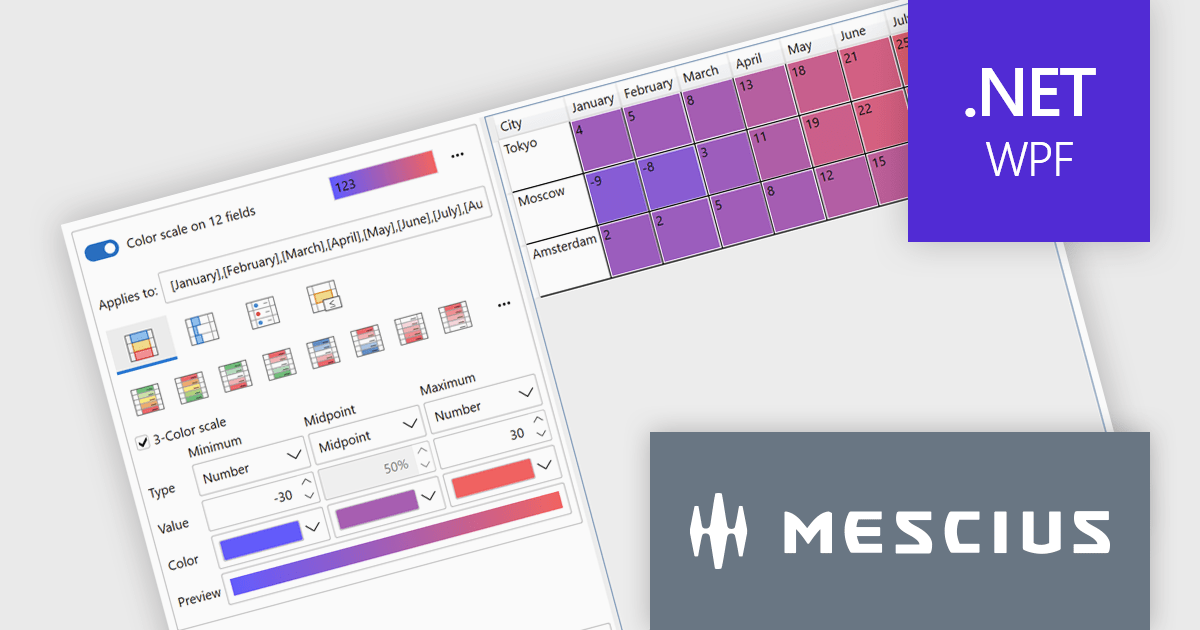
The ComponentOne Studio WPF 2025 v1 update introduces a new Rules Manager UI Library that enables end-users to define, apply, and persist conditional formatting rules directly at runtime. This addition eliminates the need for developers to hardcode rule logic, streamlining customization and reducing maintenance. With support for gradient fills, progress bars, and value-based symbols, the Rules Manager enhances data visualization, making it easier for users to interpret trends and thresholds. Designed to work with FlexGrid, FlexPivot, DataGrid, and ListView controls, it offers a flexible and consistent formatting experience across the application.
To see a full list of what's new in 2025 v1, see our release notes.
ComponentOne Studio WPF is licensed per developer on a perpetual basis and includes a 12 month subscription. See our ComponentOne Studio WPF licensing page for full details.
ComponentOne Studio WPF is available individually or as part of ComponentOne Studio Enterprise.
Actipro Avalonia UI Pro is a suite of professionally designed UI controls, themes, and components specifically built for the Avalonia UI framework. It empowers developers to craft beautiful, modern cross-platform applications while leveraging their existing C# and WPF skills. Actipro offers a range of controls from essential navigation and data visualization components to advanced charting and scheduling features, all adhering to its signature high-quality design and seamless integration with Avalonia.
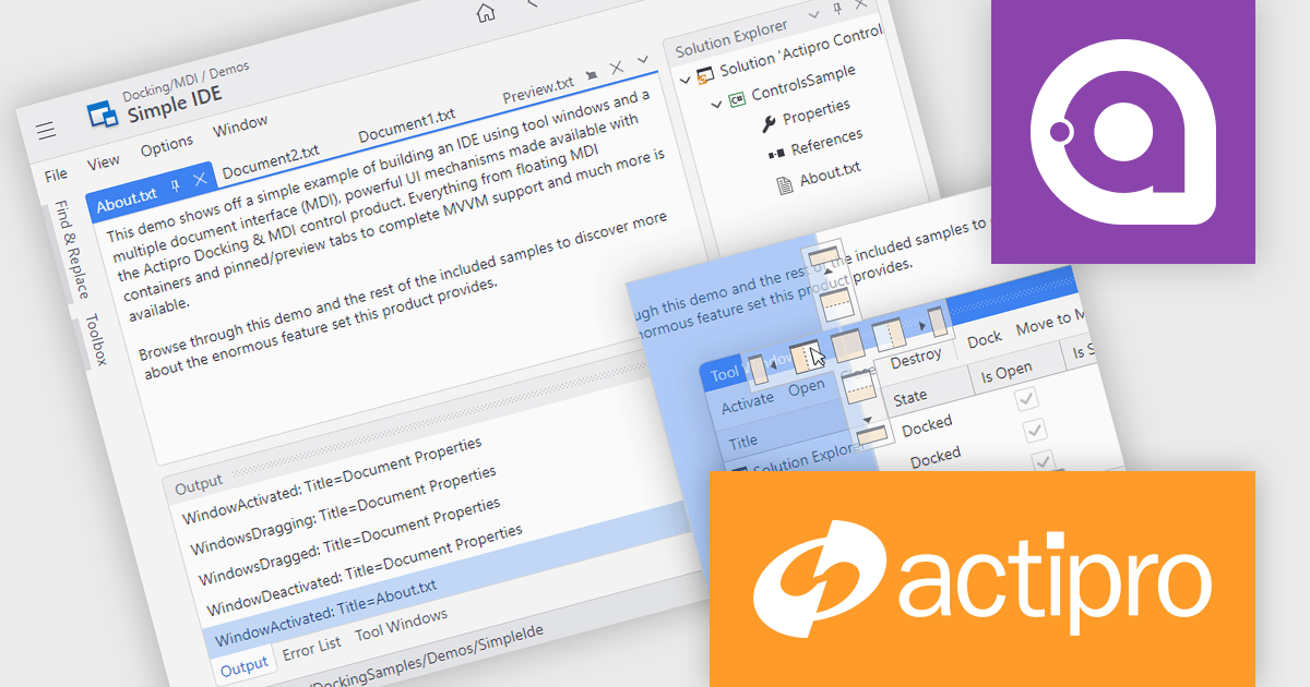
The Actipro Avalonia UI Pro 25.2.0 release adds a Docking/MDI (Multiple Document Interface) control library, bringing Visual Studio-style window management to cross-platform Avalonia applications. This new feature allows end users to freely drag, dock and rearrange windows, with full support for persisting their layout preferences. Mirroring capabilities found in modern integrated development environments (IDEs), the library is ideal for building applications that require complex customization. It also includes comprehensive support for data-binding, ensuring compatibility with Model-View-ViewModel (MVVM) design patterns to ease integration into existing application architectures.
To see a full list of what's new in 25.2.0, see our release notes.
Actipro Avalonia UI Pro is licensed per developer and is available as a Perpetual license with 1 year support and maintenance. See our Actipro Avalonia UI Pro licensing page for full details.
Learn more on our Actipro Avalonia UI Pro product page.
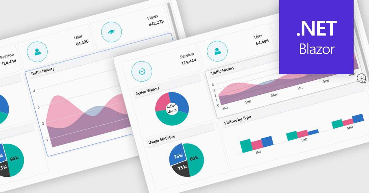
In a UI suite, layout refers to the arrangement and alignment of interface elements, such as widgets, charts, controls, and navigation bars, into a coherent structure that prioritizes usability and visual hierarchy. Effective layouts ensure that users can intuitively find and interact with content, while developers benefit from built-in support for responsive grids, flexible spacing, and adaptive positioning that simplifies the creation of consistent interfaces across devices.
Several .NET Blazor UI suites offer layout components including:
For an in-depth analysis of features and price, visit our .NET Blazor UI suites comparison.
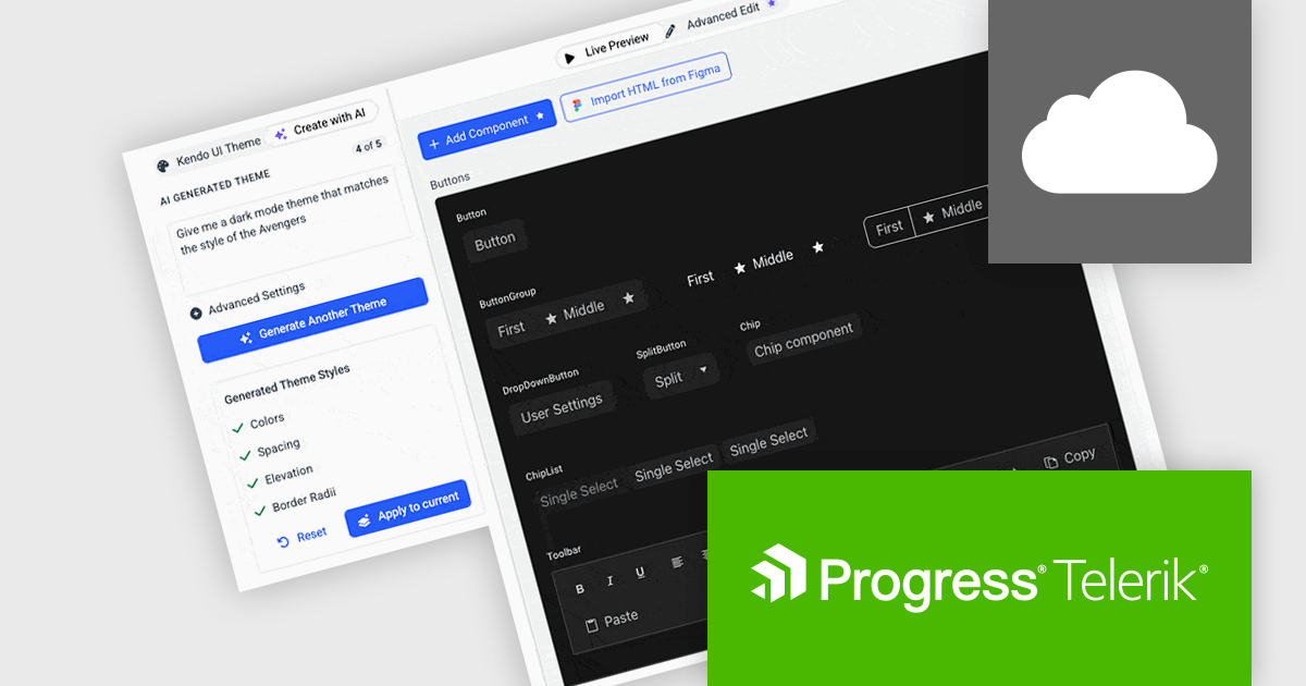
Progress ThemeBuilder by Telerik is a comprehensive visual design tool that accelerates user interface customization for Telerik and Kendo UI web components. ThemeBuilder enables you to style virtually every appearance-related property of the UI components, from top-level elements to the smallest of details, without requiring direct CSS manipulation. It integrates seamlessly with existing development workflows and allows developers to create, modify, and maintain consistent and visually appealing themes across applications. This tool significantly reduces the time and effort required for UI customization and makes it easy to align them with branding and design specifications.
The Progress ThemeBuilder 2025 Q2 update introduces AI-powered theme generation, allowing developers to produce fully cohesive design themes through natural language prompts. Instead of manually configuring color palettes, typography, and layout settings, developers can specify brand requirements or stylistic preferences in plain text, and the AI generates the corresponding theme assets, reducing development time and minimizing inconsistency across components. Generated themes integrate directly with existing ThemeBuilder workflows, ensuring immediate compatibility with styling APIs and design tokens. This enhancement streamlines the process of adopting new design styles, enabling teams to focus on functionality while maintaining a unified visual identity.
To see a full list of what's new in 2025 Q2, see our release notes.
Progress ThemeBuilder is licensed per user and is available as an annual license with a one year support subscription, which is available in three tiers: Lite, Priority or Ultimate. See our Progress ThemeBuilder licensing page for full details.
For more information, see our Progress ThemeBuilder product page.
전화 : 00798 14 800 6332
팩스 : +1 770 250 6199


