Codejock Toolkit Pro
Visual C++ MFC 개발자들에게 모던한 컨트롤의 전문적인 세트를 제공합니다.
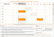
Codejock Calendar - Calendar for Visual C++ MFC는 통합된 시간 규모 및 날짜 선택, 여러 일정, 일 및 월 일정 보기, Microsoft Office와 사용자 지정 테마 지원 및 그 이상을 포함하는 여러 옵션을 제공합니다.


전화 : 00798 14 800 6332
팩스 : +1 770 250 6199


 (1)
(1)

 (2)
(2)

 (1)
(1)