


Fornecedor oficial
Como distribuidores oficiais e autorizados, nós fornecemos licenças legítimas diretamente de mais de 200 editores de software.
Ver todas as nossas marcas.
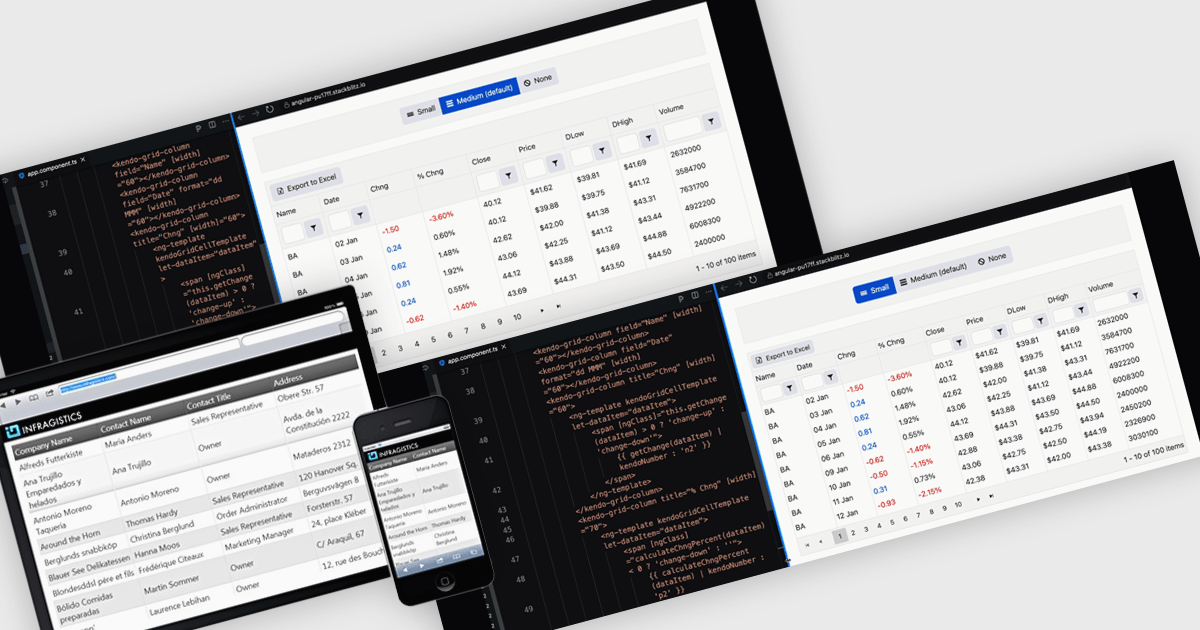
A responsive layout is a design approach that enables web and application interfaces to automatically adjust and optimize their structure, content, and elements for different screen sizes and devices. By using flexible grids, scalable images, and adaptable components, responsive layouts ensure a consistent and user-friendly experience across desktops, tablets, and mobile devices. For software developers, this approach simplifies the creation of cross-platform applications, improves accessibility, and enhances user satisfaction by delivering interfaces that perform seamlessly in diverse environments.
Several Angular grid components support responsive layouts including:
For an in-depth analysis of features and price, visit our comparison of Angular grid controls.
KendoReact by Telerik is a comprehensive library of UI components specifically designed for building modern, feature-rich React applications, enabling developers to create intuitive, responsive, and visually appealing interfaces with ease. It includes robust components like data grids, charts, form elements, and navigation tools, optimized for high performance with features such as virtualization for large datasets and adherence to accessibility standards. Ideal for dashboards, enterprise apps, and data-driven applications, KendoReact empowers teams to accelerate development, ensure design consistency, and deliver inclusive user experiences.
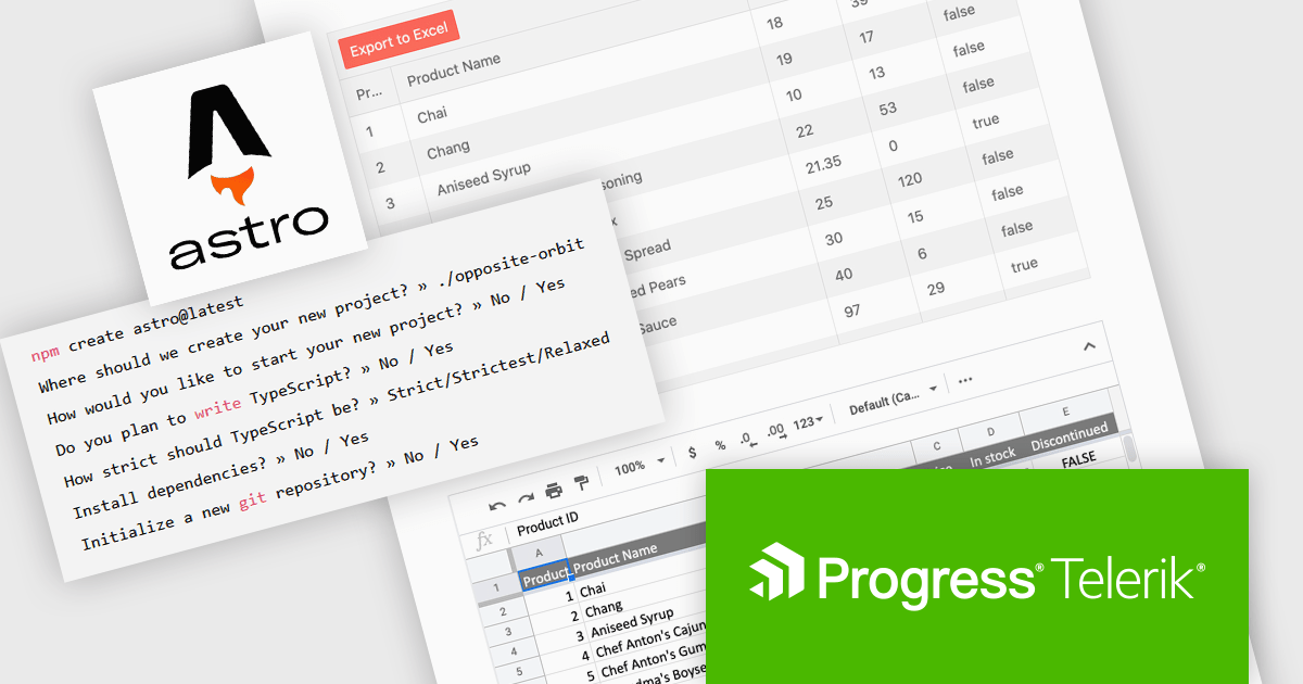
The KendoReact v9.0.0 update introduces integration with Astro, a modern static site builder that supports multiple front-end frameworks, including React. This enhancement enables developers to seamlessly incorporate KendoReact components into Astro projects, leveraging Astro's performance benefits such as minimal JavaScript delivery and support for server-side rendering (SSR) and static site generation (SSG). By following the provided getting started guide, developers can efficiently set up Astro projects with KendoReact, thereby enhancing development workflows and application performance.
To see a full list of what’s new in 2024 Q4 (v9.0.0), see our release notes.
KendoReact is licensed per developer and is available as a perpetual license with a 1 year support subscription, which is available in 3 tiers: Lite, Priority or Ultimate. See our KendoReact licensing page for full details.
KendoReact is available individually or as part of the following products:
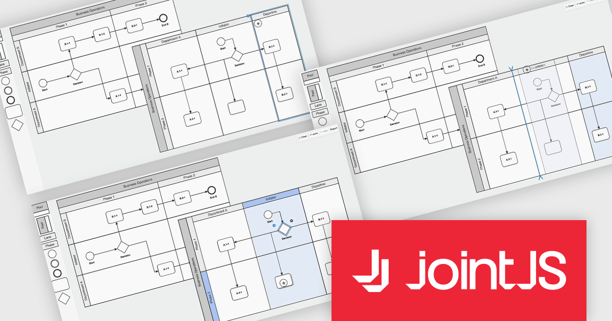
JointJS+ is a diagramming library that offers advanced features like custom shapes, data binding, and advanced layout algorithms, enabling you to create complex, interactive, and visually appealing diagrams. It includes a ready-to-use demo application that showcases its functionality and serves as a starting point for your own diagramming projects.
The JointJS+ v4.1 update introduces significant improvements to Business Process Model and Notation (BPMN) modeling, enabling developers to work more efficiently with enhanced pools, swimlanes, and milestones. These enhancements streamline the process of inserting, resizing, and reordering elements while maintaining content alignment and preventing out-of-bound resizing. The addition of vertical pools and milestones with drag-and-drop functionality further expands modeling capabilities, offering greater flexibility to meet diverse design requirements. Features like content awareness, automatic adjustments, and real-time previews ensure accuracy and ease of use, empowering developers to create precise and dynamic process diagrams with minimal effort.
To see a full list of what's new in v4.1, see our release notes.
JointJS+ is licensed per developer and is available as a Perpetual license with 1 year support and maintenance. See our JointJS+ licensing page for full details.
Learn more on our JointJS+ product page.

ComponentSource and Dynamsoft have enjoyed a successful 20-year partnership focused on delivering document capture and barcode reading tools to the global developer community. This long-standing cooperation demonstrates a shared commitment to providing developers with tools that enable precise data extraction, optimize workflow automation, and enhance the accuracy and efficiency of application processes.
Dynamsoft is a leading provider of software development kits (SDKs), specializing in barcode scanning, document capture, and TWAIN scanning solutions. Its core competencies lie in delivering high-performance, scalable solutions to enterprise-level financial, logistics, retail, and healthcare companies. Dynamsoft offers tools that enable seamless integration of computer vision functionalities into web, desktop, and mobile applications, empowering developers to build high-performance, scalable solutions tailored to diverse enterprise needs. Choosing Dynamsoft products enables businesses to drive digital transformation, improve operational efficiency, and achieve significant cost savings.
ComponentSource, a leading distributor of software components and development tools, has played a crucial role in expanding the reach of the Dynamsoft range. Through this partnership, ComponentSource has helped make products such as Dynamic Web TWAIN and Dynamsoft Barcode Reader accessible to a broader audience of developers.
The enduring collaboration between ComponentSource and Dynamsoft has had a significant, positive impact on the developer community by making advanced imaging and barcode scanning tools more accessible. As we celebrate this two decade partnership, we look forward to strengthening our relationship and continuing to provide developers worldwide with innovative, reliable solutions to meet their evolving technology needs.
Learn more about Dynamsoft.
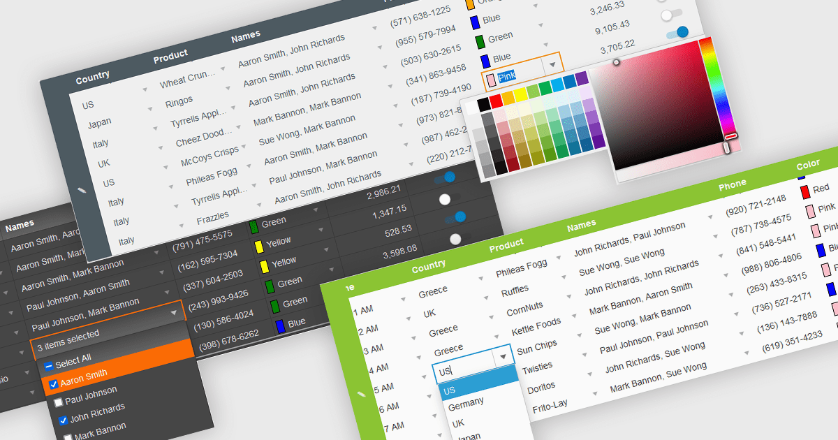
In the field of data editors, themes are style configurations that define the visual appearance and behavior of the interface. They provide developers with a consistent design framework, ensuring alignment with brand guidelines while enhancing usability and accessibility. By supporting features like dark and light modes, responsive design, and unified styling across components, themes enable developers to create a visually cohesive and user-friendly experience. They streamline maintenance, improve scalability, and reduce development overhead by offering a centralized system for managing design updates and ensuring consistency throughout the application.
Several React data editor collections offer support for themes including:
For an in-depth analysis of features and price, visit our React data editor controls comparison.
Tel: (888) 850 9911
Fax: +1 770 250 6199


