













Fornecedor oficial
Como distribuidores oficiais e autorizados, nós fornecemos licenças legítimas diretamente de mais de 200 editores de software.
Ver todas as nossas marcas.
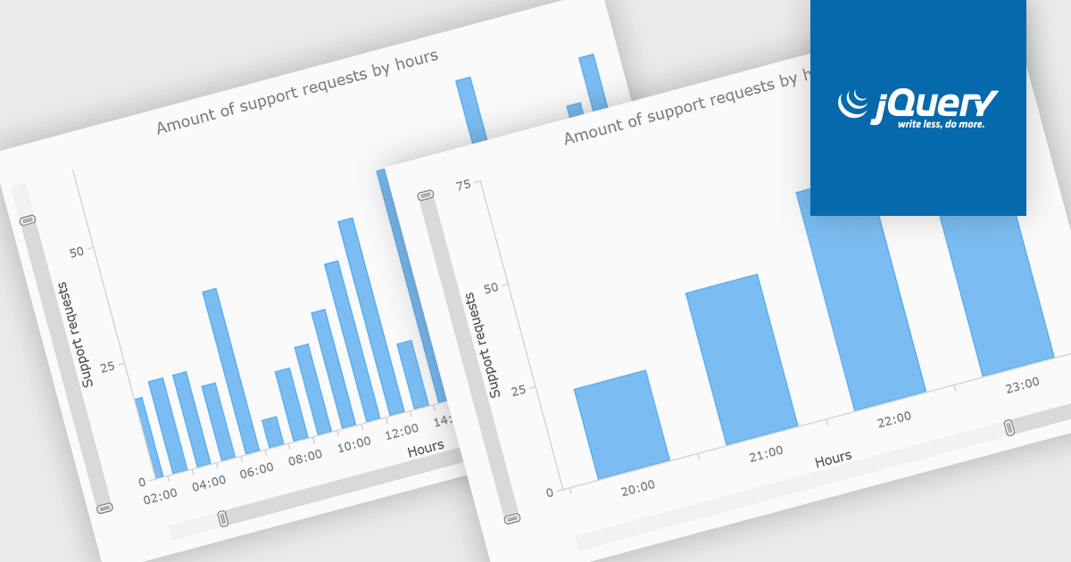
Chart scrolling lets users navigate large datasets by moving horizontally or vertically through a chart without displaying all data points at once. This improves readability, reduces visual clutter, and makes it easier to explore specific time periods, categories, or value ranges while maintaining access to the full dataset. It is particularly useful for dashboards, financial reports, business intelligence applications, and other data-intensive visualizations where users need to analyze large volumes of information efficiently.
Several jQuery chart controls offer Funnel charts including:
For an in-depth analysis of features and price, visit our jQuery chart controls comparison.
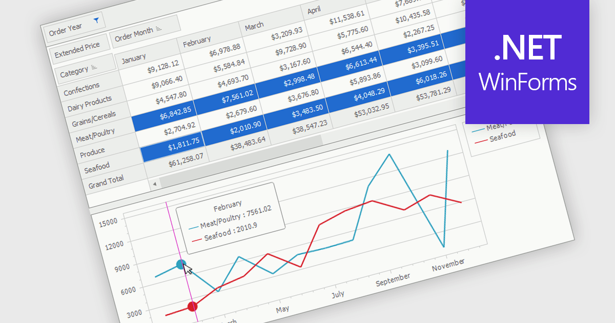
A pivot chart is an interactive data visualization tool that works alongside a pivot table to display summarized data in a graphical format. It enables users to analyze datasets by dynamically changing categories, series, and filters without altering the source data. By presenting trends, comparisons, and patterns visually, pivot charts make complex information easier to interpret and support faster decision making. They are widely used in business intelligence, reporting, and data analysis where flexible exploration of aggregated data is important.
Several .NET WinForms UI suites provide you with pivot chart functionality, including:
For an in-depth analysis of features and price, visit our comparison of .NET WinForms UI suites.
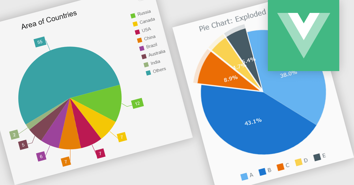
A pie chart enables developers to display data as proportional slices of a circle, with each slice representing a category's share of a single total. It is well suited to datasets that show part-to-whole relationships, making it easy for users to compare relative proportions at a glance. A well-designed implementation typically includes interactive features such as tooltips, legends, labels, animations, responsive layouts, and customization options, allowing the chart to integrate cleanly into modern web applications while providing a clear and accessible way to present composition data.
Several Vue.js chart components support pie charts, including:
For an in-depth analysis of features and price, visit our comparison of Vue.js charting components.
Syncfusion Essential Studio Enterprise provides a comprehensive collection of UI components and frameworks for building modern cross-platform applications. It offers over 1,800 components compatible with .NET WinForms, WPF, ASP.NET Core & MVC, WinUI, MAUI, JavaScript, Blazor, and more, enabling seamless application development across diverse devices and operating systems.
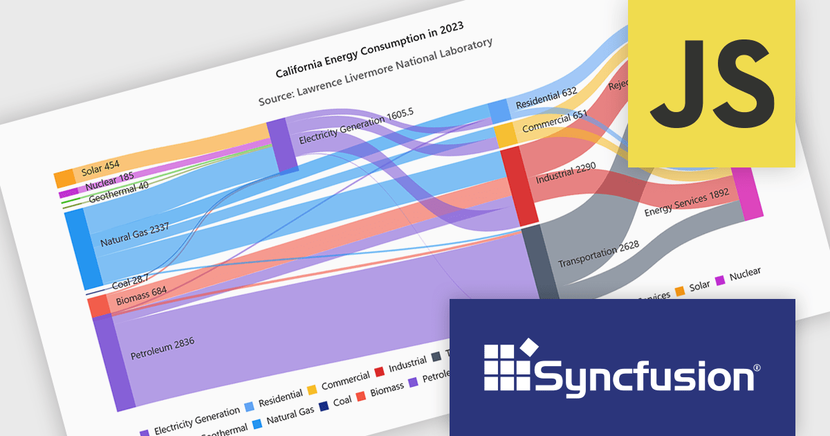
Syncfusion Essential Studio extends Sankey Diagram support to JavaScript, enabling developers to visualize the movement of quantities and relationships within complex systems through interconnected nodes and weighted links. This helps applications present complex data flows more clearly, making it easier for users to understand how values move and transform across stages, identify patterns and dependencies, and gain meaningful insights from interconnected datasets.
Syncfusion Essential Studio Enterprise is licensed per developer and is available as a 12 Month Timed Subscription License which includes support and maintenance. See our Syncfusion Essential Studio Enterprise licensing page for full details.
Learn more on our Syncfusion Essential Studio Enterprise product page.
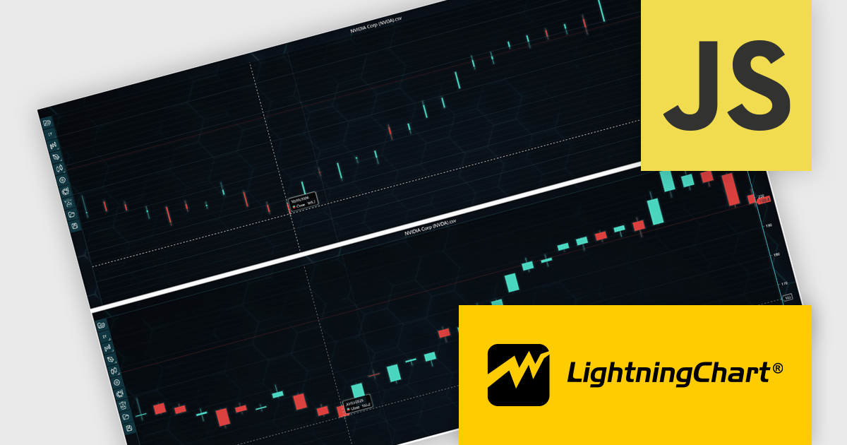
LightningChart JS Trader is a JavaScript/TypeScript library developed by LightningChart that specifically targets the creation of financial and trading applications. It provides high-performance, 2D, 3D, and real-time charting controls and a comprehensive suite of visualizations including candlestick, bar, line, and various technical indicators and drawing tools. This library enables software developers to create interactive technical analysis tools without the need for server-side setup as it runs completely on the client device.
LightningChart JS Trader automatically adjusts the width of candlesticks and bars as users zoom, improving chart readability and making more effective use of available space. By reducing unnecessary gaps between data points, it provides a clearer view of price movements and trends at different zoom levels without requiring manual configuration. This helps developers deliver more intuitive financial charting experiences while retaining the option to disable the feature when fixed-width rendering is preferred.
LightningChart JS Trader is licensed per developer and is available as an annual license with 1 year support. See our LightningChart JS Trader licensing page for full details.
For more information, see our LightningChart JS Trader product page.
Tel: (888) 850 9911
Fax: +1 770 250 6199


