


Fornecedor oficial
Como distribuidores oficiais e autorizados, nós fornecemos licenças legítimas diretamente de mais de 200 editores de software.
Ver todas as nossas marcas.
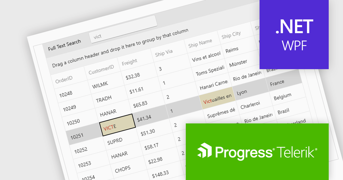
Telerik UI for WPF is an extensive UI library specifically designed for building modern and feature-rich business applications using the Windows Presentation Foundation (WPF) framework. It offers many customizable controls, ranging from data-driven grids and charts to specialized navigation and input components. The suite emphasizes performance and user experience, providing data virtualization for handling large datasets efficiently and ensuring visually appealing interactions.
The Telerik UI for WPF 2024 Q3 (2024.3.806) update enhances the DataGrid control by implementing "Search as You Type" behavior without filtering the items. This new option provides users with greater control over the grid search process with the ability to disable data filtering when performing search operations. By enabling users to tailor the filtering behavior, this feature ensures that search results are not inadvertently limited by active filters, potentially revealing more relevant data that would otherwise be hidden.
To see a full list of what's new in 2024 Q3, see our release notes.
Telerik UI for WPF is licensed per developer and is available as a perpetual license with a one year support subscription, which is available in three tiers: Lite, Priority or Ultimate. See our Telerik UI for WPF licensing page for full details.
Telerik UI for WPF is available to buy in the following products:
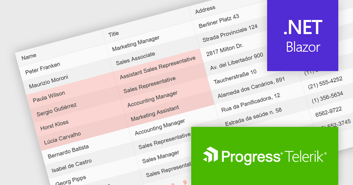
Telerik UI for Blazor is a comprehensive UI library that provides over 110 native Blazor components for building modern and feature-rich web applications. This professional-grade solution offers a complete set of components to satisfy all user interface requirements, saving time and effort in UI design.
The Telerik UI for Blazor v6.1.0 update (part of the 2024 Q3 release) enhances the grid component with a new SelectionMode feature, providing the ability to select single or multiple cells simultaneously. It supports intuitive selection methods via keyboard navigation and allows users to easily navigate and select either cells or rows. This feature enhances the user experience and makes the grid more flexible, enabling Blazor developers to offer functionality better suited to meet the complex data manipulation needs of modern web applications.
To see a full list of what's new in 2024 Q3 (v6.1.0), see our release notes.
Telerik UI for Blazor is licensed per developer and is available as a perpetual license with a one year support subscription, which is available in three tiers: Lite, Priority or Ultimate. See our Telerik UI for Blazor licensing page for full details.
Telerik UI for Blazor is available to buy in the following products:

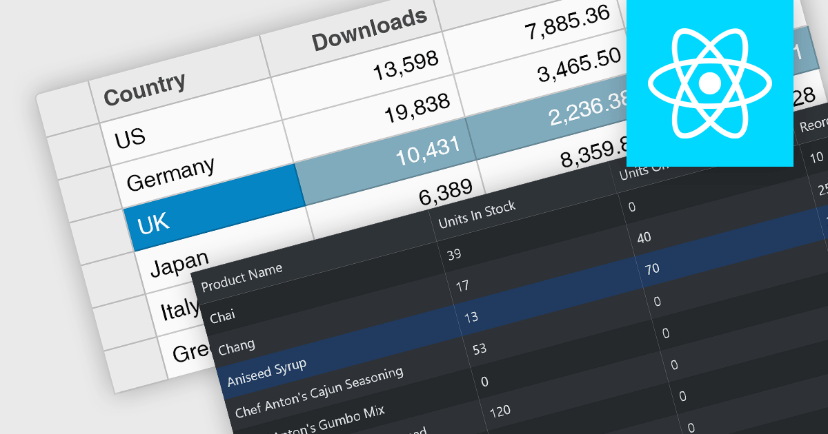
Infragistics Ignite UI for React is a comprehensive suite of enterprise-grade React UI components designed to accelerate the development of modern, high-performance web applications. Packed with features such as data grids, charts, gauges, and spreadsheets, it empowers developers to visualize and interact with complex data effortlessly. Ignite UI for React offers exceptional performance, customization options, and responsive design, facilitating the creation of engaging user experiences across various devices.
Infragistics Ignite UI Version 24.1 (Infragistics Ignite UI for React 18.6.0) adds a new Hierarchical Data Grid component, which provides a robust solution for visualizing and interacting with complex, hierarchical datasets. It empowers users to effortlessly expand or collapse parent rows to reveal detailed child grids, offering an intuitive, dynamic way to explore data at various levels of granularity. With rapid data binding, extensive customization options, and a comprehensive suite of functionality the Hierarchical Data Grid is a versatile tool for creating engaging and informative data-driven applications.
To see a full list of what's new in version 24.1 (18.6.0), see our release notes.
Infragistics Ignite UI for React is part of Infragistics Ignite UI which is licensed per developer and is available as a Perpetual License with a 1, 2 or 3 year support and maintenance subscription. See our Infragistics Ignite UI licensing page for full details.
Infragistics Ignite UI for React is available to buy in the following products:
Row selection functionality empowers users to interact with data grids by selecting individual or multiple rows, enabling efficient data manipulation and analysis. Users can perform actions on selected rows such as editing, deleting, exporting, or filtering data. This feature significantly enhances user experience and productivity by providing a direct and intuitive way to manage and process large datasets, facilitating tasks like batch updates, generating reports, or performing complex data operations based on user-defined criteria.
Several React grid controls offer row selection including:
For an in-depth analysis of features and price, visit our comparison of React grid controls.
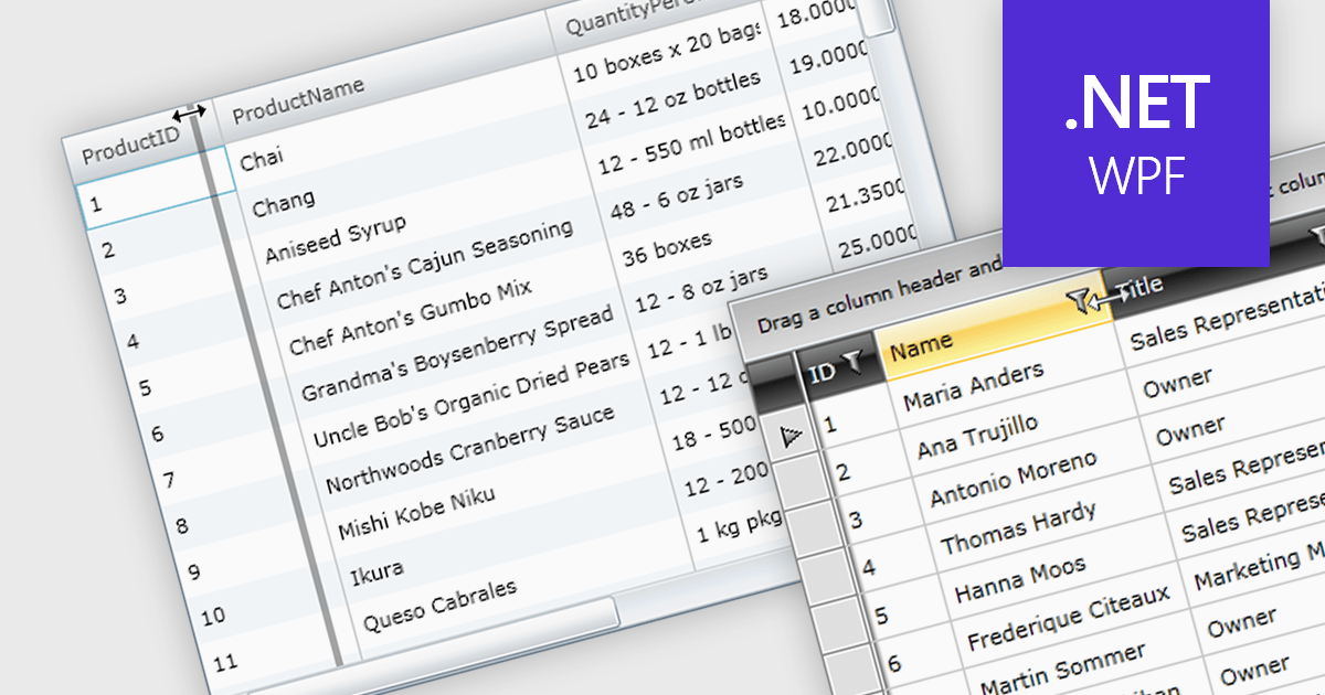
Column resizing in a datagrid empowers users to dynamically adjust column widths, enhancing data visibility and analysis. By dragging column boundaries, users can prioritize information, reveal hidden content, and improve readability. This flexibility accommodates diverse screen sizes, data volumes, and user preferences, ultimately optimizing the datagrid's usability for various tasks like data entry, reporting, and analysis.
Several WPF grid controls offer support for expanding and resizing columns including:
For an in-depth analysis of features and price, visit our WPF grid controls comparison.
Tel: (888) 850 9911
Fax: +1 770 250 6199


